untitled (asphalt siding) 2006
I’m pretty fond of the siding this nineteenth-century house in Brooklyn’s Vinegar Hill aquired some time in the next.
Author: jameswagner
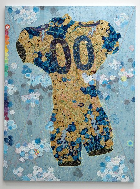
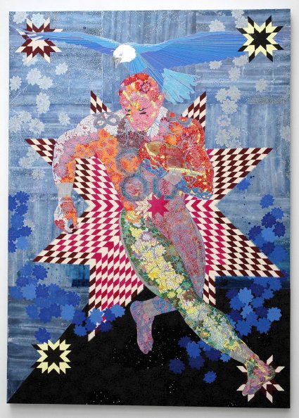
Haeri Yoo at Thomas Erben
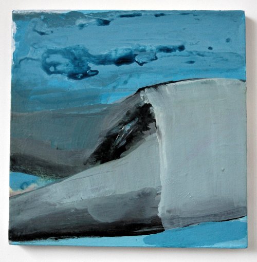
Haeri Yoo Untitled 2006 acrylic and gouache on canvas 12″ x 12″ [installation view]
While I was in Thomas Erben‘s gallery yesterday I couldn’t help thinking about the fact that I was looking at the work of one established artist, one just beginning to be recognized and sought, and a third who has hardly been seen at all. Only while I’m writing this now do I also notice that each of these artists is a woman.
The artist who is becoming increasingly visible is Chitra Ganesh, and she deserves even more than all the goodies that have been said about her. The underknown artist is Haeri Yoo, whose small drawings Barry and I first encountered in the Queens International two years ago.
I had not seen anything of hers on canvas until yesterday, but if this very beautiful small figured “landscape” is representative of what she can do, I expect my earlier enthusiasm to me more than just renewed if she contiues to work in this medium.
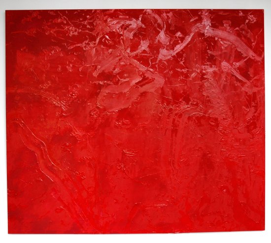
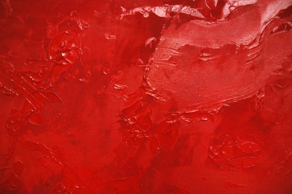
Dona Nelson at Thomas Erben
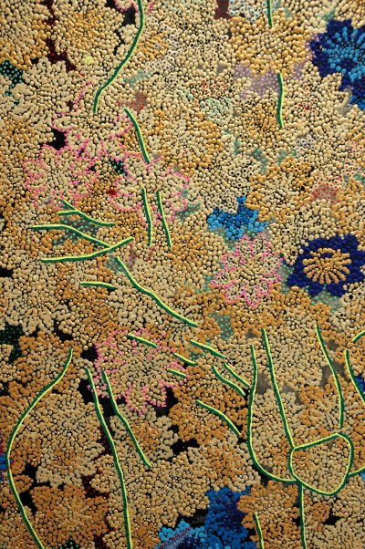
Dona Nelson Untitled 2004 acrylic on canvas 69″ x 80″ [installation view]
[detail]
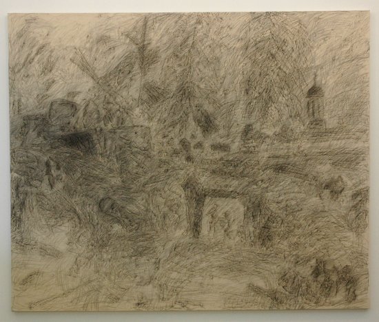
Dona Nelson Walnut Way 1999 charcoal on canvas 88″ x 106″ [installation view]
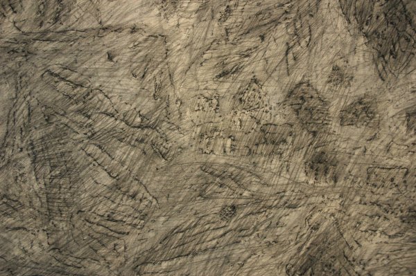
[detail]
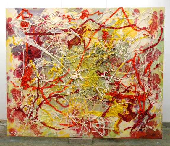
Dona Nelson Gaucho Groucho 2005 acrylic and cheesecloth on canvas 88″ x 106″ [installation view]
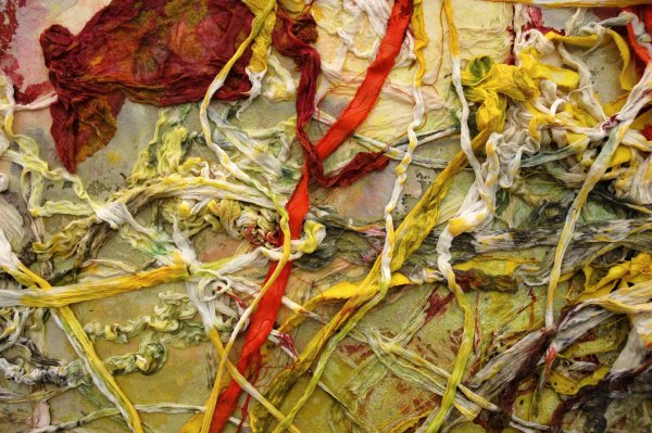
[detail]
I think it’s a great show. I went into Thomas Erben’s gallery this afternoon pretty much ignorant of the work of Dona Nelson, although I knew enough to realize that was a lamentable admission. Nearly an hour later I left her brilliant installation, “Brain Stain“, very impressed, also thoroughly charmed, and wanting to know more.
The work could speak for itself in any environment, but I have to say something for the installation: It manages a huge success of its own, balancing the paintings in the way normally only a good museum show can, while accomodating the fortunate visitor’s access to both sides of two of her extraordinary double-sided canvases.
Five years ago Roberta Smith wrote in her review of the artist’s solo show at Cheim & Read that “Ms. Nelson is painting up a storm.” The end of her last paragraph, “. . . these works suggest that the dead horse of modernism still has plenty of kick.” could have been written for the current show.
I was told that Nelson was fully responsible for the installation herself, so perhaps I should ask her forgiveness for giving the priority of location here to the untitled red (very red) painting hanging in the project room behind the main space.
Check the gallery’s press release for more about the artist’s technique and some “performance” notes, but if you are in the New York area and you find what you see here the least bit seductive you really should visit 26th Street in person.
unidentified object appears inside Kantor/Feuer window
UPDATE: The artist who created the object has finally been identified on a label attached to the window (see the credit immediately below the image here), and it seems that the window is now the responsibility of something called Art Production Fund. Some geometric abstractionist cognescenti (I confess: not including me) will immediately notice that the title of Anthony’s piece has a history.
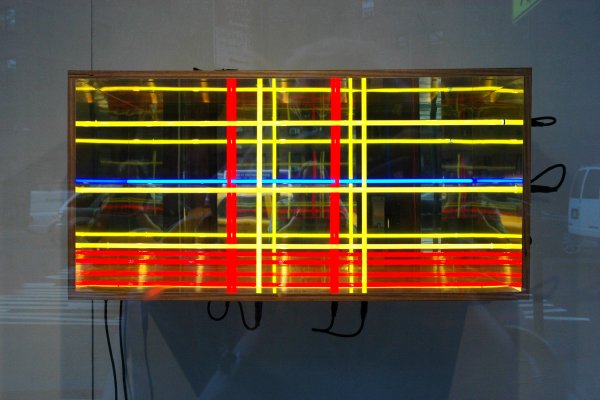
Anthony James New York City II 2004 [installation view]
I like it, but I have no idea who did it. This piece has been installed inside the Kantor/Feuer Window on 10th Avenue since Tuesday at least, but there’s no label and the website hasn’t been kept updated.
The box, punctured in a number of places for the passage of a number of colorful neon tubes, is constructed of a better grade of plywood and lined with a reflective material, perhaps mylar.
an on-line review for our real-space show
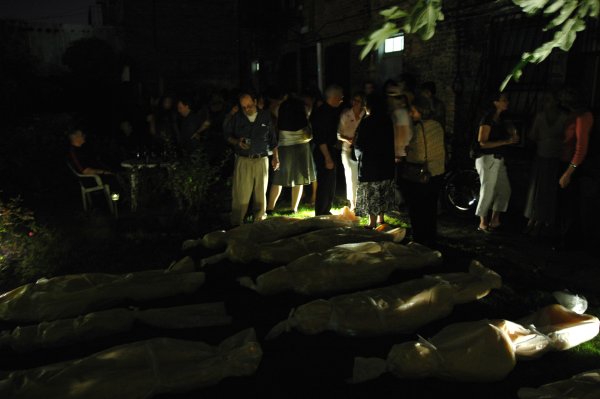
later the visitors did actually “step over the body bags” to reach the backyard bar
See Barry for the word on Susan Dessel’s first review. The writer seems to have gotten it just right, and this account of a Williamsburg show appears in the middle of a recap of Chelsea openings last week. Goodness.
the antidote to 9/11 24/7
I wasn’t going to say anything more today about the fifth installment of our annual orgy of mourning and revenge, the anniversary of September 11. But things just got out of hand once we walked into Pierogi this evening and now I can’t help myself.
For some this sacred holiday was all about a service held around a small temporary wading pool installed downtown at the bottom of a very big hole (by now the flower-filled tank of water has probably been drained and its parts tossed into some recycling bin), but some of us decided we had to be around other, more thoughtful New Yorkers on the evening of the day which just won’t shut up, the drubbing from which most of our countrymen seem to have learned all the wrong lessons.
Barry and I decided to go to Brooklyn, and specifically Williamsburg, always a reasonable choice in stressful times.
Tonight Pierogi Williamsburg threw an opening party for “Matt Marello and Matt Freedman, Five Years After” and it would have been a smash even without the presence of most of Brooklyn and Downtown Manhattan’s art world working aristocracy and creative yeomanry. Matt Marello was in Gallery 1. From the press release:
Matt Marello’s “1968/2001” is an extensive multimedia presentation based on the phenomenon of apophenia [the experience of seeing patterns or connections in random or meaningless data, according to the press release]. A few years ago, while digesting the events of 9/11, Marello began to notice an odd synchronicity between the destruction of the World Trade Center and Stanley Kubrick’s sci-fi epic, “2001: A Space Odyssey.” His further explorations led him into a strange and murky world, linking together such diverse elements as the moon, apes, 9/11, “2001: A Space Odyssey” and the historically pivotal years 1968 and 2001.
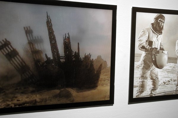
Matt Morello Lenticulars: Ground Zero/Planet of the Apes/Apollo 8 Astronauts/Escape from the Planet of the Apes 2006
2 Lenticular prints 20″ x 63″ [large detail of installation]
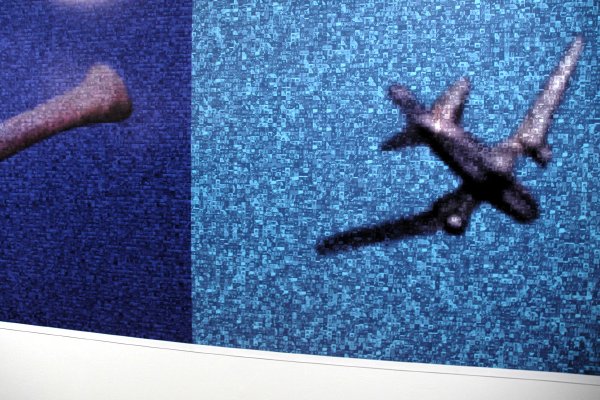
Matt Morello Bone (WTC)/Plane (2001: Space Odyssey) 2006 large format ink-jet print 60″ x 158″ [large detail of installation]
Matt Freedman’s “Twin Twin II” in Gallery 2 was a wonderfully silly and welcome magical antidote to the baneful effects of our self-inflicted twenty-first century affliction: 9/11 24/7. From the artist:
I kept coming around to the notion that the images of the towers were sort of recurring waking dreams, and that collecting them should be a continuing process of perception and manipulation. What I keep looking for in all the material I am using is something uncanny–either in the found objects themselves, or in the nature of the interventions I make–that leaves a lingering sense of unresolved discomfort in the mind of the viewer. The overriding and consciously dumb idea behind the work is that whatever else the towers are, they are definitely not gone from our lives, and they never will be. (Freedman, 2006)
Thumbnails of only a very few of the twinned objects seen tonight in Freedman’s ongoing project:


Presto! Exorcism complete.
Alejandro Diaz on approaching art
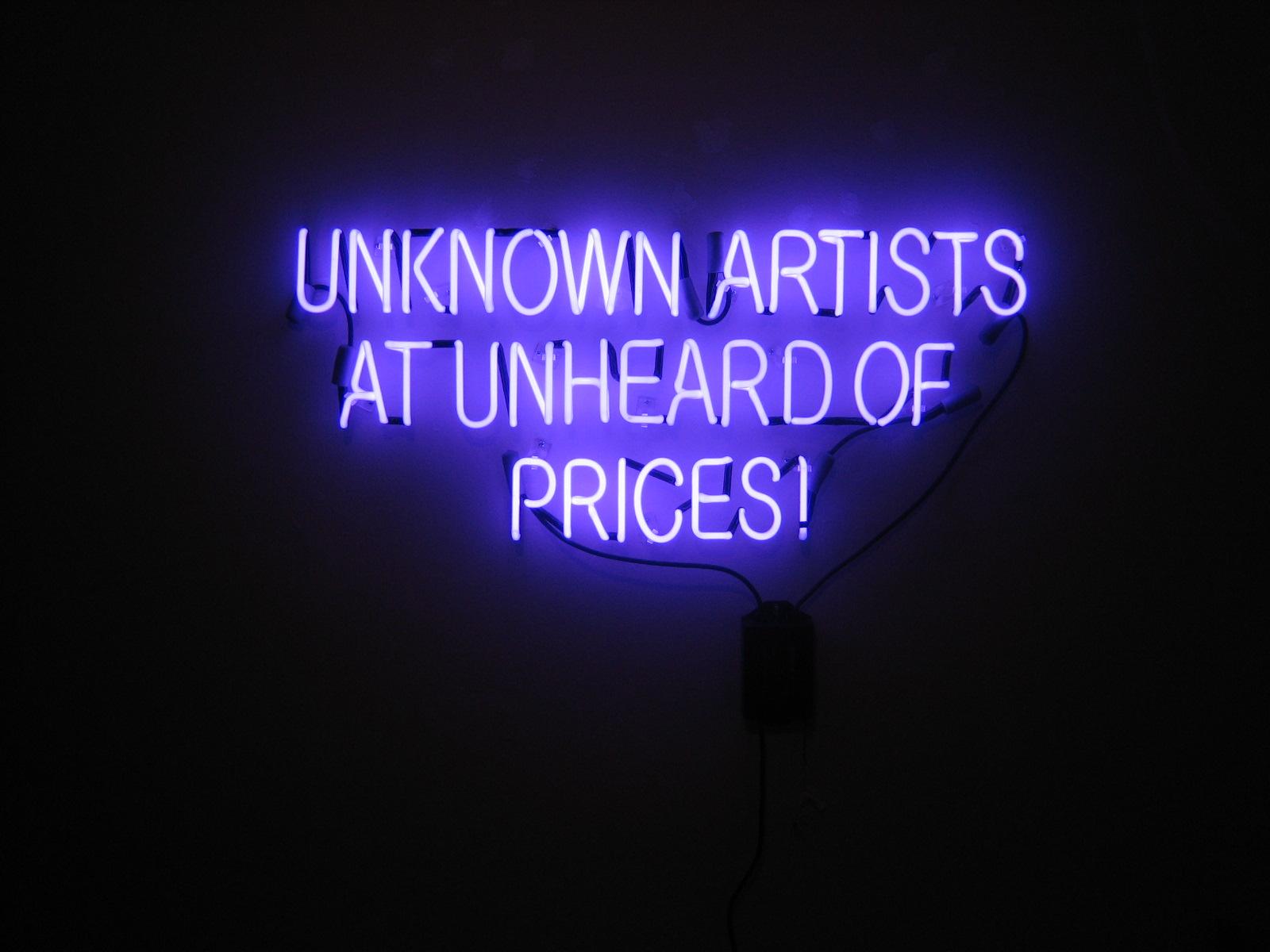
Alejandro Diaz Unknown Artists at Unheard of Prices 2006 purple neon sign 24″ x 36″ [installation view]
I’m drooling.
Alejandro Diaz attached this [sad/happy?] image to an email greeting this morning and I couldn’t resist broadcasting it further. It also gives me a device for reminding myself and anyone reading this that the message of this piece is still valid, and in a new age of hype and price inflation it’s more exciting than ever.
There’s plenty of “affordable”, cheap or even free art by “emerging”, underknown or even secret artists still out there waiting to be discovered and picked up by intrepid patrons and impecunious collectors. I don’t know the price of this one, but it’s an edition, so at least the cool message could potentially keep several people warm.
More on this subject, including “less than the price of a movie ticket”, here and throughout the archives of this site.
More on Diaz here, here and here.
[image from the artist]
the terrorists have won, without lobbing another shot
I suggest we haven’t had another terrorist attack within our borders in these five years precisely because it hasn’t been necessary.
Bush has managed to exactly fulfill the objectives of the last one. To begin with, it’s now official: He’s murdered more Americans in Iraq alone than the terrorists murdered in the destruction of the World Trade Center (and not all of those were American citizens).
This administration has also destroyed America’s ability to do anything but think about, or rather pretend to think about, the threat of another strike, and it has succeeded in destroying whatever sympathy or support the world had extended to a wounded nation immediately after September 11, 2001.
Even absent this regime’s record of abysmal incompetence, ordinary and extraordinary domestic imperatives which demand political attention have been forgotten or deliberately ignored largely because of our fear of terrorism and the manipulation of those fears. The same factors have caused us to casually abandon most of the fundamental liberties which were once our boast and the envy of much of the world.
Because we are tied down in a totally misconceived and disastrous adventure in the Middle East the world’s only remaining “superpower” is virtually helpless to impact events elsewhere, especially since we have also managed to isolate ourselves diplomatically.
Finally, because our domestic political process has been so corrupted by fear, simple timidity, opportunism, greed and cynicism we are arguably in an economic decline from which we may not recover even if we somehow manage to shift political personnel between now and 2008. We are intellectually and morally bankrupt.
Only because the worst may be yet to come, I won’t say the terrorist victory is already complete. But I’ll wager they’ve been smiling for five years.
Chie Fueki at Mary Boone
Chie Fuyeki The Nature of How We See 2005 acrylic, mixed media, paper/wood 96″ x 72″ [installation view]
[detail]
I’m not sure when I last walked into Mary Boone on 24th Street, (these days much of my decision-making about worthy gallery stops has to resemble the ordinary dilemmas confronting emergency workers in administering triage), but I have to admit I was happy about our visit yesterday. Chie Fueki’s paintings, in a show titled “Lucky, Star, Super, Hero“, manage to be both scary and cheery at the same time, while broadcasting the kind of rich textured detail usually seen only inside the glass case of a renaisance treasury.
I have to admit that the subjects she chooses were responsible for at least some of my interest.
Remember the Bill Maynes!
Chie Fueki Toward and Away 2005 acrylic, mixed media, paper/wood 86″ x 60″ [installation view]
Susan Dessel in “OUR BACKYARD”
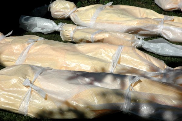
[detail of “OUR BACKYARD: A Cautionary Tale” as it was being installed yesterday]
“They’re wrapped in the material used to make sandbags. The sandbags always arrive when it’s too late, don’t they?” Susan C. Dessel was answering a friend’s question about the outer layer of each of the pieces in her installation at Dam, Stuhltrager while she arranged the twelve differently-sized figures on the newly-sodded lawn behind the gallery building.
She bent over each wrapped figure, softly talking to the silent shapes and tenderly placing and positioning them (as family units?) according to a plan she had obviously been thinking about for a very long time.
Dessel had been with all of them from their birth. They were born in her creative mind and then throughout a very hot summer in her warm studio she had spent long hours shaping fully-formed individual bodies from the synthetic “clay” of the modern sculptor’s bucket. In the end, like the countless victims of the hideous unnatural disasters they call up from our conscious or unconscious, individual or collective guilt, they were wrapped in blankets, sealed in plastic and laid back in our yard.
There the beauty of these veiled figures partially confounds the horror of their significance.
How does an artist work in the environment we have created? Dessel’s sensitive installation invokes no specific wars; no specific catastrophes, whether the result of criminal negligence or deliberate policy; and no specific crusades embarked upon by an ignorant, manipulated and frightened populace, but it is clear these bodies do not represent natural deaths and that they have to be seen as our friends, neighbors and relations. Their presence here, in this very ordinary, even universal “backyard”, speaks to the continuing personal responsibilty we share for their deaths. Even an artist cannot make them disappear, but a humble moral and bold political awakening now would mean that the dead could be given a proper burial, and it would shut down the slaughterhouses which threaten the living.
In reply to an email request I made earlier today, Susan responded within minutes with this wonderful description of her construction proces:
For the adults I began with the basic, but generic, form of female and male using mannequins as my models (three female, one male). The kids were made totally from freehand and for them I used cement and fiber glass bits.
I thought of each body as a representative individual, i.e., I did not give them names – I always bond with my pieces. The process is very important to me, and over the time that the whole piece takes from idea to research to selection of materials to actually making the work the work becomes a part of me. I think that most artists experience something similar.
I thought of each as a body type representing a human condition in a general situation. I made more females than males to represent the fact that it is the innocent (i.e., non-military, or what our government refers to as collateral) that are so often among the dead.
The forms (bodies) are made out of many layers of plaster gauze. (this is gauze already permeated with plaster that you dip into water to activate). I made each figure in two halves and then wrapped the gauze around the halves to create the whole.
I altered the forms after the initial body form was made (i.e., the first two layers or so of the gauze). For instance one woman is pregnant, another is fat, the others have slightly different bust sizes, arm and/or feet form/direction, body language. This is the same with the men, e.g. one of the men is emaciated. The infant, child, and adolescent are more based on size to represent stages in life than a particular body type or situation.
When the bodies were dry (you do recall the environmental challenges during the time I was working. UGH!), I covered each with two coats of marine shellac. This is for exterior use, primarily on boats. In particular I did this because the installation is an outdoor installation and it is sure to precipitate over the course of the exhibit.
This also eased my uncomfortableness with the fact that the plaster layers were basically white (as in caucasian). I wanted these forms to represent humanity not people of a particular background. So while none have dark skin the effect of the shellac was to turn them to shades that were creamy to light brown.
Also, as I do not believe that any of us is perfect (in any way. and how boring that would be, no?) there are lumps and drips and bumps, such as we each have.
The bodies that we see in print and the electronic media are wrapped in blankets and then sometimes in plastic. I selected medical emergency blankets that are used by EMS teams around the country. The color – amber, yellow, or whatever – represents to me caution and that was appropriate for the essence of the piece. Also the blankets are poly with about a 1/16″ layer of foam on the backside. The blankets are wrapped around the whole body and the edges hand sewn into place.
I decided to use sand bag tarps for the outer layer, because of the elements over the duration of the exhibit and because it is fitting for dead bodies that are to remain unidentified and in the public eye.
Sand bags are usually used when a disaster has already started (to shore up the banks of a body of water, etc.) and often do not work to prevent a disaster. Thus it felt like a good fit. These were also hand sewn to close the openings and tied (self ties, i.e., also sand bag tarp material) in the fashion that dead bodies are tied. The size of the three non-adults is emphasized by the outer wrapping that hangs below (the feet) and above (the head) of the actual body form.
For a dignity which is very important and often not heeded, the outer covering is an attempt to protect the body when it is no longer able to protect itself, or even try to.