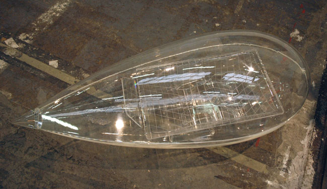
Carsten Höller Kabine 2003-2007 acrylic glass 54″ x 18″ x 21″ [installation view]
Casey Kaplan had this seductive piece by Carsten Höller lying on the floor outside the gallery’s Armory booth, just waiting for this blogger nut, with his obsession about minimalist transportation designs, to pass by and scoop it up – metaphorically, of course. I love this piece, but I probably cannot account for my passion in art terms alone.
For those who can’t quite make it out in this picture, inside the teardrop-shaped capsule there is the suggestion of a perfectly-reclined seat awaiting its lone time-and-space passenger/operator.
Author: jameswagner
Kevin Zucker at Greenberg Van Doren (Armory)
This austerely-handsome, if baffling, piece by Kevin Zucker was in the Greenberg Van Doren booth at the Armory. Unfortunately I passed without getting any details, but its a medium-sized painting of, I’m surmising here, acrylic (and transfers?) on canvas.
Rebecca Morris at Barbara Weiss (Armory)
Rebecca Morris Untitled (#03-07) 2007 17.25″ x 14″ [installation view]
Berlin’s Galerie Barbara Weiss showed this small exquisite Rebecca Morris painting in their booth at the Armory.
There are more images of Morris’s work on the Berlin gallery site and on Google, but while looking (unsuccessfully) for the artist’s own website, I realized where I had last seen her work. Go to the “Abstract” link in this entry for images of her work in a Mitchell-Innes & Nash show of just a few months ago.
Hany Armanious at Foxy Production (Armory)
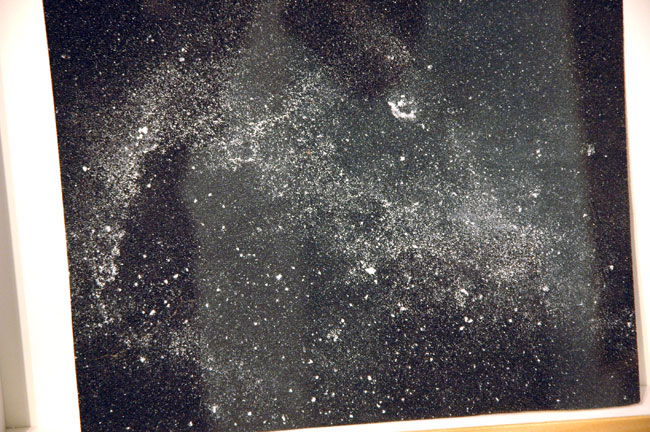
Hany Armanious Wall Rubbing #1 2007 clogged sandpaper 8.5″ x 10.5″ (12″ x 16″ framed) [large detail of installation]
Foxy Production showed several small, ethereal drawings by Hany Armanious in their booth at the Armory [large detail of one shown here]. The artist alters simple pieces of black sandpaper (emery paper?) by carefully orchestrating their contact with white wall surfaces. The result resembles a photographic image of a distant galaxy, but with an anomalous textural life inhabiting its surface. Each piece rests near the plexi on the bottom of a deep fillet inside its frame, and then leans back on the mat; they are as much sculptural objects as drawings.
Armanious is currently in a small group show at the gallery, titled “Surface Wave”. It opened February 25, but I haven’t yet seen what looks like very interesting work from artists new even to this gallery of new artists.
Butt Johnson at CRG (Armory)
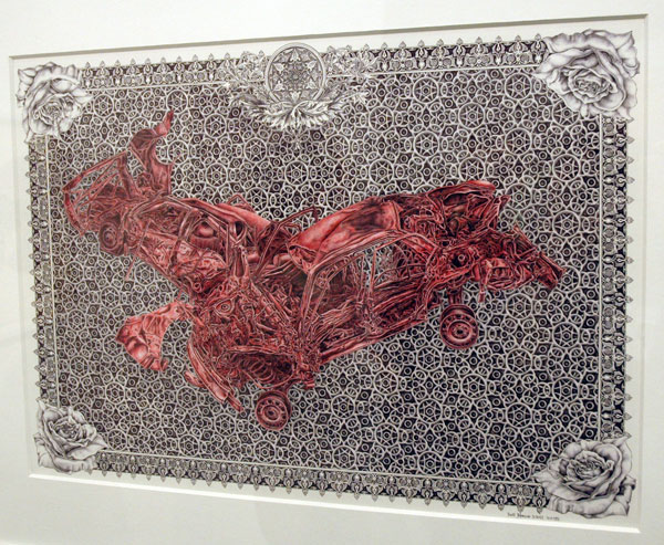
Butt Johnson Qualb tenah Maksour 2006-2007 ballpoint pen on paper 16.5″ x 23″ [installation view]
Butt Johnson Another Study for Scientific Creationism 2006 ink on paper 11.75″ x 8.5″ [installation view]
CRG displayed stunning booths at both ADAA and Armory. At the latter, a powerful group of incredibly delicate drawings by Butt Johnson were among the highlights of the entire fair for me.
Even without the problem of reflections on the plexi, this work is difficult to show in reproduction but I’m going to risk uploading one more image. The picture below is a rough approximation of the artist’s exquisite foil piece, in an edition just completed. If you’re looking at the real work it has more of the presence of an enameled miniature than a stamped print:
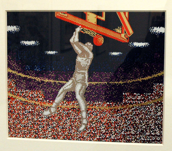
Butt Johnson Slam Dunk ’87 2007 7-color hotstamp foil and 3-color enamel screenprint on 4-ply museum board 15.5″ x 18″ [installation view]
Jimmy Robert at Diana Stigter (Armory)

Jimmy Robert Untitled 2006 archival print 35.5″ x 27.5″ [installation view]
The Amsterdam gallery Diana Stigter was back at the Armory this year with more work by Jimmy Robert. I found myself attracted to this and another print the gallery was showing before I realized they were by the same artist I wrote about one year ago.
Tal R at Zach Feuer (Armory)
Continuing with entries showing images I’ve retained from the late February art fairs, at least until I run out of breath or get distracted elsewhere, this is a beautiful painting shown by Zach Feuer at The Armory Show. The work is by Tal R, an artist who refuses to be defined by any one style, or in fact by any number of styles.
jimlog subscriptions

stay connected
This blog will be five years old next month, having evolved from a series of emails I had started sending to friends six months earlier, almost immediately after September 11. Some of those folks asked me early on to continue letting them know whenever I did a new post.
In response to this modest demand I continued to maintain a dedicated email address group for the purpose, naming it “jimlog”, and It’s grown a bit since I started it, necessitating several re-configurations. At the end of every day on which I’ve done an entry I’ve manually assembled specific links to every separate item (anywhere from one to seven posts a day), generally giving each a new, fanciful or abstruse title to relieve the routine, and then clicked “send”. At least I didn’t have to burden a postman.
Until now. Jimlog is being modernized. My wonderful webmaster Barry has recently set up an automated system which will send an email to reader/viewers on any day I’ve logged one or more new entries. That one piece of electronic mail will include each separate post done that day, and each will appear instantly and exactly as it does on the site – in full color! The mailing will be sent at the end of the evening, New York time.
My old, manually-produced email list will be discontinued in a couple of weeks; if you are getting emails now and wish to continue getting notices of new posts, or if you wish to get notices for the first time, you will have to subscribe using the new system. The process is very simple:
Go to the sign-up box on the top left, enter your email address, click “subscribe”, then verify your intention by typing the code you will see displayed.
Don’t forget to look for the confirmation email, as you will have to respond to it in order to activate the subscription (note: the automated confirmation email may get diverted to your spam folder, depending on the nature of your email security system).
[image from Minnesota Historical Society]
the pink cupcake comes down this month

going soon from your neighborhood
The giant, spinning, flood-lit pink cupcake perched above the curb on the top of an advertising canopy on West 23 Street has to be removed within 30 days. The city’s Department of Transportation [DOT], which has the authority in these things as the safety guardian of our streets and sidewalks, has found that the owners’ original permit for a conventional framed canopy expired in 2003 and that the mechanical structure appended to the awning the restaurant had built after 2003, is itself in violation of city statute.
I call it a victory for the public’s common right to the streets. It represents official recognition that there are limits to what a business operating for profit can seize from the people, even if some individual members think a particular encroachment is cute.
I won’t try to suggest that another winner here might be a decent respect for aesthetics, because New York bureaucracies are obviously not to be trusted with that kind of protection. What is to be regarded as seemly, or pretty in a huge city? I’m in love with the lively chaos of big metropolis at least as much as any of my neighbors, but New York is not Las Vegas and today’s corporate Times Square is not a reasonable model for a neighborhood. A great city must enjoy playing with itself, but it must be allowed to reveal its history and its quieter comforts and beauties as much as its essential energy.
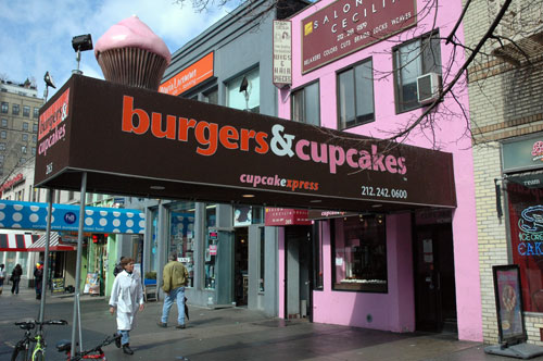
Pepto-Bismol pink
A personal note about Burgers & Cupcakes only partly related to issues of “taste”: Even before the giant cupcake appeared late last fall I had thought the aesthetic choices made by this particular food-operation business were rather unwise, if not totally unbelieveable, for business reasons alone: Pepto-Bismol pink and wet-feces brown would not seem to be the obvious choice for a restaurant’s advertising sign and interior decor.
still curved after seventy years
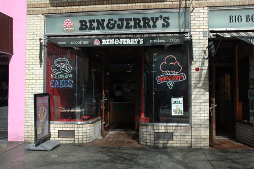
And a note on both the historical and street context of the Pepto-Bismol building: This is one of several two-story “taxpayers” constructed on the site occupied by four early-nineteenth-century brownstones when I moved in next door twenty years ago. The landlord(s) of these once-handsome townhouses (converted eventually into rent-stabilized or rent-controlled apartments, with small stores on the ground floor) had deliberately neglected their upkeep and eventually succeeded in displacing the tenants in anticipation of some speculative boon which apparently never materialized. The buildings were then demolished and the lots left boarded up for a time, until the current structures, thrown together almost overnight with metal sticks, styrofoam and stucco, displaced hundreds of our neighborhood pigeons and untold generations of rats.
Today these jerry-built structures are an exceedingly awkward interruption of the streetscape of the north side of this Chelsea block. On their left is a large and quite handsome art-modern building (still a Woolworth store with a full lunch counter when I moved to the street, but currently a GAP branch, with a gym occupying the areas on the second floor which were originally devoted to professional offices). On the right is a large yellow-brick 1936 art deco apartment house (with eight very neat restored small storefronts on the street level. One of them is occupied by a Ben & Jerry’s boasting the original curved glass windows and period metal moldings which can’t be duplicated today. There is a restored fully-retractable awning mechanism in a pocket above the windows, and below them there are two reconstructed grilled openings ingeniously devised for ventilating the basement storage area).
This kind of love, intelligent attention, labor and sacrifice devoted here to enhancing the ambience of a cherished neighborhood in a city of eight or nine million people is of an entirely different order from the ignorance and indifference which produced the rotating pink cupcake and the several poor sheds of which it is such a part.
[thanks to Blog Chelsea for helping to keep the pink cupcake issue alive, and to Melanie La Rocca of Chris Quinn’s office for doggedly pursuing the DOT about the status of my complaint]
Coralie Huon at Yukiko Kawase (DIVA)

Coralie Huon Dunes Océanes 2006 video [still]
Several entries back I wrote something about noticing a “theme of homes and homelessness” during a visit to Yukiko Kawase at DIVA. The idea of home in the broader sense seemed then to be everywhere, but looking back now, I realize I was probably thinking mostly about the installations in the gallery’s hotel suite bedroom space.
The French artist Coralie Huon showed a video of computer-generated images describing a utopian project for an elegant futuristic self-sustained floating community. I’m an architecture nut, especially when it comes to homes of any kind, but I wasn’t very interested in this part of the room. It probably had nothing to do with it, but for someone who was entertained as a child by the fantasy covers of Popular Mechanics it all felt a bit retro (although thinking about it now, that may have been intentional). Huon probably survives day to day with her work as an interior architect, but even in her professional practice her imagination seems to be a bit more conceptual than is customary for the trade; does anyone expect her floating commune to be built?
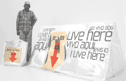
Coralie Huon Camping Urbain 2005 mixed media
“Camping Urbain”, her second installation at DIVA shares a concern for satisfying social needs responsibly and with a fundamental concept of utility but here her design skills were only her tools; the work ends up on an entirely different plane, the product of a more purely artistic imagination.
The more obvious distinction is that here she chose to address the requirements of a very different, and already existing, “lifestyle” than that which would be sheltered by her maritime utopia. As potential design clients, the homeless of Paris and other cities of the world are considerably less hypothetical than the future-sleek residents of her “Dunes Océanes”. I don’t expect to be in the market for either kind of home in the foreseeable future, but it was the tiny, minimal house kit installation, and the unsettling message of the tape boundaries secured on the carpet, all of which were contained within the walls of a bedroom of this warm, dry and seriously-bourgeois hotel suite that really captured my imagination [unfortunately it was too far dark and crowded to capture an image with my camera].
The visitor can read about this innovative extreme mobility house in a press release whose tongue-in-cheek style is not unlike the mock language of marketing also used to “sell” her companion project for a floating community:
It is ingenious, stylish and compact. It can be taken away anywhere thanks to its carry-on bag matching. In a short moment of minutes, it unfolds and folds back again. It is mobile, but at the same time, it is [an approximately 20 sf] pod for the homeless, my house, and my own place.
In her 3 minutes video, she explains on up-beat rock music:
1. Definition of target: For whom?
2. Specifications and operations: How does it work?
3. Message: How does this communicate?
4. Demonstration: How one can live with it?
Design for the homeless? This apparently non-sense idea would be a starter of discussions on the homeless issue. Here, the design can be recognized as a powerful tool. A tool to make this social issue visible, a tool to identify the homeless as a human being with dignity.
It is a multi-dimensional project complete with sound, visual, and a three-dimensional prototype. Audience will be participating and experiencing life condition of the homeless. Make them aware of the uncertainty of the existence.
Camping Urbain, playful and disturbing: not so fun, but not to be dramatized either.
Ms. Kawase, the gallery owner, told us that the artist had been surprised (amused, dismayed?) to find that visitors to the gallery’s exhibition in New York showed little interest in “Camping Urbain” but were much taken by “Dunes Océanes”. This was reportedly the opposite of her experience in Paris, where people are apparently truly disturbed by the increasing visibility of the homeless on the streets.
And why am I so interested in this anecdote? I doubt it’s because I believe that Parisians are fundamentally more compassionate (empathetic?) than New Yorkers, and I don’t think I want to believe they are. Or, if I do want to believe we’re lacking something here, is it because I want to do something to help in a city where I think I could, or because I want to complain in a city where I think I have a right to complain?
Repeating the question of construction probability, does anyone expect her pods will be built, or will we come up with a better, more practical, an achieveable “utopian” solution for bringing the homeless home?
[images from Yukiko Kawase]