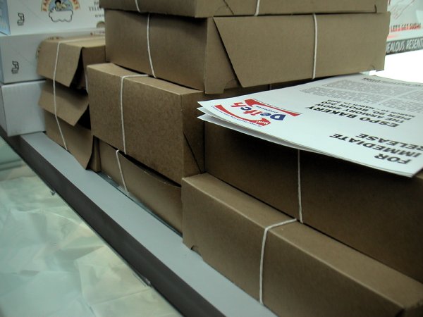
Steve Powers ESPO BAKERY detail of installation
“graffiti that looks like advertising since the early 90s”
Steve Powers (ESPO) will almost certainly be a delectable hit on Pier 90 this weekend, especially since the food court is at the other end of the Pier. At the press preview yesterday he was still setting up his store/installation, “ESPO BAKERY,” but beginning today this Deitch Projects booth will be selling ESPO-designed cookies and cakes. “The baked goods can be collected as art multiples or enjoyed on the spot,” according to the press release.
[the headline quote is from the gallery site description of the work of Powers]
Category: Culture
Dave Muller at Armory
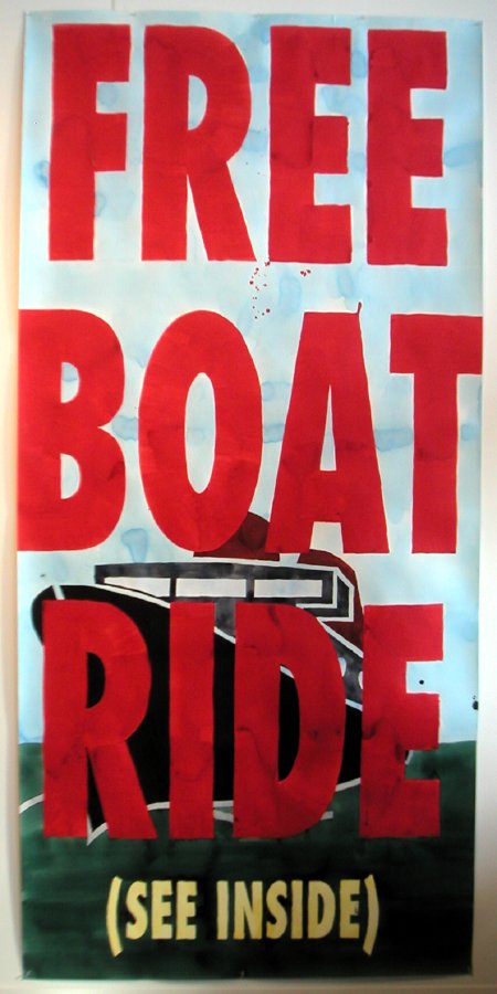
Dave Muller Looks Good from a Distance
And who doesn’t want a boat ride? This wonderful large piece [gouache? and maybe eight feet tall?] by Dave Muller was installed on the side of Murray Guy‘s booth, adjacent to the large windows overlooking the walk and cartway of the pier [see the image in the post below].
the Armory Show, Pier 90
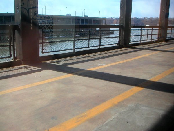
yesterday, the Hudson River from this year’s more opened-up exhibition spaces
The abstraction reflected in the glass is Dona Nelson‘s The Deep (1997) exhibited at Cheim & Read.
Ian Kiaer at Armory
 Paul Scheerart project/palm house 2005 mixed media installation dimensions variable [large detail of installation]
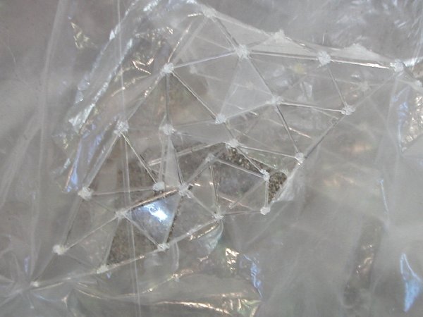
Scheerart project detail
Scheerart project detail
I know I can’t be his only acolyte, but I must be among the newest. I did feel I was all alone in my excitement in the booth of London’s Alison Jacques Gallery while trying to get a decent image of Ian Kiaer’s really sublime sculptural assembly. The work includes the five separate parts seen in the photograph (the small rectangle on the upper right is the gallery’s label). I imagined no one else had ever seen this wonderful thing, and that it would disappear moments after I walked away.
Kiaer is also represented by Tanya Bonakdar Gallery in New York, but I have not yet seen that exhibit at the piers.
UPDATE: I added two [small detail] images of Paul Scheerart project/palm house after a return to the show on Monday.
Bruce Conner at Armory
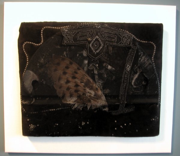
Bruce Conner Untitled 1960 mixed media, pearls, nylon, mesh, wire, etc. 20″ x 24.5″ x 2.5″
My first Armory image, and after all I said below, it’s not emerging, not obscure, but this 45-year-old piece took my breath away this afternoon. I saw it at Los Angeles’s Michael Kohn Gallery.
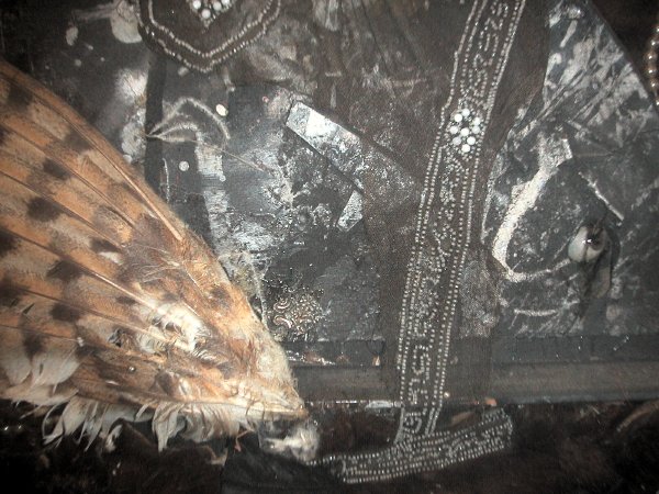
Conner Untitled detail
Armory Show 05
taking a break at the Armory Show press and VIP preview this afternoon
Although we were there for four hours, we managed to make our way through only a little more than a third of the floor area of one of the two piers occupied by this year’s pared-down roster of Armory Show exhibitors this afternoon. Well it hasn’t even opened yet, so can still go back. We were there for the press preview [yes, the White House now isn’t our only institution which gives press passes to bloggers], so much of the first hour was spent on the organizers’ presentation.
We’re pretty tired this evening, but then we never took a lunch break – or a break of any kind – and we didn’t take advantage of most of this year’s welcome innovations: more open space, open views of the Hudson River, the wonder of artist-designed lounge seating, and even mood lighting in the food concession area.
But we did enjoy ourselves a lot, not least because we found less of the big-name, big-ticket art whose pricey presence had seemed to dominate shows in recent years. There was a wealth of new sights and new names even for gallery-going veterans, and those weren’t all in the booths of the foreign galleries. Also, is it my imagination, or does the work in those galleries look less “exotic” here than it used to? And if so, does that mean the New York art world, and that in the U.S. generally, has become less provincial, or is the rest of the world succumbing to our particular tastes?
Biggest news nugget (news at least for me) carried out of the press preview: Glenn Lowry, the Director of the Museum of Modern Art, reminded us that this year MoMA had coordinated the opening date of the next “Greater New York” show mounted by its more edgy farm team, P.S.1, to coincide with the period of the Armory Show, apparently in order to show the parent organization’s appreciation of the new. Then he mentioned casually that this year the huge Queens show would be “presented jointly” by MoMA and P.S.1. Wow. Apparently MoMA’s now got to be in the room when junior invites his wild and crazy friends over to the house.
By the way, the extraordinarily-wealthy beneficiary of the monies raised by tonight’s tony Opening Night Preview Party on the Armory piers is MoMA, and specifically the exhibitions program, not even its new works acquisitions program. In any event, no arts scholarship or arts healthcare foundations need apply. Even the staid old-guard ADAA Art Show can think outside of its own institutional box when it comes to benefits.
That’s enough at least for now about the venue and the arrangements. In the next few days I expect to post a number of images with brief descriptions, but one caution starting out: As usual on this blog site, the images will not necessarily represent the things I liked most. Rather they will be the best photographs I was able to get of those works seen which interested me most. And, also following precedent, preference will usually be given to the more obscure works, the least-known artists.
See Barry tonight, and watch both of our sites over the next few days at least, for more images and comments about the various art fairs dotting New York this week.
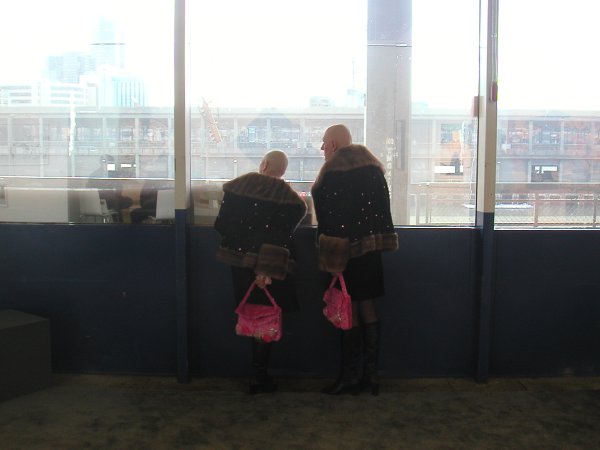
Oh yes, would somebody help me remember: Who are these two wonderful performance artists in the picture at the top of this post?
UPDATE: In his comment below Martin is kind enough to answer my question: The artists are Eva and Adele.
“Exploding Plastic Inevitable” at Bergdorf’s
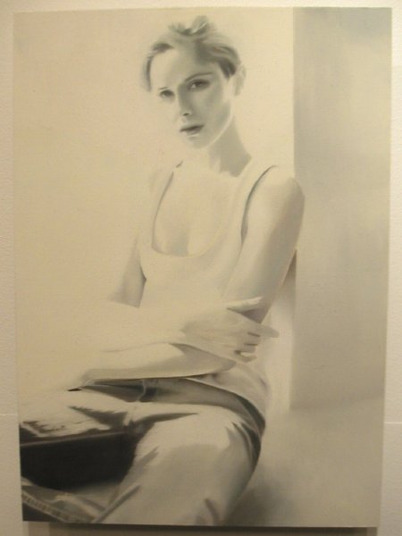
Christoph Schmidberger Yours Till the End of Time 2004
The stylish and merry crowd which braved a nor’easter to get to the opening tonight made any serious judgments, not to say almost any chance for decent photos, almost impossible, but there was more than enough opportunity to see that a return visit, or first pilgrimage, to Bergdorf Goodman before March 29th (when everything comes down) should be in order.
Fifty emerging artists represented by dozens of emerging galleries from around the country have found their way onto the designer floor walls of the Men’s Store, through the good graces of the upscale clothing emporium itself, Giorgio Armani, the New Art Dealers Alliance (NADA) and the persuasive offices of Simon Watson’s Scenic.
I loved the quirkiness of Bill Adams‘s one-eyed kitten, courtesy of KS Art. Although I just couldn’t get a clear photo, for a number of reasons, here it is anyway to haunt us all:
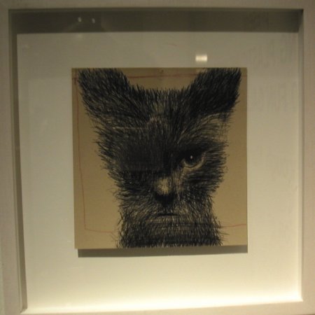
Bill Adams One Eye 2004
I had the same crowd and lighting problems with most of the other pieces, and a glass of wine in one hand was no small handicap. But without taking away anything from the other exhibitors I’ll say that I thought the works in the display areas given to ATM Gallery, Foxy Production and Goff + Rosenthal (which represents Schmidberger, repsonsible for the drawing at the top) were especially impressive.
On our way home we looked at the store’s 5th Avenue windows, where we stood in the 14 degree cold warmed by a wonderful Adam Cvijanovic mural featuring salvaged Vegas electrical signs strewn about a dry warm desert. Cvijanovic is shown by Bellwether gallery. On the other side of the entrance were several fine colorful Tyson Reeder works, which easily upstaged the clothes with which they shared the spotlight. Daniel Reich regularly shows Reeder in his more conventional space on 23rd Street (although it’s still hard to associate the word “conventional” with Daniel Reich).
While it is certainly arguable whether this is a good way to show art, few of us would have a problem with the proposition that anyone who shops Bergdorf’s and spends hundreds of dollars on one shirt should be told (reminded?) that some really good art can be carried home for about the same investment – and it will never wear out.
Allan Pettersson and Sergiu Comissiona
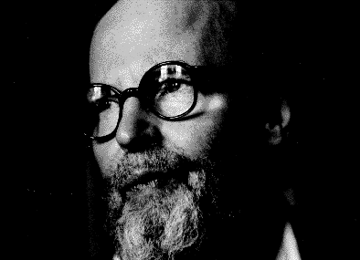
Allan Pettersson
It begins in the middle, the sounds suggesting that you have been there listening all along. In a way, you have, since the symphony is Allan Pettersson‘s Eighth (1969), and it is only one section of a very long song. The symphony closes with the orchestra slowly dipping back into the dark pool from which it had emerged some fifty minutes earlier.
This 20th-century Swedish composer (1911-1980) completed fifteen symphonies and together they feel very much like a single, endless piece, the powerful introspective work of an entire lifetime. His song is one of great sadness, although it may also contain the faintest suggestion of hope, even if that hope may only be for the extension of a life of pain, or the rebirth of life – anticipated as one of pain as well.
“Jag är ingen tonsättare, jag är en ropande röst (något som ej får glömmas), som hotar att dränkas i tidsbullret.”
“I am not a composer. I am a voice crying out, (something that should not be forgotten) that threatens to drown in the noise of the times.”
In the early 20th century Sweden had not yet become the extraordinarily successful society it is today. Large numbers of Swedes were still leaving the country as emigrants. Pettersson’s childhood reflected the distress of that society and his own immediate family, and its physical scars left him in pain for the rest of his life. He died in his late 60’s after having been housebound for ten years.
The music is profoundly disturbing, but achingly beautiful, and it owes little to the fashions of its century. At the time of the composer’s death I had barely begun to assemble my collection of his music. I concentrated on each of the symphonies (the epic form which almost-completely dominated his output) and in the end I managed to find all except the uncompleted First and Seventeenth. But while the record of the music survives, on my own LP and CD shelves, and surely on those of other admirers, I never hear of a public performance today. Has Pettersson become just too dark for our own new dark age?
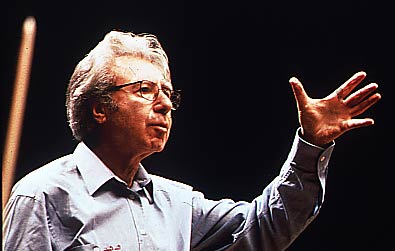
Sergiu Comissiona
My romance with the post-classical symphony form began in the 60’s with Mahler, moved through Bruckner, Nielsen and Sibelius to Shostakovich, whose death in 1975 seemed to close the door to this extravagant world. But in Boston in 1980 I spotted a beautiful Deutsche Grammophon LP with a color photograph of a kindly-faced bearded man in profile on a rich apple-green ground. In those years the LP art certainly did sell music! But that’s properly another story. Inside this particular sleeve was a recording of Petterson’s Eighth Symphony by the Baltimore Symphony conducted by Sergiu Comissiona, then its music director.
I immediately fell in love with the composer’s music. I did not hear of his death later in that year until much later. The performance on that recording is magnificent, and on its evidence alone I based my admiration for the conductor. Sergiu Comissiona died in his hotel room in Oklahoma City last Saturday, only hours before he was to perform as guest conductor of the Oklahoma Philharmonic.
Joel Levine, music director of the Oklahoma City Philharmonic and a longtime friend of Comissiona’s, filled in for him Saturday night and led the orchestra through a powerfully emotional performance, said William Cleary, past president of the Oklahoma Philharmonic Society.
“It was like a concert unlike any I have been to, and I’ve been going for 40 years,” Cleary said. “The orchestra got three standing ovations during the first number, and I’ve never seen that before.”
And from this fan, a belated and very humble thank you, Maestro.
[image of Pettersson from Passagen Hemsidor, image of Comissiona from Asian Youth Orchestra, Pettersson quote from Paul Kenneth Cauthen]
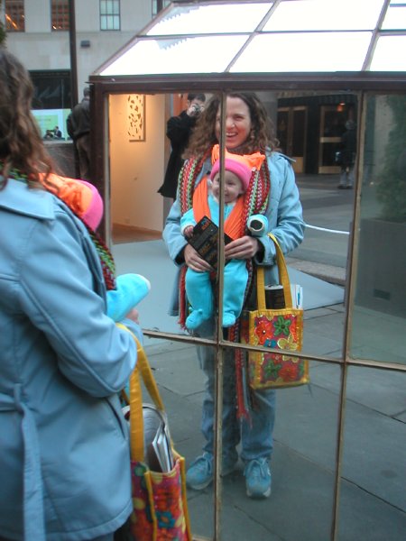
Art Rock opens intense arty week in New York
The sun was out and the temperatures were milder than they’ve been in weeks, so Barry and I had an extra incentive for hurrying to Rockefeller Center this afternoon on the opening day of Art Rock.
This unprecedented mid-town public installation is only the first of at least half a dozen events scheduled in New York this week devoted specifically to showing the work of contemporary and emerging artists, but it’s definitely the most public venue of all. Tourists and office workers alike will find it almost impossible to avoid the art, but judging from the curiosity and delight shown by the very diverse crowd seen today, they aren’t going to be inclined to try.
Art Rock was the inspiration of Elizabeth Burke and Abby Messitte of Clementine Gallery, and while it’s an excellent exhibition it also represents an extraordinarily impressive feat of persuasion and organization.
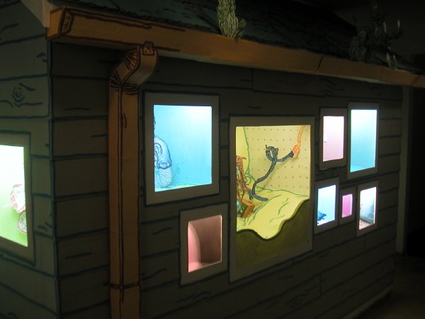
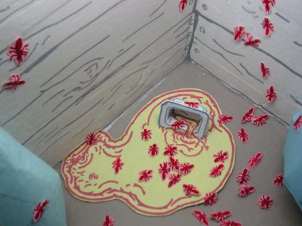
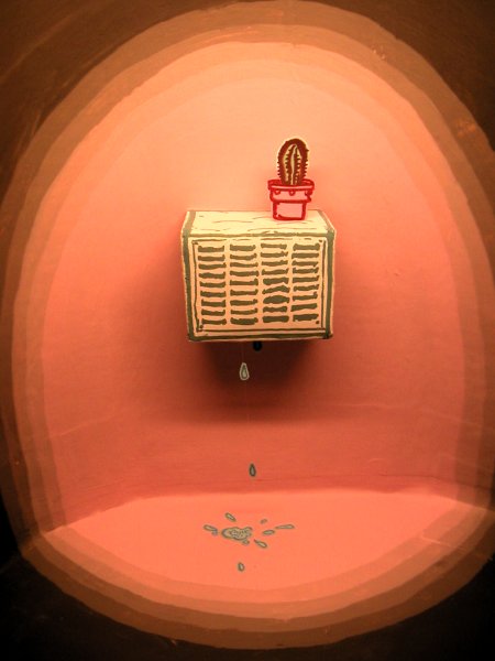
Barry has some great images on his site, and I managed to get a few more, but they still fill in only some of the blanks. In and around the orange-painted [the color only a coincidence – ed.] cargo boxes in front of the RCA (NBC) Building are works by ten artists represented by ten galleries, and there are no disappointments. If some are not included in this post it’s probably because I wasn’t able to bring home a decent image of every installation. The Art Rock link at the top of this post includes links to each gallery, with images of work by almost every artist represented – although they are not usually the pieces to be found west of 5th Avenue this week.
These are just two of the Richard Aldrich paintings hanging in the Oliver Kamm/5BE Gallery container:
P.P.O.W. was represented by Sarah Oppenheimer’s highly-appropriate cardboard container installation:
 Los Angeles’s Mary Goldman Gallery showed Rob Fischer‘s Mirrored House out in the open plaza [Barry poised center rear], where it attracted admirers of all ages:
Clementine welcomed Tayor McKimens’s installion of his hand-drawn paper cut-out, somewhat housekeeping-challenged house and yard inside their own big orange box:
Art Rock will enjoy the hospitality of Rockefeller Plaza, and vice versa, through March 14. Oh yeah, there are two “Gateway Lobbies” (lounge boxes) decorated by Todd Oldham, for those who wish to rest from or contemplate their artfulness.
Stefan Saffer’s gold edge
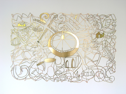
Stefan Saffer Goldkante [Gold Edge – ed.] 2004 marker, golden foil, cardboard, cut-out, shadow on the wall 81″ x 120″ (8 panels)
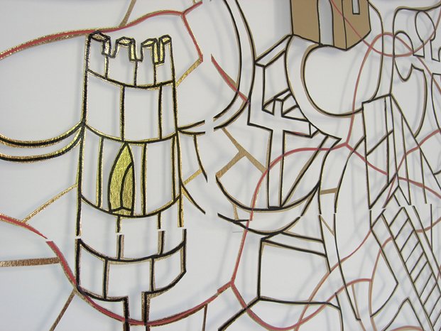
Goldkante detail
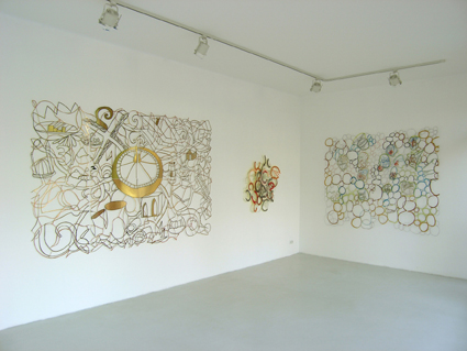
installation view with Goldkante on the left, Bohemia on the right, center piece not identified
We first saw the German artist Stefan Saffer’s work last year at a studio show of the Whitney Independent Study Program (ISP). We really liked it at first sight, and our enthusiasm has built with every exposure since. We almost missed meeting the artist that first afternoon, but someone pointed him out to us as we were leaving and he became instantly unforgettable. Saffer is an articulate, and charming, intelligent and well-educated artist with an extraordinary familiarity with and curiosity about his world. His honest and open face is wonderfully distinctive, but perhaps the more remarkable considering the usual fine scale of his adopted medium he is also impressive for his heroic size (I checked, his hands alone seem to be larger than mine, and I have a span of nearly ten inches).
Saffer creates gorgeous, delicate-appearing paper (usually) cutouts which evoke entire literary (usually) worlds in wonderful graphic almost-narratives which will reveal their secrets to the patient viewer, but only reluctantly. Each of these truly sculptural pieces, whether worked from a sheet of thin cardboard only a few inches in length and resting on pins projecting from a wall or cut from heavy sheet metal and installed in a public square, boldly resists confinement to the two dimensions normally expected of its form. Because of its relationship to the wall or physical space outdoors, Saffer’s work is always three-dimensional – at the very least.
The shadow which gives the paper works such dimension is probably seen to the best advantage in the image of the artist’s Forest below.
Because of the richness of their sources and their materials, and the artist’s creative imagination, these pieces never come close to repeating themselves. Lately Saffer has begun to experiment with using more than one layer of cut material, so it’s clear we’ve only begun to see what he can do. Although his curriculum vitae is very impressive, he looks like he may still be in his twenties.
Saffer’s galleries are müllerdechiara in Berlin and Kate MacGarry in London.
Additional works appear below as thumbnails which can be enlarged by clicking onto the images.
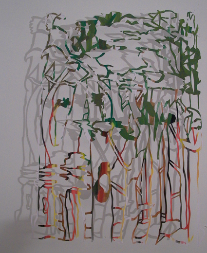
Stefan Saffer Forest 2005 gouache, lead pencil, cardboard, drawing cut-out, shadow on the wall 16″ x 23″

Stefan Saffer Rainer Maria 2004 the poem “the Panther” informs a small cut-out paper cage 10″ x 2″ x 6.25″
Stefan Saffer StagNation 2004 gouache, cardboard, drawing cut-out, shadow on the wall 81″ x 94.5″
Stefan Saffer The Meeting 2004 gouache, color pencil, cloth tape on cardboard, cut-out, shadow on the wall 67″ x 78.75″ (4 panels)
Stefan Saffer Bohemia 2004 color pencil, marker on colored cardboard, cut-out, shadow on the wall 45.25″ x 25.5″
[images from Stefan Saffer]