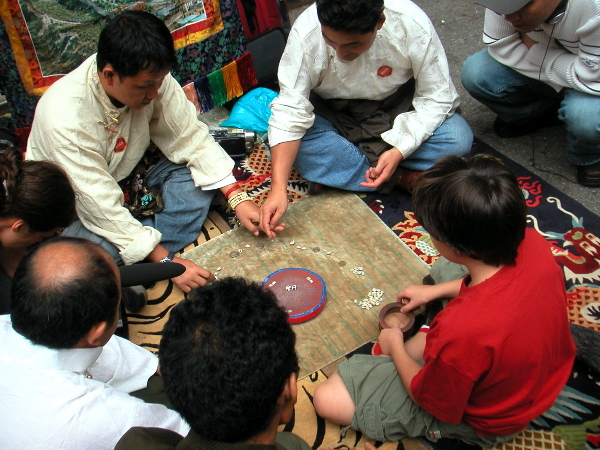
I have almost no idea what we’re looking at here, but it was one of the most interesting things I saw yesterday afternoon while we were at the Himalayan Street Fair. Maybe someone can explain the game; these people seemed to be having a ball.
Seventeenth Street between 6th and &th Avenues was closed for events and installations celebrating the opening of the Rubin Museum of Art.
Late risers, we had apparently arrived just after the Himalayan Dog Pageant. Most of the attractive competitors were still hanging about however, continuing to draw small crowds of admirers. We probably missed all of the most exciting events scheduled for the day. Barry did buy a beautiful green scarf from the good people inside the Bhutan kiosk, and I liked the geographic conceit which set up the portable rock climbing wall for the occasion.
We decided that the line to get into the building itself was too long, deciding to return another day. The trip itself won’t be a challenge, since we’re only six blocks away, but any visit to this museum will certainly demand more than a quick run-through.
[historical note: the building now occupied by the museum was once the site of Barneys, an oddly entertaining temple of chic in the 1980’s and early 90’s; the Pressman family’s creation self-destructed ten years ago and the stores which bear the name today are basically corporate pretenders]
Category: Culture
Allan McCollum
Allan McCollum, installation detail of The Recognizable Image Drawings from The Kansas and Missouri Topographical Model Donation Project
[Kansas counties on the left, Missouri on the right]
I didn’t manage to get to Allan McCollum’s show at Friedrich Petzel until this afternoon, and now it’s gone. But I liked the two installations too much to let a little matter of their deposition stop me from showing this installation photograph and from linking to both the gallery’s pages and his own site for more images and information about this wonderful artist.
At least we have five more months to see his “Three Perfect Vehicles” currently installed at the southeast entrance to Central Park. This time I promise myself I won’t wait until the last day.
Evan Schwartz
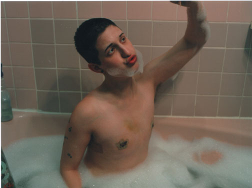
Evan Schwartz tub
I really like it when I come across a subject, any subject, for a second time and it’s arrived from another direction altogether.
It was at least a number of months ago that I had read a story (I believe it appeared in the NYTimes, but I can’t find it now) about a young student who was raising money in very imaginative ways to pay for gender reassignment surgery.
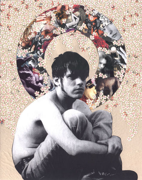
While visiting Williamsburg galleries this past Sunday I spotted a photograph which bowled me over at the time and which remains etched in my mind tonight. The image was a powerful and very beautiful self-portrait by Evan Schwartz, the young woman whose courageous story had impressed me earlier.
Evan is an artist; I don’t remember that part, and maybe it wasn’t even a part of the account I had read, but I’m not going to forget it now.
I saw Schwartz’s image (it’s the one which appears at the top of this post) hanging in the long hall at the Schroeder Romero Gallery and now I know that he will have his own show there in a few months. It opens January 7th. I don’t remember ever before recommending, or even mentioning, a show on this blog months before it had been hung, but this is a good time to start.
There is more work on Schwartz’s own site, including this image, which is from the same series, Reclaiming Puberty, as the one above.
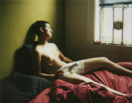
Evan Schwartz post-coital
CORRECTION: The published story I referred to above was not in the Times, but rather in Time Out New York magazine. Unfortunately “TONY” still has no online archive; I guess it thinks of itself as just a weekly billboard (or a shopping and entertainment guide minus the coupons).
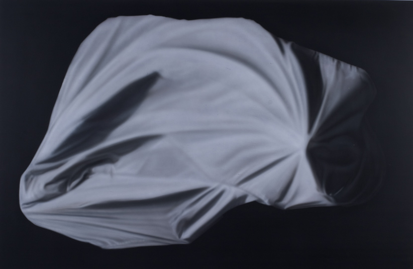
Dan Rushton revisited
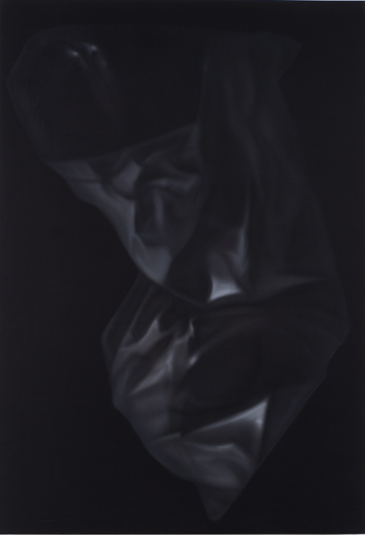
Dan Rushton untitled 10 (2004) 40″ x 30″ gouache on panel
On Sunday, while visiting Dan Rushton‘s studio for the second time this year, Barry and I had been separately thinking that if we could find room for one of his newest large paintings on our walls we’d find a way to get it there. In the end size didn’t seem to matter that much; while it’s not the largest piece we saw that day, three days later I still haven’t figured out how I’m going to clear space for “untitled 10.” But it’s now ours.
These images in an idiosyncratic marriage of realism and abstraction hardly begin to show what has excited us both about Rushton’s work. Only standing in front of the panels themselves can you appreciate the subtle balance of brush and airbrush and the surprising colors which emerge so honestly from the basic monotone of each piece. I also really like the provocative way they tease the eye, drawing the body closer to the surface where the areas which had seemed unfocused because of distance remain unfocused still, and the highlights survive equally uncorrupted.
Dan Rushton untitled 1 (2004) 48″ x 72″ gouache on panel
death comes to the New York Philharmonic
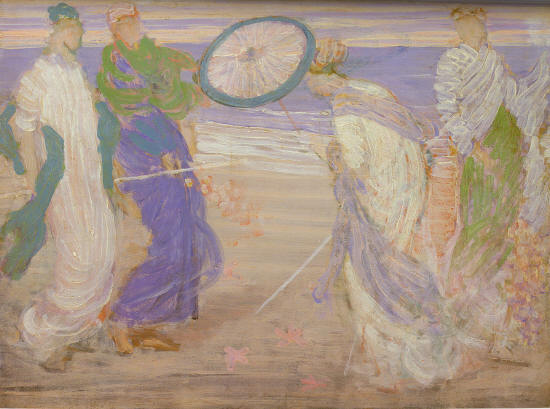
James Abbott McNeill Whistler Symphony in Blue and Pink (ca. 1870)
Disclaimer: I’m posting this even though I didn’t attend either of the two New York Philharmonic performances reviewed by Justin Davidson in today’s Newsday. I should be a natural and enthusiastic patron of an institution which can bring alive an historical musical heritage which means a great deal to me and which continues to inspire exciting composers and performers in our present century. In fact however, for reasons described in Davidson’s critique, I’ve stayed away for a while, and I don’t expect to attend any Philharmonic performances this season.
While the orchestra and I have had a history together, the relationship has been suffering for years and now we may not share any future whatsoever.
I’m showing my frustration now because I’ve just discovered that someone has outdone the sometimes shockingly-outspoken critic from the NYTimes, Anthony Tommasini, in condemning what has become of our hometown orchestra.
Davidson’s review of the orchestra’s first two concert programs of the season includes phrases like, “doing business like it has always been done,” “executing that chestnut,” “arid mannerisms” and “a cannonade of defiant conservatism,” but he finally just has to let it all out:
These comments have a ritualistic quality, I know, but if critics have been making them for decades, it’s because the Philharmonic has consistently refused to embody the innovative, restless and constantly self-inventing spirit of its hometown. This might be a tolerable failing if the artistic leadership made up in traditionalist thrills what it lacks in enterprise. But Maazel is a taxidermist among conductors: In his hands, great pieces become lifelike rather than alive.
Although we know Tommasini has little love for Maazel, the orchestra’s conservative programing and the neanderthals on its Board, in his own review of the opening night concert, compared to his Newsday colleague, he sounds almost like a votary, of both Maazel and the players who reportedly adore their music director. Has he finally been called on the carpet by representatives of an establishment he has offended?
Earlier this year the management team of the New York Philharmonic extended Maazel’s contract until 2009, possibly sealing the fate of what has become little more that a dusty museum maintained for shrinking numbers of a musical Old Guard and the few members of a new monied class who seek annointment with “Culture” (but nothing not already hallowed, you understand).
Obviously the only relationship between the text of this post and the picture at the top is the painting’s title, but it’s beauty is also a palliative in this context. Whistler was once on the edge, but while we can still enjoy his art, here even patrons of the Philharmonic have moved on. Why is it so hard when it comes to the pleasures of Euterpe?
[image, in the collection of the Freer Gallery, from Simon Fraser University]
“I’ve Met Someone Else”
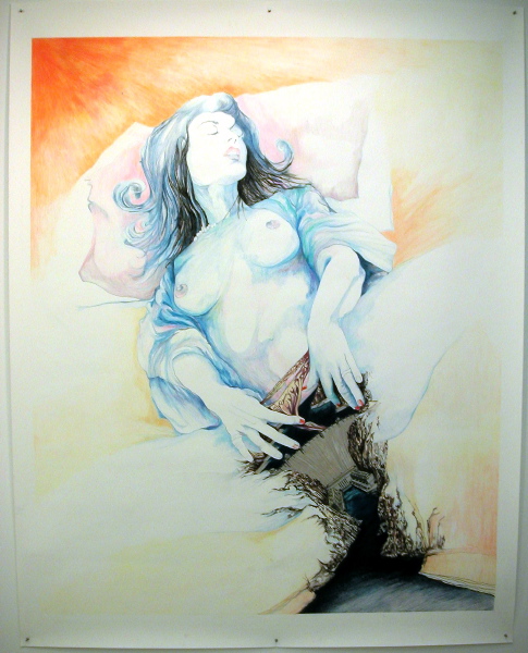
Suzanne Wright Hoover (Empowerment Series) color pencil and graphite on paper, 6.25′ x 7.75′
No, it’s not about me. Rather it’s the title of an extraordinarily intelligent group show which opened at Monya Rowe two weeks ago. The press release points to the origin of the phrase in a recent drawing by Kevin Christy, who is in this collection, but with other work. Christy had replaced the text of the infamous “HOLLYWOOD” sign in Los Angeles with the words, “I’ve Met Someone Else.”
The imagery begins with sexuality,and how we talk about it, but then the real surprises begin.
The exquisite piece below only begins to describe the incredible world imagined by Larissa Bates and which is represented in two other pieces in the exhibition. This drawing (the word doesn’t seem adequate) is now ours, and although it sounds really selfish, I wish we were able to bring them all home. Bates will have a solo show in the gallery later next month.
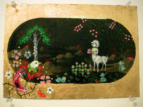
Larissa Bates Poas Volcano (2004) gouache, gold leaf and acrylic ink on paper, 10.25″ x 7″
Scott Treleaven, temple knight
Scott Treleaven cara frater (2004) paper on board, 14″ x 11″
Some artists are comfortable in just about any medium. It looks like Scott Treleaven is working on it.
When we first saw his work it was in the form of an amazing film, “THE SALiVATION ARMY,” shown at the 2003 New Festival. Only after we acquired a copy of it and began communicating with him did we learn that some people might have first encountered Treleaven through a series of zines he had produced earlier bearing the same title. We now have copies of the zines, but our connection with the artist hasn’t stopped there.
Lately the Toronto-based Treleaven has moved into another medium, creating a number of amazing collages assembled from found images, wrapping paper and his own gouache, crayon and watercolor interventions.
We managed to acquire one of the early pieces from a show at D’Amelio Terras in 2003, and last week we were fortunate to be able to see a preview of his latest work at a reception in Simon Watson’s Scenic space, and it’s pretty spectacular.
For some of the images shown on Simon’s walls, see this gallery. Some of the titles will be less enigmatic for those who know their history. Google.
Treleaven’s work will be shown in three galleries outside of New York over the next few months, but I’m certain we will be seeing more of him here very soon.
Kavi Gupta Gallery, Chicago (opens October 29)
Marc Selwyn Fine Arts, Los Angeles (opens November 6)
Conner Contemporary Art, Washington, DC. (opens January 15)
Andrea Loefke at PH Gallery
Andrea Loefke, detail of installation, “Little Objects”
We first saw her work at S1 last November and when we wandered into her space at Smack Mellon open studios earlier this year I was pretty certain I’d see her again, soon. Now Andrea Loefke has a one-person show at PH Gallery on 27th Street, and if it’s not quite so totally mad as the environment she had created in D.U.M.B.O., she’s easily forgiven; after all, a commercial gallery has to think about access and safety issues.
The materials are wonderful, and the constructions are a mix of a perfect minimalism and a very imperfect assemblage of loose debris, everything invested with enough chuckles to support the show’s title several times over: “when the green frog changed into a happy prince the nearby well – splish, splash – turned into sweetened lemonade.”
Andrea Loefke untitled drawing (2003) 10″ x 14″
Zachary Wollard at Audiello
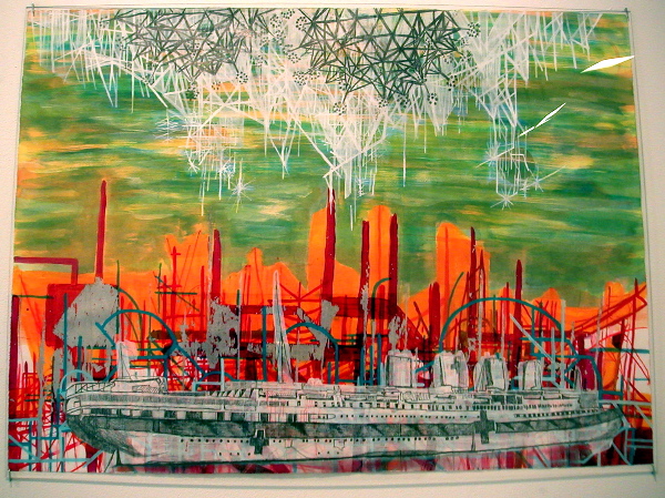
Zachary Wollard A Historic Evening (2004) oil and acrylic on canvas 48″ x 64″
The most remarkable thing about the paintings and drawings of Zachary Wollard now being shown at Massimo Audiello? No, not the fact that the artist is self-taught (ok, his first career was poetry, and there was some school-learning involved, at Columbia), but the fact that the work is so magnificent, and so enchanting.
He’s only about 30, this is his first one-man show at the gallery and by the time you read this all of the work may already have been sold. See, poetry does pay.
Zachary Wollard Harbor Master (2004) graphite, watercolor, gouache and silver leaf on paper 22.5″ x 30″
fantastic Japan, here in Chelsea
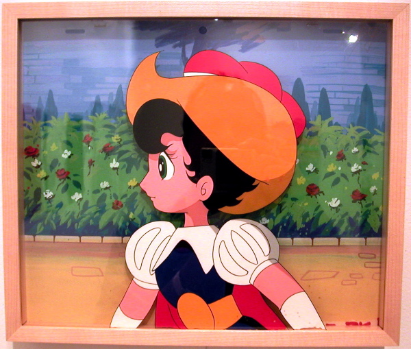
Osamu Tezuka, cell from “The Princess Knight”
M.Y. Art Prospects has launched a fascinating show, “Fantastic Landscapes from Japan,” curated by Taro Chiezo, one of the eight artists in the exhibition. It’s a trip, in several senses, and it certainly saves us bundles in travel costs.
In the 21st century the exotic no longer has much of a chance of maintaining its distance from the familiar. I’m not at all suggesting that the M.Y. Art show is difficult to approach, but the aesthetic merit of the work may stand out even more because it lets a European-dominated society share in the power of ancient cultural traditions very different from its own, if also woven into them at the same time. Ultimately this show provides the kind of jolt a visitor should expect in experiencing any good art, regardless of its source – only here maybe with a few more amps.