color: it only looked really white in bright sun; when we left at 6 it actually was more of an eggshell
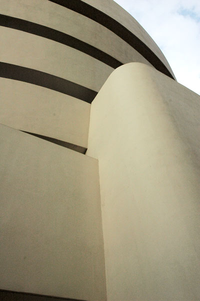
Barry and I almost missed another show which we had decided long before was a must-see. But yesterday we headed for the Guggenheim, where the newly-restored museum’s fascinating exhibit, “Frank Lloyd Wright: From Within Outward“, closes tomorrow, Sunday.
The show is part of the Guggenheim’s celebration of the 50th anniversary of its landmark Frank Lloyd Wright-designed building, whose exterior renovation was completed last year.
I’ve been a fan of Wright’s almost from the moment Hilla Rebay and Solomon Guggenheim first approached the great man to design a permanent home for the Museum in 1943. I’m pretty familiar with his work, and not blind to his inadequacies (or those of the Guggenheim: “The Art of the Motorcycle“?), but I was often surprised by what I learned from the materials assembled for the show, and my criticisms of certain of Wright’s obsessions have been somewhat blunted after my progress down the Guggenheim’s ramp. Yes, we took the elevator up and walked down the ramp, which is how I always experience this museum (and what I understand Wright himself thought was the proper approach), even though we soon realized this exhibit is clearly arranged, chronologically, to suggest a progress up from the bottom.
I go back and forth on which of Wright’s work excites me more, the private houses or the public designs. Although it actually doesn’t really matter, even to me, this handsome retrospective didn’t resolve my ambivalence. Until we got down to the second-level annex we saw not one house design. While I was very much aware of this, and mentioned it to Barry, for almost two hours I was pretty much lost inside the grand schemes of his larger projects (which I was happy to be reminded had actually included apartment houses). Then we were suddenly looking again at the brilliance – and the variety – of his plans, over seven decades, for single-family dwellings – some specifically designed for pretty modest budgets.
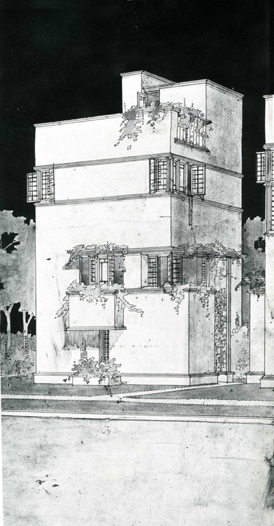
My favorite new discovery within this part of the exhibition was the beautiful small unattached house which was a part of the architect’s “American Ready-Cut Houses” project. It was represented by a pencil drawing on a single sheet of paper of an elevation and plans for two floors of what Wright described as “small town house – plastered 1912-1913”. There seemed to be another (half?) floor below the first, which had a sun room and a small balcony, and a roof terrace above the second, bedroom floor. Lovely.
Thinking now about Wright’s sketched plan for the first floor, which included furniture outlines, I’m reminded of how here and in most of his other living room plans, even though there’s an eating area off of the kitchen, a handsome collection of table and chairs dominates the floor area of the room, unless the client can afford a particularly large living space. Our own apartment has a conventional living room arrangement, and we’re lucky to have a dining gallery as well, but I think that I would be quite content with entertaining people sitting around a dining-height table. There food, drink and anything else which could be spread out might be shared along with the conversation. I could pretty much do without a lounge area altogether. It’s very much how we live now, whether we have guests or not.
elegantly sufficient, sufficiently elegant still today
The visit would have been worth the trek uptown on a sweltering day, the long line, and the cost of the tickets, just for the look into a few of Wright’s more iconic designs alone. For me the most amazing, and melancholy, almost-discovery was his huge body of work devoted in 1957 to “The Plan for Greater Baghdad“, intended for an undeveloped island in the middle of the Tigris and of the city, sadly, unbuilt of course.
Although there are plenty of other candidates for an appreciation of his genius, I’m thinking especially of the 1913-1922 Imperial Hotel, and of course The Illinois of 1959 (unbuilt), Wright’s magnificent, plant-like, utopian (he would probably eschew “visionary“, since he believed it was totally practical) skypenetrator which has captivated me for half a century:

I swear I saw gold leaf near the very top, probably intended to show the sun blessing the hero’s tower
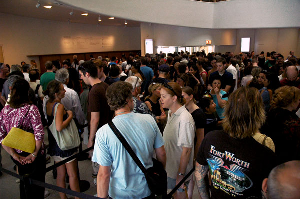
Did I mention the line? We were both aghast at the appearance of the ground floor lobby when we first walked into the museum. It was Friday, a weekday, and the time was 2:45:
at least there’s no door person at the end, ready with a thumbs down if your look’s not up to snuff
These people are slowly advancing between row after row of ropes in order to get to the desk to pay for admission ($18, students and seniors $15, or order on line for a little more). It took us a full half hour to get to the head of the line, although this being New York there was good humor and a certain amount of eye candy for entertainment while we shuffled back and forth.
[image of “The Illinois” from the website of Rich Hilliard; that of “a small town house” from savewright.org]
Category: Culture
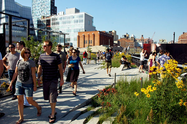
the High Line, but this time on a slow day

I couldn’t stand looking at it any more, even if it shows a tweaked image of the Whole Foods logo, one which now serves as the symbol of a national boycott. I’m referring to my last, melancholy post, “Whole Foods’ John Mackey wants us unwholesome“. So, thinking I might not be the only one so depressed, I decided to upload a picture of some flowers I snapped up on the High Line at around 4 o’clock on this warm, sleepy afternoon. I was walking back from Buon Italia in Chelsea Market, a really, really, wonderful sort-of-smallish, genuine food emporium for anyone interested in Italian food, now destined to become an even more important part of my food shopping rounds.
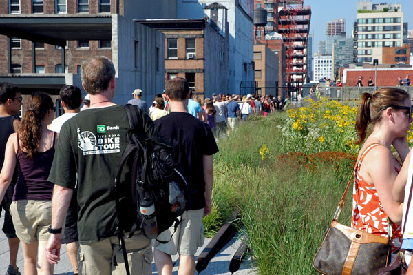
Then, remembering how few people I saw up there today, I thought about how the beautiful slim park, which has quickly become the site of a documented neighborhood passeggiata, manages to look very different at various hours and on various days of the week. Here are a couple images showing just how popular it is on weekends. Both of them were taken on the first of August, a Saturday.
These pictures remind me of why I decided years ago that I had to move to New York permanently: Weekends here seemed to have been arranged mostly for visitors, and they still are, although back in the early 80’s I was thinking of Downtown music, theater, dance bars and performance, which were always much more interesting on school nights.
take a number
but it can look like a commercial travel brochure
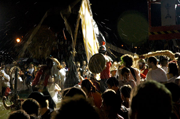
Duke Riley’s “Those About to Die Salute You”
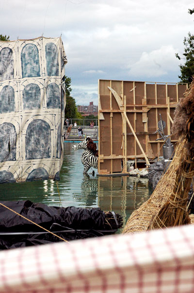
backstage at 6 pm: the battleships await their crews
Duke Riley’s rich, seriously-ambitious, aggressively-unprecious but still whimsically-theatrical large-scale piece of interactive art, “Those About to Die Salute You“, unfolded across the plains and the seas of Flushing Meadows on Thursday night, managing to exceed all expectations, probably including those of the artist himself.
The Queens Museum of Art commissioned the work from Riley earlier this year and this resourceful, heterodox (and genuinely-communal institution) got just about exactly what we saw described in the event’s press release:
Those About to Die Salute You, a battle on water wielded with baguette swords and watermelon cannon balls by New York’s art dignitaries, will take place on Thursday, August 13, 2009 at 6 pm in a flooded World’s Fair-era reflecting pool in Flushing Meadows Corona Park, just outside of the Queens Museum of Art. Various types of vessels have been designed and constructed by artist provocateur Duke Riley and his collaborators: the galleons, some made of reeds harvested in the park, will be used to stage a citywide battle of the art museums in which representatives from the Queens Museum of Art, the Brooklyn Museum, Bronx Museum of the Arts, and El Museo del Barrio will battle before a toga-clad crowd of frenzied onlookers.
And the people came.
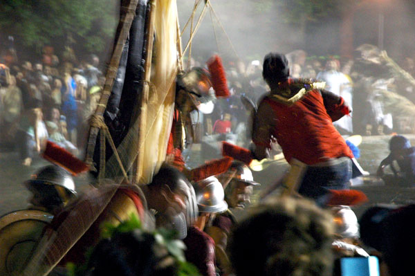
No words can do more than begin to describe what they saw – and what they contributed themselves. There are already enough images posted around the blogosphere to make anyone who wasn’t there feel a bit like what now seems to have been the handful of people who didn’t get to Woodstock forty years ago. I missed Bethel myself, but, especially since I had been following Riley’s projects for several years, I wasn’t about to miss Corona Park, only one transfer away on the subway. Besides, as a student of the classics, I just couldn’t, and if I had given it a pass, when could I expect another invitation to a Naumachia?
Barry and I got there a bit before 6, as all the announcements had suggested, but after we had checked out the boat yards at one end of the flooded “lake”, we learned that the sea battle itself wouldn’t begin until after 8 o’clock.
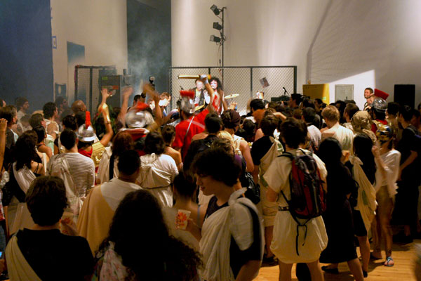
Populi entertained by Hell-Bent Hooker, including band-engineered special effects
We headed for the Museum, where an artist friend, one of Duke’s “herohelpers”, invited us to visit the now-nearly-empty and very dusty 40,000 sq. ft. “studio” where the battleships had been constructed. We stood next to an incongruously-shiny large black motorcycle with a box of cookies balanced on its seat: “Take some cookies; a nice Italian lady with her kids left these for us,” offered a long-haired gentleman with a deep, froggy voice just before he headed off to the other end of the space. I later recognized him as the lead in the metal band which was the evening’s early entertainment. We took two cookies, and they were the best: delicate, chewy macaroons.

La-Vein Hooker (Hell-Bent Hooker vocals) and affectionate Roman fan
I guess we spent too much time mingling with all the Romans eating and imbibing in and around the Queens Museum and enjoying a bit of the evening serenades offered by Hell-Bent Hooker, so it was already twilight when we finally headed back to the site of the featured event (so featured that there was a box to one side, designated ESPN, where the faux anchorman for the proceedings was ensconced). There we found another huge crowd, and unfortunately all the spaces close to the water and the powerful spotlights had already been taken. In the end, while our late arrival meant I couldn’t capture any decent documentary images, it also meant that I saved my camera from encounters with water balloons, ripe tomatoes and rotten melons.
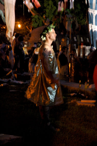
Duke-emperor, artist and prime mover, observing from the darkened wings
I’ve included a few of the pictures I took with available light while holding the camera high above my head. They’re pretty “impressionistic”, but the blurriness may convey a small bit of the excitement of the spectacle.
Queens Museum battleship and crew, later to be declared the victors
I’m not sure what’s going on in the next image (the camera saw much more than I did, and it can’t talk to me), but it looks a bit like a victory celebration.
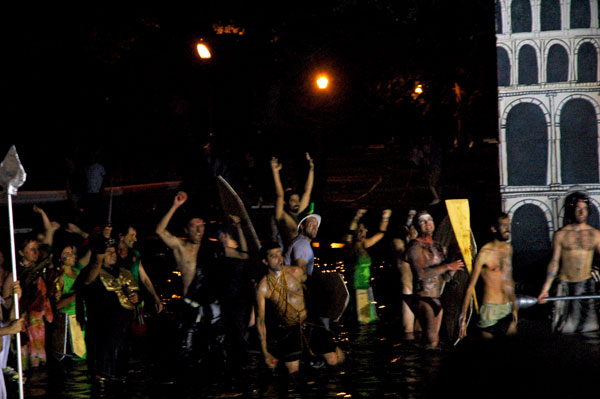
Neptune’s rowdy crew?
That whoopee came just after the sinking or withdrawal of the last manned and womanned battleships, and just before a reed-and-paper-constructed Queen Mary 2 slowly glided toward the head of the lake. Riley and the Queen have a history: When the artist tried to maneuver his one-man submarine near that vessel while it was docked in Red Hook he was arrested and his own ship was temporarily seized. Two nights ago Riley oversaw the replica go up in flames amid spectacular fireworks – turn over, and sink.
The crowd, which for several minutes seemed to be somewhat in shock and awe as they saw and heard the Roman candles going off, then went wild.

but no one’s suggesting actual sorcery is involved
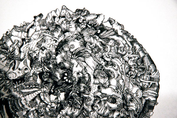
of gallery Deathwatches, Dash Snow, Bruce High Quality
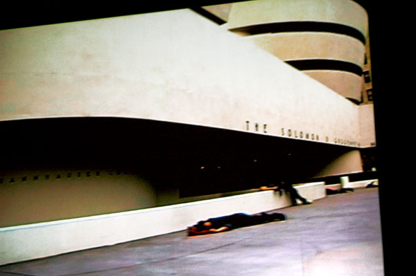
dead artists and such outside the Guggenheim, in the BHQF film, “Isle of the Dead”
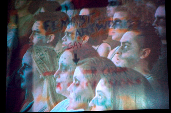
zombie artists and such recalling the summer of ’69, in the BHQF film, “Isle of the Dead”
The art world may be the middle of a continually-darkening 2009, but I’m still trying to stay well away from any ghoulish gallery deathwatches. Actually, I never understood how galleries operated/survived even in boom times, but then I never really had to; I don’t have a gallery, I am not advancing and cannot advance any money to anyone, I’m not selling art and I’ve not been able to afford to buy art for some time. Normally on this site (and elsewhere) I simply refrain from speculation, scuttlebutt, even factual news of any kind about behind-the-scenes gallery operations, except as it might impact close friends, my own blogging, the ArtCat calendar, or our ability to attract advertisers on Culture Pundits. Unless I’m standing on my virtual soapbox sharing an earnest political anger, most of the time I’m writing about art, and sharing some pictures. I can’t promise however that an occasional, particularly-colorful story might not sometimes tempt me to drop my customary constraint.
By the way, like my general habit of truthfulness, this reluctance to engage in certain conversations doesn’t seem to be have anything to do with personal virtue, but more likely stems from a consciousness that I lack the talents ordinarily required of a successful gossip, cynic or schemer; that is to say, absorption in the subject, guile, the ability to keep a story straight, and the sheer love of the game.
Anyway, I don’t pretend to be on top of the news about the regular disappearance of art galleries over the past months, sometimes unaccompanied by a notice of any kind, but after hearing today about another gallery closing, not one of the biggest spaces, but one which was a favorite of both Barry and myself, I finally confess to being deeply saddened.
While I was putting this entry together I learned of the death of the artist Dash Snow, further deepening my gloom. Barry and I were talking to William Powhida last night about the degree of interest regularly shown by much of the art world and the general public, and all forms and levels of the media, in gallery and artist prattle (as opposed to actual art news).
Today I found this sad, sweet post on Powhida‘s own blog.
The fact that we were discussing art gossip and disappearing galleries last night happens to have been only a coincidence to today’s news but it suggested some of the thoughts for this post of my own, one which was originally intended to be only a few words attached to an image or two from “Isle of the Dead”, the wonderful film by the awesome collaborative, Bruce High Quality Foundation [BHQF]. It’s playing in an old movie theater on Governors Island all summer. It’s one of the very best of the many installations spread throughout the grounds.
Thinking about the film, which I saw two weeks back, has made me feel much better, and it should work for you too. Just follow the art zombies downtown to Governors Island. Check out the trailer.
Shinique Smith at Yvon Lambert
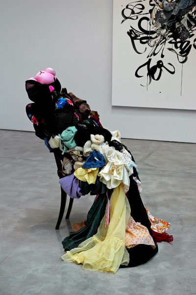
Shinique Smith Untitled (Whistler’s Mother) 2009 clothing, fabric, ribbon, rope, twine, chair, wall and collage [installation view]
Yvon Lambert’s current show, Shinique Smith’s “Ten Times Myself“, offers a splendid swirl of work in a mix of media and related to what appears to be the current Great Recession-era vogue for “austerity art”, but in this instance the found objects have been assembled into compositions as formal as the figurative art of the masters.
Smith’s “(Whistler’s Mother)” is clearly more than just an arrangement, since she’s bouncing off of Whistler’s “Arrangement in Gray and Black: Portrait of the Artist’s Mother“. Her own [disquisition on the feminine principle?] replaces Whistler’s dark, sober canvas with a robust baroque effigy and an extravagant palette, fully-modelled in its own way, yet in the softest shapes.
Singling out “Mother” may be misleading, but none of the works in this show are abstractions independent of outside references; the titles only begin to suggest how their exuberant imagery relates to a “real” world reassembled inside the artist’s mind and informing the confident hand which assembled them.
Barry and I first encountered the artist and her work five years ago when we talked to her inside her space near the top of the Woolworth Building during an LMCC open studio weekend. It’s been exciting watching her work pop up all over ever since, always attracting more big fans.
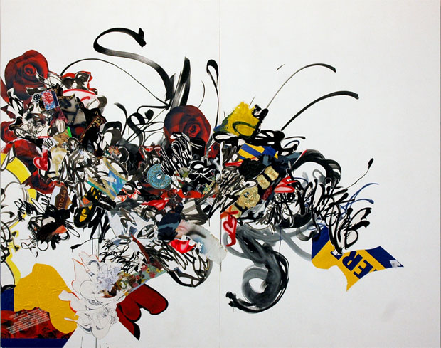
Shinique Smith And the world don’t stop 2009 ink, acrylic, enamel, fabric, ephemera and collage on canvas over wood panel, two panels 96″ x 120″ x 4″
[detail]

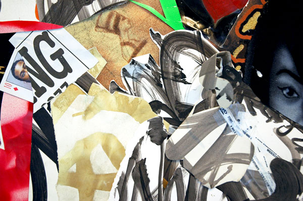
[detail of “And it feels like love”, a work not reproduced here in its entirety]
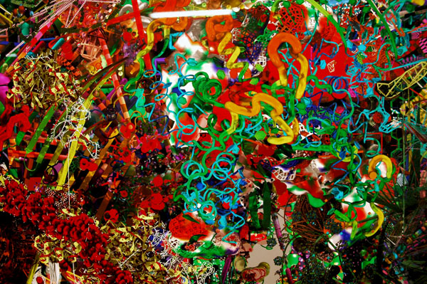
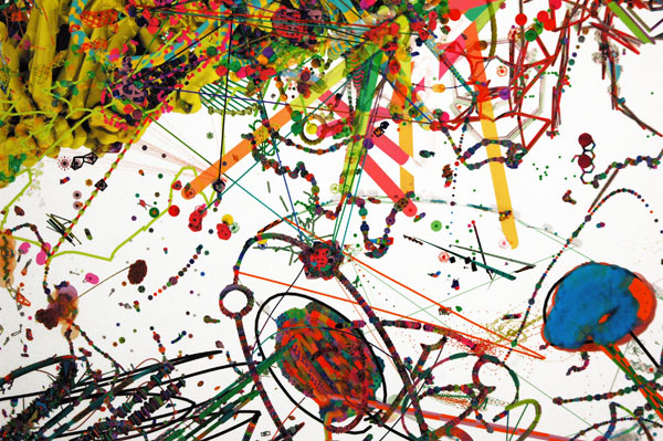
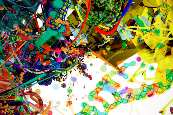
Shane Hope at Winkleman
Shane Hope cartoon_trace_atoms=1 2009 archival pigment print 60″ x 48″
[detail]
[two details of Shane Hope’s 2009 48″ x 48″ archival pigment print, “Hyperneckerdeathcube“]
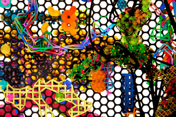
[detail of Shane Hope’s 2009 48″ x 48″ archival pigment print, “On Graphite“]
Shane Hope‘s, “Your Mom Is Open Source“, opened last Friday at Winkleman Gallery, and it’s a doozy. I already knew this artist was on to something both “outstanding” and “unique” [cf. definition of this quaint adjective], but I hadn’t seen his latest work, and until last week I could only imagine how magnificent his prints (such a modest word) would look inside a gallery, in this case a very well-lit gallery.
My photographs hardly begin to describe what can be seen on 27th Street. The actual prints of these incredibly-complex three-dimensional shapes are so luminous, their detail so extravagant, and their depths so mind-boggling, that I can’t claim that these images are anything more than rough approximations of the work.
We’re told that he uses customized versions of user-sponsored open-source molecular visualization systems to create the large monotypes. I can attest that the artist is able to share the extraordinary vision behind his �Mol Mods� and �Compile-a-Child” drawings*, and the “posthuman” world he imagines and and these systems describe, but my lamentable ignorance of these things means that I have to take his descriptions on faith, even after several conversations spread over several years. While I like to imagine that the gallery statement is likely to read like mind candy to some folks, I think that even if a viewer has only the most cursory acquaintance with “hard SF” this work will dazzle. I’m also pretty sure that complete scientific ignorance would not obscure its delights.
Hope has a science background (surprise!), but the array of delightful junk-wood-fabricated laptops visible in the gallery office and his fondness for his own B.C. wheel(!) suggests that his personal integration of art and science is sui generis, if not a bit bizarre.
Maybe its out of my embarrassment for my fundamental ignorance of science that, checking out the absence of [only a single] horizon in the portrayal of these magnificent organic worlds, I thought of Tiepolo‘s painted ceilings, with their tangle of gods heroes, chariots and horses, pink putti and broad staircases, together perched on the edges of a frame and floating in spaces assembled out of castles, cliffs and clouds. Tiepolo however didn’t have to deal with an audience which could examine the details of his creation from the distance of only a handspan.
The work is boldly conceptual, highly technical and dazzlingly beautiful. It would be more than worthy for its success with each of these purposes, but with their combined triumph Hope’s art is a wonder.
*
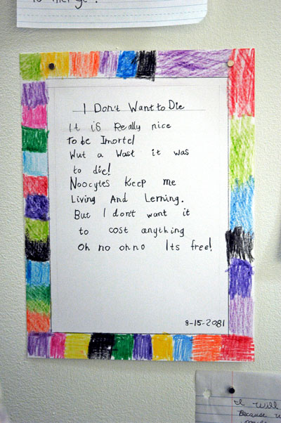
Shane Hope to be Imortel 2009 graphite and crayon on paper 12″ x 9″ [installation view]
More links:
DistribuDeev Data-Debased Dark Matter of Infactious Informorphically-Biorouted Hick-Hacker Hortus Humanus Electricus, Aeonomically Autoscient Artillectual Anthropos/Implementa GraviTV and an Acceluture Future-Pharmada of Ornamentally-Challenged Molecula Modula
Termite Art for Terminators
Decoding Shane Hope
ADDENDA:
- I neglected to mention that Barry and I were introduced to Shane Hope’s work by Stephen Lichty, an exciting artist and curator recently returned to New York from Tuscany, where he was director of Project Gentili in Prato, outside Florence.
- While I was at the opening reception I was so carried away with the color prints that I missed capturing images of Hope’s b/w work, either the computer-generated prints or freehand drawings on paper. I’ve added below a thumbnail detail of his “Goo(f) Ball No π, dark matter demarcations on lesser dimensional bits of tree, year wheneverafter” (which is not in the current show), snapped on a visit to his studio in August, 2007. As I recall, the entire image is only a few inches across.

“finally Utopia” disperses Pocket Utopia
Ben Godward Goddess (with post-modern tits) 2009 dimensions variable, mixed media with beer [installation view, without the beer]
After this Sunday it looks like it’s going to be up to those who were touched and enriched by the unique creative society which centers on Austin Thomas’s storefront in Bushwick to continue its mission elsewhere – or perhaps everywhere. The artist-run space is described in the press release for this, the final show, as:
. . . a social sculpture. It is also a gallery and a post-studio artist residency that blurs the lines between artist, dealer, gallerist, viewer and participant.
There’s nothing quite like it anywhere else in New York, but this little utopia closes on Sunday.
The friendly note, “Ben Godward will serve beer.”, appeared within the announcement for the reception of the current show. The image at the top is of the keg machine the artist constructed for the event. We were in Chicago that weekend, but I have it on good authority that both of those kegs were “stereophonically” emptied that night, as good an indication as any that Pocket Utopia has performed or excelled in the role its creator, Austin Thomas, had planned when she opened the door of the former hair salon two years ago. She did so in what much of the city would have regarded as a somewhat precarious neighborhood for the display of art, even if the artists themselves had already settled in.
Bushwick has certainly changed since early 2007, and some of the healthier changes the art world has seen during that same time just might have been inspired by the gentle, generous and creative genius of the project which began on Flushing Avenue just 24 months ago.
I’m looking forward to Thomas’s next thing, but first I’m going to head for the “The Final Salon”, this Sunday, June 28. There will be a gathering at 4pm there which will include readings by Andrew Hurst and Kevin Regan, and we’re also told Ben Godward’s Goddess will be flowing again!
“Finally Utopia” includes current work by a few of the artists who have shown in the space before. They include, in addition to Godward, Rico Gatson, Andrew Hurst, Molly Larkey, Kevin Regan, an occasion-specific text piece by Thomas herself, and Jonathan VanDyke. Valerie Hegarty’s piece can be seen in the image below.
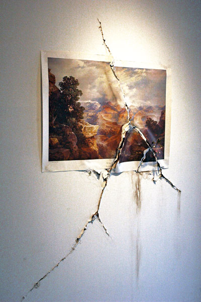
Valerie Hegarty Cracked Canyon with Flowers 2009 dimensions variable, poster, paper, paint, glue, staples, artificial stems and flowers [installation view]
old media and the Iran crisis

The Iranian protest movement is using social media in innovative ways to organize and get their message across. In this June 9 photo, a supporter of Mir Hossein Mousavi films an election rally. – Spiegel Online
The exigencies of the continuing crisis in Iran have eclipsed the importance of traditional media institutions virtually overnight.
Because of a frightened theocracy’s police controls and its effectiveness in blocking both access to and the filing of news, the role for television, radio and newspaper news reporting during the unraveling of one of the most important stories of the decade has fallen into a new category: In the telling of the story the traditional news organizations now occupy a middle position, in time and distance, somewhere between actual news reporting and what we will eventually find in the accounts of historians.
We have all become the reporters, in a gradual development whose significance is made clear and dramatic in the way in which we are learning about what is going on in the streets and homes of Iran this month, where it is new media which is keeping a popular revolution alive. Long live new media!
The impotence of old media may look like merely the consequence of a single emergency, but at the moment it’s an emergency without a denouement. Also, because there are certain to be others like it, and because our social media tools are only going to become more accessible and more ubiquitous, it’s looking like an impotence from which it may never completely emerge.
Together with the many past and continuing criminal failures of our news establishments and my excitement in watching the human and technological drama of a growing popular role in creating and reporting the news, I have to balance my treasuring a modest early experience in print journalism and my enduring pleasure in reading the best work of journalists published in hard copy. For that reason I have complex feelings while watching what may be the imminent demise of these hoary, once-great institutions which are already-so distressed: It’s pretty sad, and I confess to feeling embarrassed for all of us when I read postings, on the BBC, the New York Times or the Guardian sites for instance, apologizing for not being able to get a story from their own reporters and camera crews.
The television, radio and print news media may soon be left with merely a secondary role (if any) sifting, analyzing and commenting on information provided by outside and structurally independent reporters on the scene who are using the latest personal technology.
[image caption and otherwise uncredited image from Spiegel]
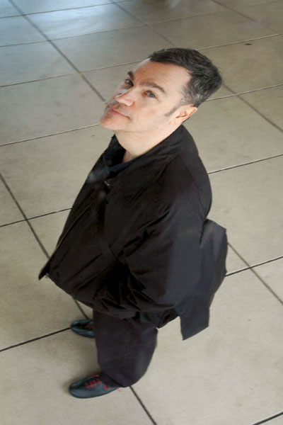
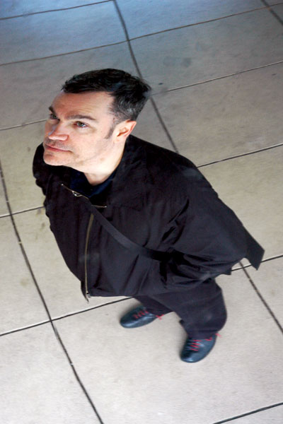
Chicago’s shiny bean, Anish Kapoor’s “Cloud Gate”
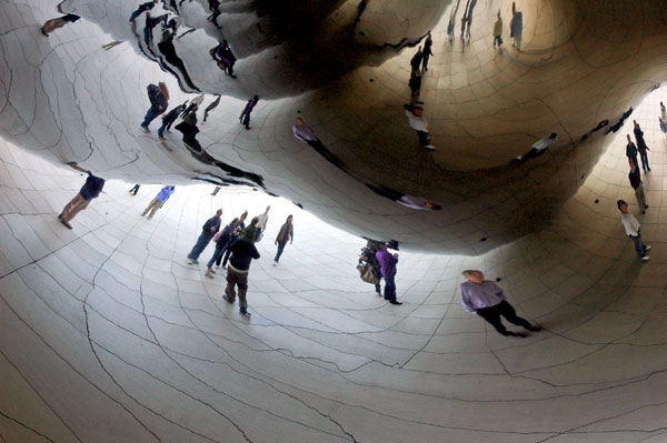
Anish Kapoor Cloud Gate 2004-2006 polished stainless steel 33′ x 66′ x 42′ [detail of installation]
I think I expected to be charmed by Anish Kapoor’s sculpture in Millenium Park, but when Barry and I encountered “Cloud Gate” on the first full day of our visit to the city two weeks ago I thought it was even better than the reviews had reported – and even more fun than its billings.
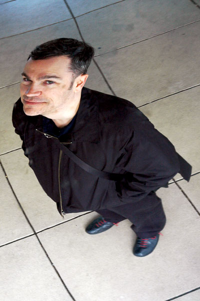
But it’s also an incredible photo opportunity, and this was one of those rare times I totally went with it. The underside of what Chicagoans had early on dubbed “the Bean” is described as an omphalos, or navel, a complex, curving indentation whose mirrored surface multiplies anything found beneath it, but in the other images I snapped the same afternoon I concentrated entirely on the first of the foreshortened Barrys I spotted above me.

first third of the [Chelsea] High Line opens
low down on the High Line
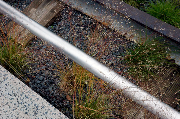
Barry and I visited the newly-opened first stretch of the High Line last Thursday, in spite of a light mist which probably reduced the crowds of the curious that afternoon. The experience was more lovely than I had dared to expect. My favorite things are its physical position (three stories above the street snaking around and through some other interesting structures, often within view of the Hudson), the handsome naturalistic plantings, and the fact that it’s only a few blocks from our apartment.
It’s a really, really wonderful thing. Its delights start even before you climb (or “elevate”) to the height of the old freight railway, with the breathtaking sight of smiling, happy people out in the open air beyond an old railing thirty feet above you, and it never stops. Actually, I think we’re both still high a week later, just thinking about it.
But I do have quibbles about some of the fancy details. I think that certain features introduced by the design team, led by landscape architecture and urban design firm James Corner Field Operations with architecture firm Diller Scofidio + Renfro, seem a bit too fussy, and their design may not age well. I’m thinking of the concrete-and-stone composite seat supports and “fingers” stretching from the path into the crushed-stone planted areas. I assume there’s a practical reason for their being there, if not in their precise configuration, and in any case nature may soon disguise or soften a lot of what now seems too much like an affectation.
The monstrous commercial Chelsea Piers operation robbed Chelsea of the kind of access to the Hudson River enjoyed by most of the communities north and south of us when the designs for Hudson River Park were approved. Chelsea is only now getting its first real park.
I’ve included only one photo here, an aesthetic and historically-referenced impression of the new High Line. It’s a detail describing some of the materials used in its construction, including the edge of the pavement, a very low steel railing, a segment of the original freight rails, and a look at the beautiful ornamental grass. I decided to hold back on any images documenting the park more thoroughly (they’re available all over the internet anyway), in order to make it easier for the reader to experience the environment visually unprejudiced.