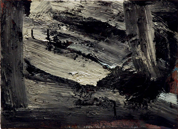
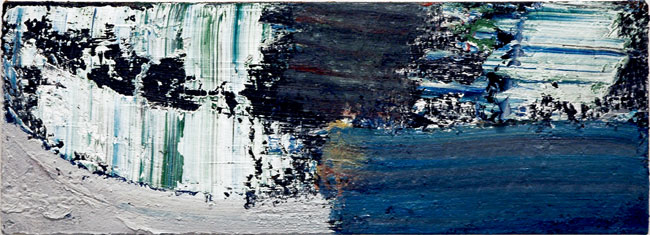
Louise Fishman Berm 2006 oil on canvas 12″ x 16″
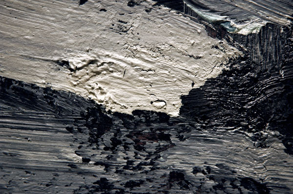
[detail]
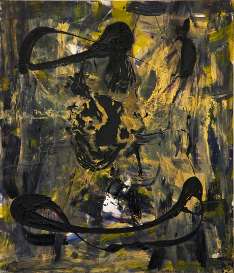
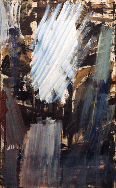
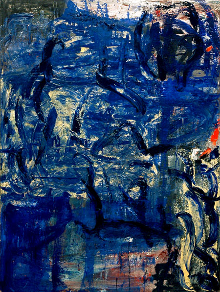
Louise Fishman Arctic Sea 2007 acrylic on canvas 72″ x 65″
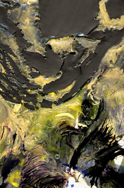
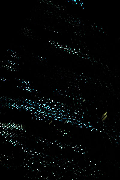
[detail]
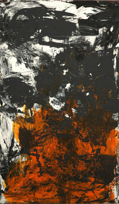
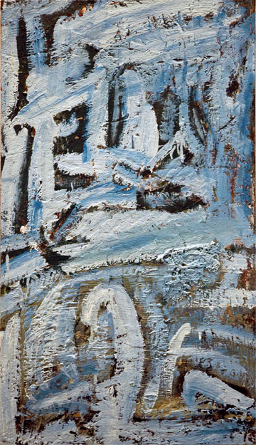
Louise Fishman Heart On Fire 2007 acrylic on canvas 66″ x 39″
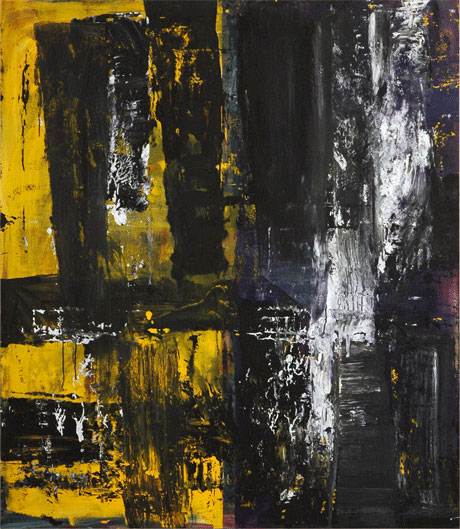
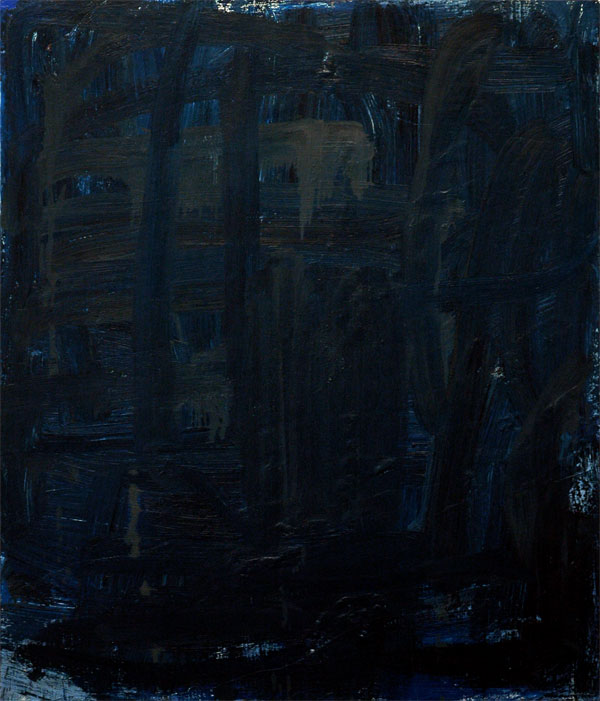
Louise Fishman Geography 2007 acrylic on canvas 72″ x 65″
Barry and I went back to Louise Fishman‘s show at Cheim & Read on Saturday, partly because we knew the artist was going to be there, and partly because I wanted to photograph one of the paintings I had seen hanging in the rear of the gallery during the opening reception. That small oil, which is not actually part of the show, is the image at the top of this post. The next three images represent a little of what I referred to in my first post, Fishman’s enormous confidence with color and the diversity of the means used in displaying it.
In the back of the gallery, in addition to “Berm”, we saw another dozen or so paintings. All of them were equally as terrific, and all of which Fishman had completed in the last two years or so. We were told that the gallery had literally run out of installation space well before the artist had run out of work.
Louise Fishman Loose the Flood 2009 [approximately 66″ x 38″]
Category: Culture
“3 Columbus Circle”: it ain’t vinyl, but it’s still siding
Untitled (Pan Am) 2009
ghosts in the night: the Pan Am Building kisses the Commodore Hotel
I had originally intended to post this virtually abstract shot as an image alone, with no commentary, like I do with many of my photographs, but then I got to thinking about some of the follies that these two barely-seen structures (the Met Life Building* reflected in the windows of the Grand Hyatt Hotel) represent, and what they continue to tell us about New York’s past. Finally, during a long-anticipated visit to the new Hearst Tower last Wednesday I looked out a window in the northeast corner of one of the higher floors and I realized that some of us haven’t learned a thing. I now knew how I was going to finish this post.
Almost 30 years ago the Hyatt Hotel group demonstrated that there really are second acts in New York, but they may not always be worth staying for, or even bearable. The early twentieth-century “skyscraper” which stood on the Hyatt site, adjacent to Grand Central, was until 1980 known as the Commodore Hotel. Not surprisingly, it had been named for “Commodore” Cornelius Vanderbilt, the railroad entrepreneur who built the first Grand Central Terminal in 1871.
The Hyatt corporation’s architects retained the shape of its mass, and left most of the exterior bricks of the old hotel in place, merely covering everything with a highly-reflective glass skin.
Anyone who thinks this kind of philistine rape is a thing of the past might be advised to take a walk across town. An equal or even greater abomination is being committed between Eighth Avenue and Broadway in the upper fifties. I’m referring to what owner/developer Joseph Moinian calls “3 Columbus Circle”. Originally known as “Columbus Tower”**, when it was finished in 1928 (Shreve & Lamb, architects), the building occupies the entire block, between 57th and 58th Streets. Some will remember It once sheltered the much-missed Coliseum Books inside its southeast corner.
Last week I saw huge sections of masonry gouged out of finely-laid brick walls every few feet of the building’s surface, all destined to hold brackets for a totally-redundant glass curtain wall. I couldn’t keep looking, and, inexplicably, didn’t take any pictures. Maybe I couldn’t imagine looking at them once I got home. For those with the stomach, here’s the website devoted to the building’s transformation and marketing.
The site of this commercial-developmental obscenity is cater-corner from the bold, newly-topped-out Norman Foster Hearst Tower, which shoots out of the cast-stone facade of the six completed floors of the landmark 1928 Joseph Urban-designed New York Hearst headquarters. But it will bear a dramatically closer affinity to the new facade tacked onto 2 Columbus Circle, one block north of it, a monstrous work of destruction commissioned by the institution which I mischievously continue to refer to by its original name, the “American Craft Museum” (and not just on account of its notorious architectural crime).
The Pan Am Building may not be anyone’s favorite New York skyscraper, but at least it’s still permitted to represent something other than a shiny siding job.
*
(1963) architects: Emery Roth & Sons, with Walter Gropius and Pietro Belluschi
**
New York Times architecture critic David Dunlap has dug back even further. In a board post [with interesting pictures] on Wired New York, he writes: “For now, a palisade of three-story Ionic columns, supporting a neo-Classical entablature, surrounds the base of the structure. This is a visible vestige of the Colonnade Building, designed by William Welles Bosworth . . . .
Shreve & Lamb�s brown-brick facade was far simpler than the monumental colonnade. That incongruous combination of ornate base and spartan tower still speaks subtly � to anyone patient enough to listen � about the rise of Automobile Row in the early 20th century. But in a few months, it will be gone; another quirky corner of Manhattan that has been scrubbed, smoothed, polished, branded and lost.”
NOTE: The image is of the west wall of the Grand Hyatt, showing a few white-ish rectangular windows; the smaller, more numerous blue-ish shapes are the lighted windows in [what I normally call] the Pan Am Building, reflected on the Hyatt glass. The photo was taken from the sidewalk on the south side of 42nd Street.
the Wooster Group’s “La Didone”
gods, demigods, heroes and zombies, running into and through each other, for a very fine evening
It’s the most brilliant performance (theater and/or music) I’ve seen and heard in ages. The Wooster Group‘s current miracle, “La Didone“, is an incredibly-inspired conflation of two relatively obscure Italian dramas, a 1960’s space adventure film and an early seventeenth-century opera.
The result is a magnificent burlesque (or let’s say, burlesco) which “rockets” past Mario Bava’s 1965 cult movie “Terrore nello spazio“, and could on its own great merits restore Francesco Cavalli’s early baroque opera “La Didone” [libretto by Giovan Francesco Busenello] to the canon of Western music. It’s a seemingly impossible creation, a moving jumble of exquisite beauty and low comedy.
It’s unlike anything I’ve ever seen or heard, and I’m a veteran Wooster Group-ie.
We saw the work last night in the St. Ann’s Warehouse space in DUMBO. Performances will continue through April 26, for the very, very lucky. And, yes, there are [very discreet] supertitles.
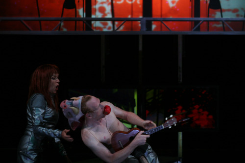
Sanya of the Argos (Kate Valk) encounters dying boar of Carthage (Scott Shepherd)
The entire company, both individually and as an ensemble, was superb, but mezzo-soprano Hai-Ting Chinn as Dido, and bass-baritone and countertenor [sic] Andrew Nolen (Neptune, Jarbas, Ilioneus, Jove, Ghost Chorus, and Kir) were absolutely amazing. Also, the primary three instrumentalists, who worked with a synthesizer keyboard, a Theorbo alternating with a Baroque guitar, and an electric guitar, were augmented on and off throughout the evening by the accordian and tambourine of Kamala Sankaram when this voluptuous and engaging performer wasn’t called on to sing Juno, Mercury, Dido’s sister Anna or the voice of Cupid, representing, if I can remember correctly, just about every female vocal range.
When we returned to the apartment last night and sat down to dinner, Barry chose to play some more unconventional music. His choice was perfectly in sync with what we had just heard in Brooklyn: Luc Ferrari’s “Cycle des Souvenirs“. Just a little night music.
“The Generational: Younger Than Jesus” at New Museum
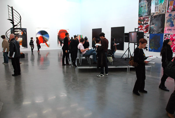
view of the extremely elegant installation on the fourth floor (where I started), showing, from left to right, Loris Gr�aud, Kerstin Br�tsch, Kerstin Br�tsch for DAS INSTITUT (Kerstin Br�tsch and Adele R�der), DAS INSTITUT, Adam Pendleton (two large black canvases), Josh Smith (far right), and James Richards (video installation on the platform)
Josh Smith Large Collage (New Museum) 2009 mixed mediums on panel, each 60″ x 48″ [large detail of 15′ x 28′ installation]
Katerina �ed� It Doesn’t Matter 2005-2007 160 photocopied drawings, dimensions variable [large detail of installation, including two monitors showing four videos]
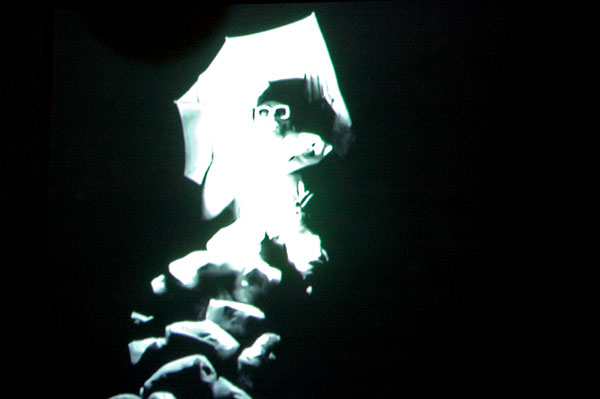
Dineo Seshee Bopape thwebula/ukuthwebula (the process of making someone into a zombie, which is also the same word for photographing someone) 2009 mixed media, dimensions variable [still from video within larger installation]
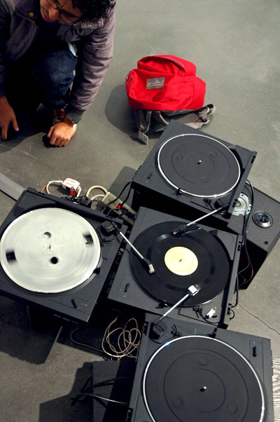
Icaro Zorbar Golden Triangle 2006 4 turntables, disc, and amplifiers [large detail of installation]
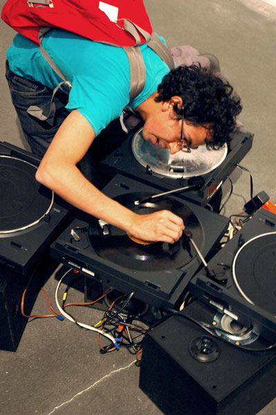
[artist at work]
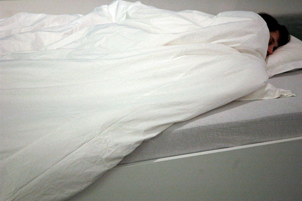
Chu Yun This is XX 2006 female participant, sleeping pill, and bed, dimensions variable [large detail of installation]
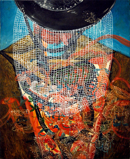
Jakob Julian Ziolkowski Untitled 2007 oil on canvas 15.75″ x 12.5″
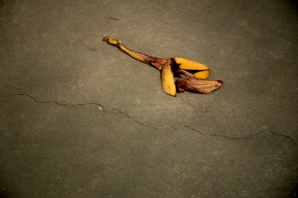
Adriana Lara Installation (banana peel) 2008 [installation view]

Guthrie Lonergan Myspace Intro Playlist 2006 two-channel video, color, sound, 8 min. 13 sec. [large detail of one video channel]
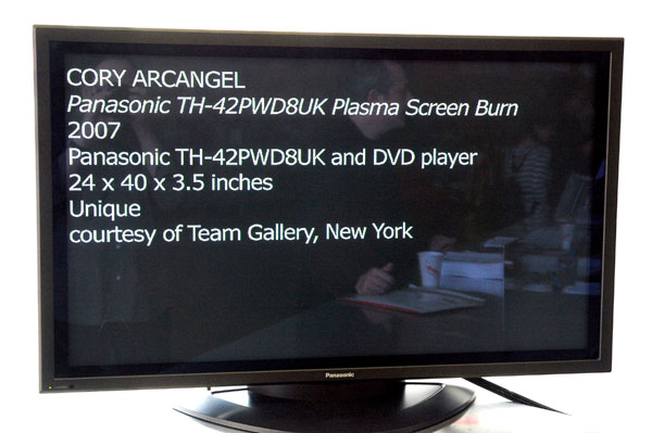
Cory Arcangel Panasonic TH-42PWD8UK Plasma Screen Burn 2007 plasma screen monitor and DVD player 26″ x 41″ x 21″ [view of installation on front counter of Museum]
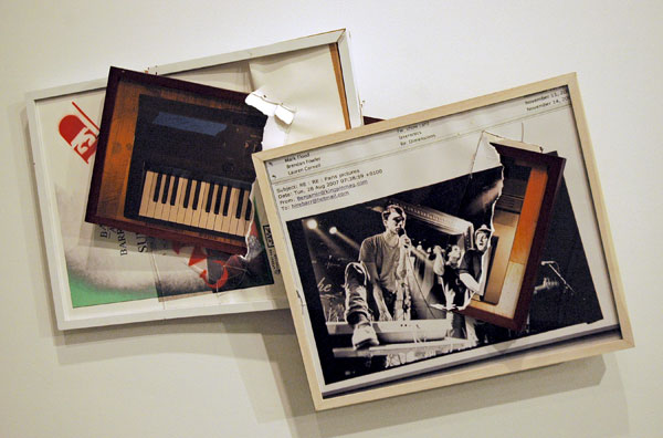
Brendan Fowler Untitled (Spring 2007-Fall 2008) 2009 archival inkjet print, enamel, lightjet photoprint, acrylic and frames [installation view]
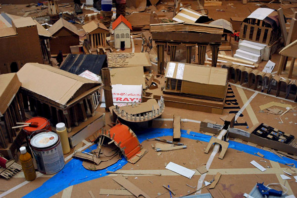
Liz Glynn The 24 Hour Roman Reconstruction Project, or, Building Rome in a Day 2008-2009 24-hour performance and installation with mixed mediums 21′ x 21′ [detail of installation as of 12:30 pm April 7]
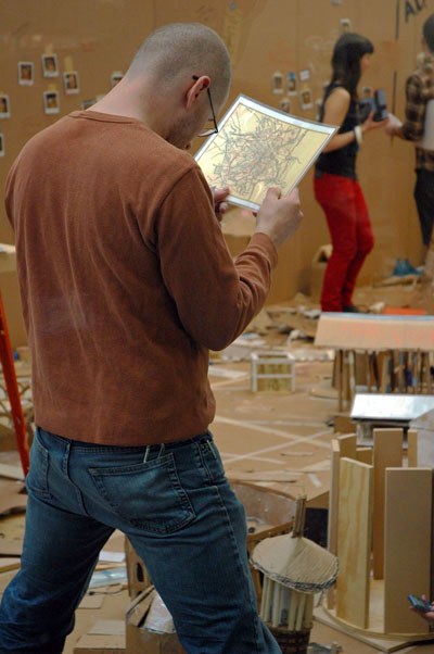
[thumbnails, also taken from the other side of the glass; first, the plan]
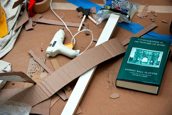
[then, the reference]

[and a closeup of (some of) the builders]
[finally, the aerial advertising]*
The New Museum’s much-anticipated new exhibition, “The Generational: Younger Than Jesus“, opens tomorrow on all four floors of the building. It’s a wonderful, elegant carnival of a show which doesn’t really pretend to represent much more than an accident of birth – in this case, a putative international “generation” of artists who were born around 1980. None of the works installed here ever saw the twentieth century, and many of them joined us just yesterday.
There are some strains running through the rich, heterogeneous catalog assembled by the curators (Lauren Cornell, Massimiliano Gioni, and Laura Hoptman, with Jarrett Gregory, Curatorial Assistant): They include a fascination with obsolescence and the anachronistic; a playful handling of serious issues with an innocence and directness normally confined to childhood; individual identities described by technology as well as the artist’s traditional tools (sometimes both); and the intimacy and anonymity of collaboration.
The images shown here are really just a teaser, representing nothing more than what caught my attention on a hurried run through the show and could be quickly captured by my camera before the press preview ended at noon.
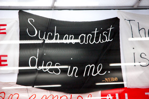
*
Hmmm . . . . Nero himself was only 30 when he succumbed to the effects of an assisted suicide.
JJ PEET at On Stellar Rays
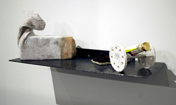
JJ PEET Luxury War Lader Kit 2009 grapes, plaster, sock, brick, aluminum, stolen door knob, steel 8.5″ x 21″ x 9.5″ [installation view]
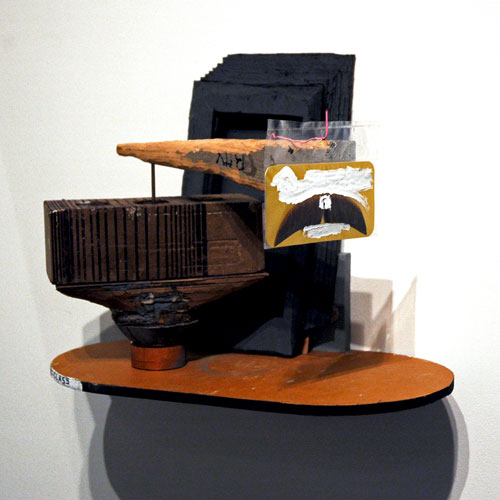
JJ PEET Middle Management Mustache Prize 2009 oak, copper, icepick, cardboard, plaster, brick, pink paper clip, whiteout, chewing gum 13″ x 16″ x 9″ [installation view]
JJ PEET Untitled acrylic and graphite 11″ x 7″ x 1″
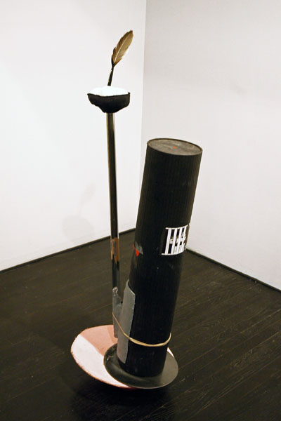
JJ PEET Buoy 2009 cardboard, plaster, sock, foamcore, steel, vulture feather 56″ x 17″ x 15″ [installation view]
Maybe I’d eventually have thought of it on my own, but it was artist Dan Rushton, to whom I was talking at yesterday’s crowded opening of JJ PEET’s “The TV Show” at On Stellar Rays, who brought up the word “surreal” in response to something I had said about the terrific floor and wall sculptures which surrounded us. Not being there long enough to do much more with that adjective, I couldn’t and still can’t say more on the subject, but the reference seemed to provide a warm, familiar place [Breton would be horrified by my adjectives] for the excitement the work had immediately broadcast to me. But if this is surrealism, although it doesn’t look like the same as the higher reality that shook up our grandparents during the inter-war period of the last century, I’m all eyes.
I’m going back.
There’s even more of an excuse for a return visit since these enigmatic pieces are actually only one element in an exhibition which is built around the artist’s own ongoing television program, live and broadcast, and which does or will include during the run of the show a series trailer, reruns, sculpture (subject to alterations), paintings and photographs.
The gallery’s promise:
Central to the exhibition is the weekly presentation of a new TV Show episode, broadcasted live by PEET from The Resistants� local station, and viewable in a TV room in the gallery. The TV Show�s first episode will premiere at the opening reception. Four subsequent episodes will be broadcast live each Saturday at 5pm. Reruns will be on view throughout the week.
Le�n Ferrari and Mira Schendel at MoMA
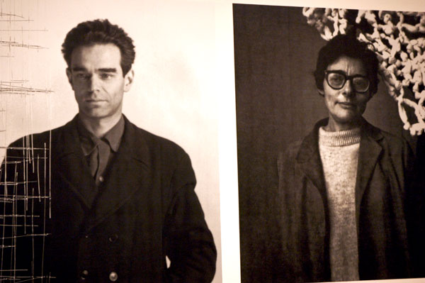
these portraits of Le�n Ferrari and Mira Schendel introduce “Tangled Alphabets”
Schedule complications kept Barry and me from MoMA’s Tuesday press preview of “Tangled Alphabets: Le�n Ferrari and Mira Schendel“, so I missed my only chance to photograph anything in this wonderful show. The only part of the exhibition free to cameras on our visit the next day, during one of the members’ previews, were these two handsome blown-up photographs mounted outside the entrance to the galleries, taken when these South American artists were young. Schendel died in her late sixties, in 1988; Ferrari, almost 90 now, is still working – and still making righteous mischief.
I am very, very sorry I didn’t have a chance to capture and share here some images of Ferrari’s metal sculptures and Schendel’s hanging filaments or transparent papers.
I really recommend the show, and the museum itself has to be commended for mounting a serious exhibition which is, as Barry said when we left the museum on Wednesday, hardly designed as a money-making tourist magnet; being virtually entirely monochromatic, it almost seems to be discouraging traffic.
I was ignorant of both of these artists until I found myself marveling over and over at the beauty, the audacity and the conscience of the works by Ferrari which I saw displayed by several galleries participating in PINTA last November, and before I spotted some stunning drawings by Schendel at Eleven Rivington two months earlier.
The brilliance of the art scene in New York can easily turn us all into provincials. Until visiting “The Geometry of Hope: Latin American Abstract Art from the Patricia Phelps de Cisneros Collection” at the Grey Art Gallery in the fall of 2007 I had probably operated under the assumption that if there were anything to know and value about South American abstraction, as New York sophisticates most likely we already knew it and knew its merits: Any exhibition devoted to the subject would probably be largely a kindness or an exercise in recondite art history.
The Cisneros collection was an eye opener for me, and a lesson for avoiding similar surprises, embarrassments really, in the future.
ADDENDA:
- Roberta Smith works her magic in a review of the show which appeared in today’s New York Times.
- This chronology from the Cecilia de Torres gallery includes some great images of Ferrari’s life and his work.
Xylor Jane at CANADA
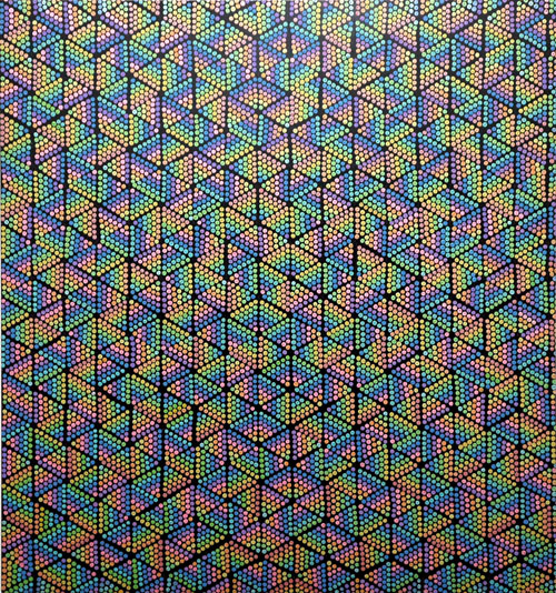
Xylor Jane Bombinating 2009 oil on panel 44″ x 41″
Xylor Jane Tunnel 2008 oil on panel 31″ x 29″
Xylor Jane Gates 2008 oil on panel 53″ x 43″
The dots and numbers seen in the paintings in Xylor Jane’s recently-closed show, “N.D.E.“, at CANADA actually add up (unlike the dots and numbers assembled by what was formerly, and rather quaintly referred to as our “financial system”*). I met the artist when I visited the gallery last weekend, but I think that because I already had a huge respect for the work, I was too intimidated to ask her for details.
The gallery assured me that Jane definitely uses a method in selecting and arranging what might appear to be a random working of digits. My informant admitted that he himself probably hadn’t comprehended it fully when the artist described it, and although he gamely began to explain it (in this case to someone who almost certainly wouldn’t have understood it anyway), we eventually decided to spare each other further embarrassment and I went back to drooling over the art.
I’ve just read the press release again, and I’m still stumped.
I can only say that I don’t think these works could possibly have the power they do, even if you weren’t aware there was some kind of very personal “formula” involved, if they owed their appearance to aesthetics or mathematics alone.
I love these pictures.
*
has everyone seen this? [a graph like this can only work its full magic in a hard copy]
Louise Fishman at Cheim & Read
Louise Fishman Slippery Slope 2006 oil on linen 88″ x 65″
Louise Fishman A Certain Marvelous Thing 2007 oil on linen 38″ x 21″
Louise Fishman Telling 2007 oil on linen 70″ x 56″
Louise Fishman Bottom 2009 oil on jute 10.25″ x 28″
It took me forever to finish this post. This time the problem was with the images, not the poverty of my text. I went to the opening reception of Louise Fishman’s latest exhibition at Cheim & Read on Thursday, but I didn’t bring my camera, since I expected that the crowd would make it difficult for me to step back to get the shots I’d want. I rushed back on Friday, even earlier in the day than Barry and I usually manage to get out of the apartment. I wanted to be able to see the paintings without having to deal with large numbers of people, I wanted to get shots for a post, and I wanted to broadcast my enthusiasm and publish it sooner than later.
When I arrived home that night I started to upload the images, but I was dissatisfied with, or unsure about, the colors I was seeing. I was unable to reconcile what I was looking at with the claims of my memory and what I saw on the gallery’s own site.
I went back on Saturday before visiting some other Chelsea shows, and I stood before the paintings for a few minutes, trying to memorize a few key colors on the few I had selected to capture the day before. It’s Monday evening, and I’m only now getting back to the entry I started several days ago. While I’ve been busy with a lot of other things, I’ve also been feeling anxious about my self-assigned responsibility of representing Fishman’s gorgeous paintings on a computer screen as faithfully as I am able.
I’m regularly frustrated, and humbled, by the difficulty of transferring a worthwhile part of the ordinary/extraordinary experience of being there into the two meager dimensions of a small screen, in spite of all its electronic mojo, but this time I really felt stumped – at least for a while.
In the end I took the bull by the horns and just did it. These photo images are not and could never be exact copies of the art they describe, even if the physical paintings themselves were not as beautiful or as fully physical as Fishman’s certainly are. But I think that they are able to suggest why I believe this is one of the best, if not the best, painting show in town.
The gallery has included work Fishman completed over the past three years. Some of it is clearly related to work she had shown earlier in the century [wow, that usage sounds so weird to someone born in the first half of the last one], but there are some astounding pieces here which seem to break ground in ways which might seem a little crazy to anyone who has only been following her recent career. Fishman has never stood still, and neither have her real admirers.
The gallery has included some of the artist’s small paintings, I think for the first time, and they are fully as strong as her larger works.
I just noticed that for whatever reason, I didn’t manage to get images of any of the more unfamiliar abstractions that I’ve just referred to. But what the heck, it should make a visit to the show, for those able to get there, even more exciting. I seem also to have confined my choices to a strangely-limited pallet: Blue dominates each of these four pieces, but in the gallery itself there are some extravagant yellows and golds, reds and greens, and at least two subdued, but shimmering rainbows, and most of the nineteen or so paintings are in conversation, or confrontation, with black.
qi peng’s conceptual interviews
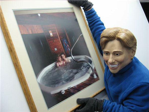
qi, aka “The Art Thief”, disguised as Hillary
institutional critiquing
Artist qi peng’s blog on the Salt Lake City Fine Arts Examiner website includes a number of conversations (which he characterizes, on his own site as part of his conceptual art, that is, “‘interviews’ executed as a form of collaborative portraits”) with artists and art mavens who might be located just about anywhere.
I agree with Ed Winkleman‘s assessment: While the interviews are just one of the reasons to go there, you’ll find some very good talk, notably an astounding exchange with artist William Powhida [hot photo, William], who is guaranteed good company every time. But just before that, you’ll find qi’s “portrait” of the great and generous Winkleman himself.
Peng’s interview with this unworthy fanatic showed up on his site two days ago.
[image from the artist]
“Changing Times” will mean interesting times
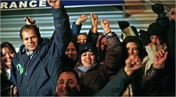
Republic Windows employees celebrate getting everything they asked for, after sit-in
taking over the factory
After writing up my report of what was said by others at last Thursday’s panel at the X Initiative I asked myself what I thought about the question implied in the program’s title: “After the Deluge?; Perspectives on Challenging Times in the Art World”. I’ve decided to continue the discussion I had with myself in this space.
As far as the economy is concerned, I think things are going to get pretty crazy out there, and they may perhaps stay pretty crazy for a long time. In spite of the optimism coming from Washington and in much of the press in the last few days, I still think we’re sliding into another great depression. I’d say they’ve really broken it this time. I’m especially concerned because I’m not hearing anyone who is supposedly in charge really admit it.
If the U.S. population is a little more than 300 million and the total amount of the so-called bailouts and capital infusions remains no more than the estimate of $9.9 trillion published in an article in the Times two months ago (which now may seem a very optimistic assumption), those numbers equate to more than $32,000. for every single American. And yet it may not do the trick. The country, and the whole world, might still collapse into chaos.
Under both best- and the worst-case scenarios, there will be changes in the way we all live.
But let’s put aside the doomsday bugbear; it seems there’s something else going on, and this phenomenon just might turn out to be a good thing. People are not just worse off than they were one year ago, or perhaps eight or even thirty years ago, as we’re now learning. People are mad; they’re *really* mad; and it’s not just about the AIG bonuses. It’s about the selfishness, the greed, the arrogance and the pure stupidity of those who have been given those bonuses, as well as all the other financial tycoons, and their fellow-traveling politicians too. They have together created the disaster which is taking from people their jobs, their savings and their hopes, while mortgaging their future and that of their children with the trillions of dollars stuffed into the pockets of those same tycoons and politicians, in transactions which remain opaque today.
For what it’s worth, we can be sure this debacle won’t look anything like the last one. When things like wars and depressions come back, when historical things are repeated, they actually never do “come back”, and they really never are “repeated”. World War II looked nothing like its almost-equally infamous namesake. We can also be sure that Great Depression II will end up looking nothing like the first one, which seemed to have defined the 20th century almost as much as totalitarianism, genocide and industrial progress.
One thing we do know is that nothing was ever quite the same both during and after the Great Depression. I think there’s a good chance that nothing will survive the current crisis in the same form in which it existed just one year ago, including the current arrangements within the art world. I have no predictions about galleries or other institutions, but the relationship between the artist, the gallery and the public may be altered. It’s probably safe to assume that while some will certainly survive and eventually flourish once again, any space which today we think of as on the leading edge will almost certainly be supplanted in that role by others not yet in business, and the old edge will become the middle ground.
But assuming we don’t end up tearing each other apart over scraps of food, maybe we can look forward to “interesting times” as for artists and the people who love them and what they do. I’ve assembled a far-from-exhaustive list of developments which I think we’re likely to see just ahead of us, if not already. It does not include trends which would seem to be unrelated to the economic depression, like digital experimentation. Also, most are not entirely new concepts or developments, and some of them are already here.
Every artist will finally get a website, including those who have held out because of some idea of principle, and those who have depended on their galleries.
There will be more virtual art, meaning both online work and projects.
We will see an growing trend toward the adoption of “open source, open content and open distribution” (pace Eyebeam).
There will be more interactive work.
Individual artists and groups of artists will be showing work in their studios, art both by themselves and by others.
Artists will organize shows themselves in vacant buildings and storefronts, even if private and public institutions fail to do so.
Some businesses, large and small, will find it useful and rewarding to cooperate with artists in a symbiotic relationship.
A distressed economy will encourage the recognition of the folly, and even counterproductive consequences, of camera prohibitions.
We can expect to see a greater popular documentation of the visual arts, where it doesn’t interfere with its appreciation by others.
We will see more street art and more street performance, both in more inspired forms than ever.
We are sure to see more work that reflects the growing populism abroad in the land today.
And consequently, we will see more socially and politically provocative work (actually, that may be mostly wishful thinking).
But this new art will be subversive (no, I mean really subversive), even if it’s not “Political”.
There will be work which would have been unrecognizable as art, by most people, until now.
And certainly there will be art created in totally new mediums.
But, because of reduced budgets, we can still expect more works on paper and more work using found materials.
Governments and citizens will finally grant artists a status withheld from them until now, recognition as a full and worthy part of society in every way.
It all sounds good to me, but the best thing I’ve heard or read describing the positive things which lie ahead for artists even in our reduced economic circumstances was a piece Holland Cotter wrote for the Times, published February 12, “The Boom Is Over. Long Live the Art!“:
At the same time, if the example of past crises holds true, artists can also take over the factory, make the art industry their own. Collectively and individually they can customize the machinery, alter the modes of distribution, adjust the rate of production to allow for organic growth, for shifts in purpose and direction. They can daydream and concentrate. They can make nothing for a while, or make something and make it wrong, and fail in peace, and start again.
Now if we can all just get through this no-money thing and crawl out the other side in one piece.
[image by E. Jason Wambsgans from the Times via Chicago Tribune and AP]