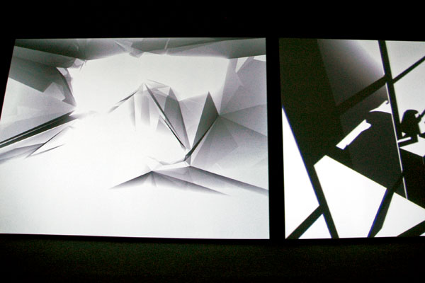
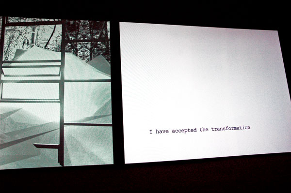
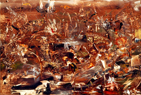
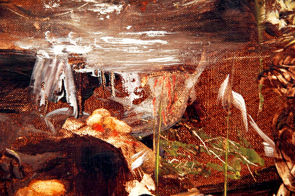
Ann Lislegaard Crystal World (after J.G.Ballard) 2006 two-screen video [two large-detailed stills from the double-screen installation]
Murray Guy is showing two beautiful projected animations by Ann Lislegaard in its space on 17th Street. They’re both seriously conceptual, but the looping double-screen animation, “Crystal World (After J.G. Ballard)”, sections of which are seen in the two images above, is incredibly exquisite to boot.
Aside from its virtues as art, for those who already feel they’re being force-fed a surfeit of holiday color: This frozen minimalist world is the perfect antitoxin.
Category: Culture
Van Johnson: still hidden in the New York Times closet
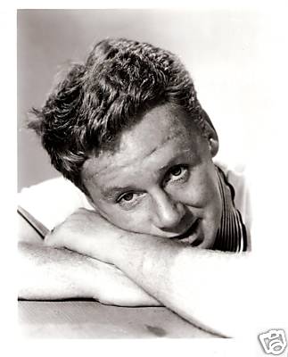
I know it from the very personal relationships the man enjoyed with good friends of mine who regularly hosted this sweet man in their homes. Van Johnson was quite queer, even if he didn’t seem to want it broadcast everywhere.
It’s too bad the obituaries in the NYTimes and other MSM outlets I’ve just looked at on line still seem to think that queer is, well, . . . too disgusting to talk about in public, thus perpetuating the climate of fear and loathing in which Johnson grew up and which continues to waste and destroy lives even today.
ADDENDUM: By way of media corroboration, I just found this copy of a 2004 obituary of Evie Wynn Johnson, the woman the star married in 1947, It appeared in the The Independent.
[image from ioffer]
Larissa Bates at Monya Rowe and LMCC
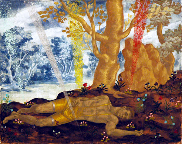
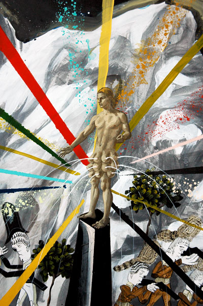
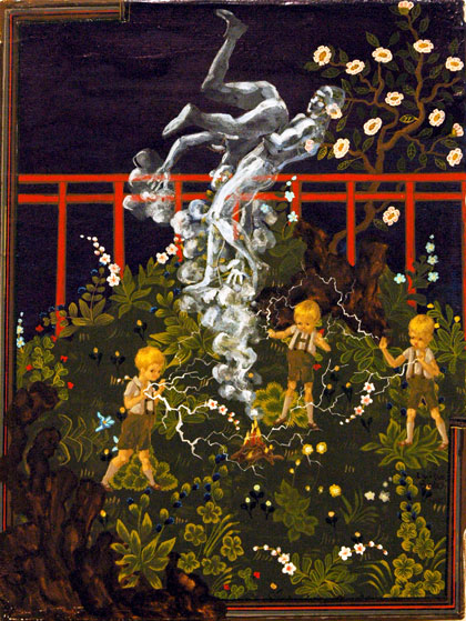
Larissa Bates Sleeping MotherMan with Lazer Beams after Poussin’s Narcissus 2008 acryla gouache on canvas 8″ x 10″
I neglected to post anything about Larissa Bates’s wonderful show at Monya Rowe, “Just Hustle and Muscle”, while it was installed this past September and October. I was reminded of its excitement, and my own failings (just now I was also shocked to find that I have never done a separate post on Bates), when I visited the show of works by the gallery’s artists installed in a new space on 22nd Street. I’ve decided to begin making up for lost time and opportunities.
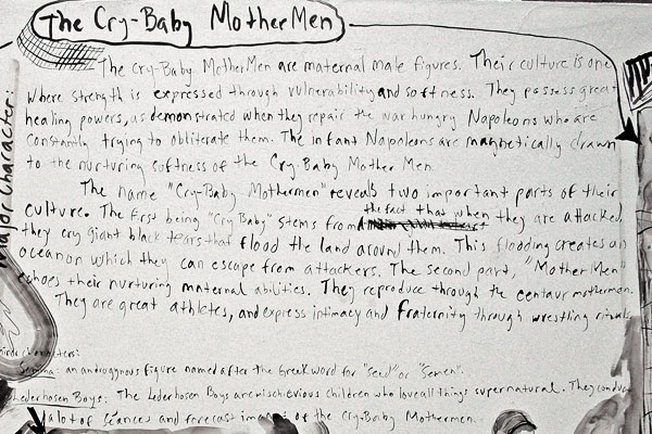
Almost as soon as I started uploading images for this post I realized I had bitten off more than I could chew. Bates’s work had hit me, both alarming and charming me, over a period of several years before I was able to learn much about either her inspirations or her anomalous iconography. Even now, after having seen and read things which provide more narrative context for this very beautiful work, I find that I can’t give a compact written account of what I’ve learned. Instead I’ll show several more images than I had originally planned. They were assembled from visits to several shows at Monya Rowe and one LMCC studio tour. I also can refer the curious to this Beautiful/Decay interview with the artist. They’re all there; The wrestlers, the Cry-Baby MotherMen, the Lederhosen Boys, the Napoleons/Head Honchos and a lot more.
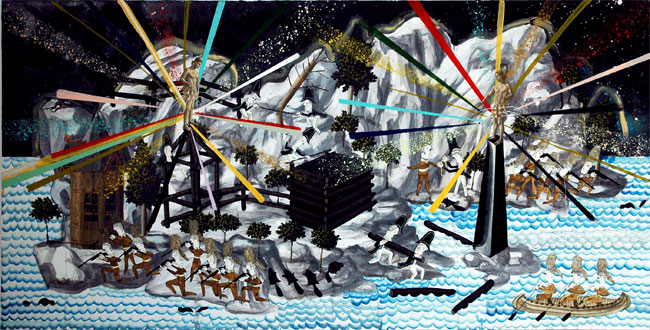
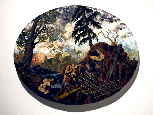
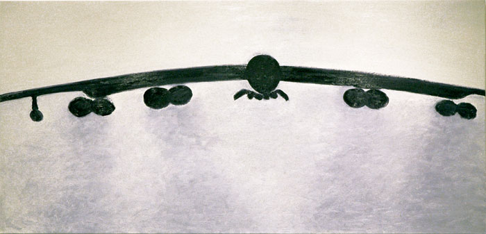
a relatively large piece, from the series “Man Power”, shown in the artist’s LMCC studio in April
[detail]
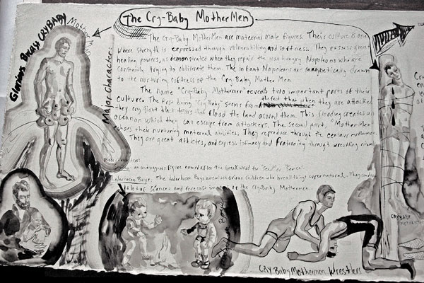
the first of three panels of an instructive legend shown by the artist in her LMCC studio
[detail]
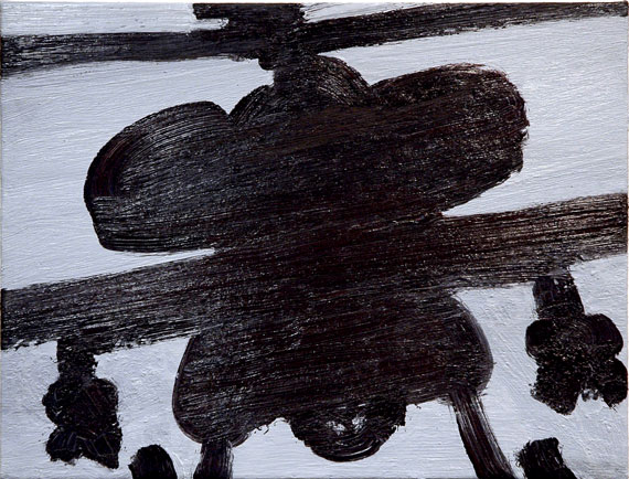
Lederhosen Boys Electric Shock S�ance 2008 acryla gouache and ink on canvas 8″ x 6″
Larissa Bates MotherMen Birthing Scene at Bingham Bluff 2008 acryla gouache and ink on canvas 16″ x 20″ [installation view]

[detail]
Fred Gutzeit at Pocket Utopia
Lee* inside Fred’s work
Fred’s Lee thing** [detail]
Utopia, with Fred’s Lee, and artists
The title of the installation, “Love To Fred From Lee Lozano“, comes from the inscription on a graph-paper notebook given to the artist Fred Gutzeit by Lozano, who died in 1999. Gutzeit used its pages to plot his 60-foot printed mural, its imagery inspired by Lozano’s own work, mounted along one wall of the narrow Bushwick gallery, Pocket Utopia.
If the current show is a generous homage to an artist who had once almost disappeared, Austin Thomas’s remarkable Bushwick space itself is a generous and continuing homage to all those who make art.
Jerry Saltz, in a piece in this week’s New York Magazine headlined, “Art on a Shoestring: That�s where creativity really thrives”, points readers to four Bushwick galleries, including Pocket Utopia, “. . . where you�ll likely be greeted by the ball-of-energy artist known as Austin Thomas, who, in the year and a half she�s been open for business, hasn�t sold a single work to a collector�only to artists.”
It sounds shocking, but it almost doesn’t surprise me. Maybe it’s actually just the way things have come together up to now on Flushing Avenue, but having hung around there from its very beginnings, I can’t think of any words which might better describe the inventive direction and magnanimous motivation of Thomas’s space on Flushing Avenue. Austin is an artist first, and the organic, collective process behind the works which pass through this tenement-building’s former hair salon shop always takes on the aspect of a creative work itself, of artists both individual and collaborative. This kind of sensitivity and generosity is understood and appreciated by artists first.
*
NOTE: The image of Lee Lozano’s face is only fully visible if the side of the viewer’s head is almost touching the mural as it faces toward it from several feet away.
**
the billboard installation inside the gallery
Lisa Sanditz at CRG
Lisa Sanditz Pearl Farm Underwater II 2007 acrylic with pearl on canvas 70″ x 90″ x .75″
Lisa Standitz New Mall in Shoe City IV study 2007 acrylic on paper 18.75″ x 25.5″
I had already started to write this blog this afternopn when I looked it up: Lisa Standitz’s show at CRG has closed already. I was really surprised. Of course I’m now looking back at the ArtCal listing and see that the exhibition had been up since the end of October. But even if I didn’t get to the gallery until a month after that, it still seems weird that it’s no longer there: Damn, and don’t I still miss having the DIA Center located just down the street, with its many-months-long installations of work which was almost always interesting on many levels.
I’m also somewhat abashed, since Sanditz’s paintings on canvas and paper were among the finest I’ve seen this season; I would like to have been able to share my pleasure in them by sending at least a few more people over to 22nd Street with this post. If they haven’t all been snatched up, maybe you can stop by the gallery and ask someone to give you a peek. The large stretched canvases were pretty spectacular, but the smaller, jewel-like works in the second room were just as amazing – and much easier to pull out off a shelf in the back.
The title of the show, “Sock City” threw me off at first since I was thinking of a regular open-air market with that name from years back. Was it the one located on a lot in SoHo next to Tower Records?
I learned however that with this body of work Standitz is continuing with her long term interest in “the various forms in which the marketplace and wilderness intersect, overlap, and inform each other”, according to a very useful press release, only this time she has turned to “the Chinese commercial landscape”. All of the images represent aspects of single-industry towns in China which she visited two winters back. The names of these places reflect the products they produce, and Sanditz’s paintings borrow those names.
It was very, very warm in the gallery that afternoon, and I had almost decided I’d have to leave after taking only a quick look at the first room, when the various elements of these large acrylics started to coalesce, and the abstractions began to sing along with the dramatic shapes of the the buildings and landscapes they revealed.
I ended up staying for some time, and the paintings came with me when I finally left.
Ali Banisadr at Leslie Tonkonow
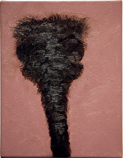
Ali Banisadr untitled (Black 2) 2008 oil on linen 22″ x 32″
[detail]
Ali Banisadr Prisoners of the Sun (TV) 2008 oil on linen 54″ x 72″
Ali Banisadr currently has a show of his latest paintings at Leslie Tonkonow. I can’t throw out enough superlatives about this work, for it attributes, both separately and together, of its great beauty, its extraordinary skill, its staggering concept, and its remarkable genesis.
The beauty is dazzling; the skill is only fully evident upon closer examination of the small images on these canvases, when it can be seen that they are composed of what are essentially abstract paint strokes and not really figures; the concept behind their splendor is that they represent (and not quite hide) some pretty horrible scenes of human cruelty; their genesis begins with the artist’s childhood in war-time Iran.
The gallery press release has much more:
[the paintings] combine stylistic idioms from the history of western art with references to Persian miniature painting. Underlying the seductive beauty of Banisadr�s richly interwoven imagery is the apocalyptic nature of his subject matter. In these works, memory and history collide, inspired by his childhood recollections of the Iran-Iraq War.
“Signs of Change” at EXIT ART

“No Border Camps” members dramatize how goods cross borders freely, people don’t (1998)
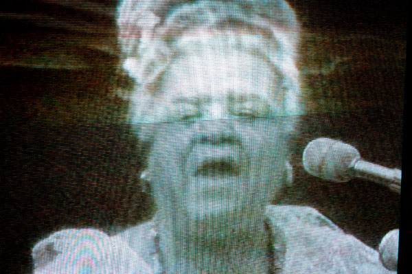
Queen Mother Moore radicalizing much younger Green Haven Prison inmates in 1973
Barry and I spent almost two hours at the current Exit Art show, “Signs of Change: Social Movement Cultures 1960s to Now“, on what may have been our last beautiful late fall Saturday afternoon. Let me just explain that it was several times more compelling than even this old activist had expected. I’ll add this caution: It closes at the end of the week, on December 6th.
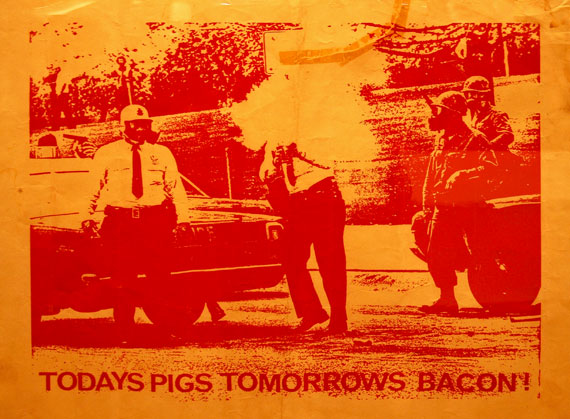
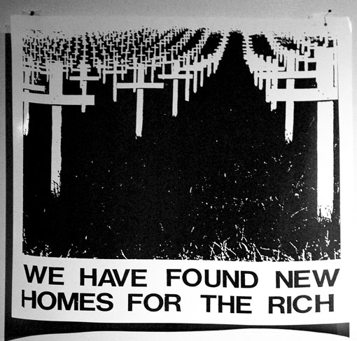
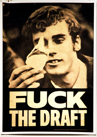
There are colorful posters, photographs, broadsheets, banners, sound documentations and videos. In addition to the two images above I can show captures of a small selection of some of the more provocative posters below. I’m including only minimal captions since a proper context for the posters generally requires more information than I can supply here.
The single greatest thing about the show may be less its lavish size than its enormous geographical compass. It covers modern social movements just about everywhere on the planet. The video documentaries are particularly intense.
So I hope this short tease works. If you read this blog with any frequency you probably should see this exhibition, especially if you’re the sort who is inclined to muck about in the street, or maybe especially if you’re not yet that sort. Tell your friends, in any event.
I suppose it was not part of the project’s scope, but I noticed that there were virtually no artifacts in the exhibition which were not printed, that is, there were no hand-made “signs of change”. And I’m sure that anyone looking for specific content could find something to say about the curatorial choices, but after I left this rather dense survey of the use of art in social movements I recalled that I had seen very little material devoted to AIDS or homosexuality. That really surprised me, as it’s not as if these two issues, AIDS in particular, did not attract artists of all kinds, or that their response had no aesthetic resonance.
anonymous poster from the 1970s
poster using cover from 1980s UK newspaper, Class War
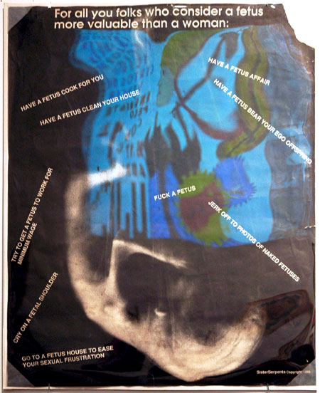
poster from Chicago feminist collective, “SisterSerpents” (1989) [blue is a reflection on plexi]
poster from “Dirty Linen Corp” (1969)

1970 poster from Amsterdam absurdist theatrical party, “Kabouterbeweging” [gnome movement]
Eyal Danieli at Elizabeth Harris
Eyal Danieli Some of my Best Friends #5 2008 oil on linen 14″ x 18″
We’re big admirers of Eyal Danieli‘s work so I guess it was because we were out of the city and otherwise pretty distracted during the run of his fall show, “In the Mood for Love“, at Elizabeth Harris that we very nearly missed it. I can’t explain in any other way why we were reduced to arranging with the gallery via a weekend email to see the exhibition after it had officially closed, but so it was that Barry and I found ourselves visiting the gallery early on a recent Tuesday – beyond the last minute, but just in time.
We weren’t disappointed. The beautiful installation managed to draw on all of the powerful themes Danieli has been pursuing in his work for years, but it also included some newer subjects and introduced one large-ish canvas, “Locate the Arab, Identify the Jew”, whose style seemed to suggest an opening onto a new body of work. But maybe not.
These paintings come with music, but maybe that’s just me. Sure, I’m listening to a recording of Wagner’s “G�tterd�mmerung” right now, but that’s just happenstance; they would furnish their own without any help.
I shiver with both delight and horror each time I look at these troublesomely “awesome”, nearly-abstracted helicopters and bombers. I’m attracted to the texture and color of the oil and repelled by the terror represented by the outlines. Then, if try to get more comfortable with the other canvases, fragmented-text paintings and softer human or animal shapes representing the world below the killing machines, I don’t find relief: I’m still almost afraid to get too close.
Eyal Danieli In the Mood for Love 5 2008 oil on linen 38″ x 80″
Eyal Danieli Are You Looking at Me? 2008 oil on canvas 10″ x 8″
ADDENDUM: Element Editions has just released an edition of 16 unique (hand colored) prints by Danieli. They are available for $450. See Bloggy‘s post for an image and a link to the order page of this artist-run print-making studio.
Derick Melander in ADA Gallery project at SCOPE
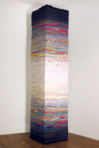
Derick Melander Flesh of My Flesh 2008 fabric 2′ x 2′ x 10′ [installation view]
We won’t be in Miami this week, although we’re finding more and more reasons to regret the decision. The news that a Derick Melander sculpture will be prominently represented at one of the fairs is only the latest. The artist has created a new piece for Richmond’s ADA Gallery and it will be exhibited as a Special Project at SCOPE from December 3rd through the 7th.
It’s a tall column made up of carefully folded and stacked second-hand clothing. Each layer is categorized by its relative color value, with the darkest placed at the bottom and the top of the stack, each transitioning to white. The title, “Flesh of My Flesh”, is pulled from the script exposed at the fold of a found t-shirt located somewhere in the center.
I’ve been a big fan of Melander’s work for years, and while I haven’t actually seen this new piece except in the form of the photo above, it looks pretty spectacular from here.
[image from the artist]
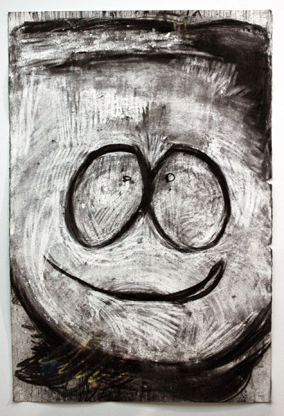
Joyce Pensato at Petzel
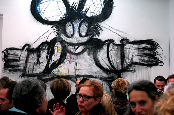
large detail of “Welcome” as it appeared at the opening reception
It’s the show I’ve been waiting for all year: On Friday Friedrich Petzel unveiled an exhibition of Joyce Pensato’s works on, and through, paper (and paper wallboard). It’s her second solo exhibition at the gallery. The 22nd Street debut of the expressionist “Eraser” last winter was a terrific show of exciting, drippy works on canvas. but I said then that I had always thought it was her inspired, frenzied, even violent encounters with paper that really got me off.
I also wrote then how much I liked seeing the beginnings of subtle bits of color in some of the paintings. Some of the drawings in the current show continue this exploration, at least one with an extraordinary vigor which makes the spectrum look like something Pensato had just invented on her own.
Finally, a word on the success of the giant and “engaging” characters portrayed in large wall murals installed at either end of the large room. Pensato has found a way to envelop (ensnare?) within her wacky, yet scary, but somehow always weirdly genial world both the kind of huge crowd which flooded the gallery during the opening reception and any smaller number of visitors wandering in on an ordinary day. I’ve now seen the show in both circumstances, and it worked perfectly each time.
I’ve uploaded images of three of the works below.
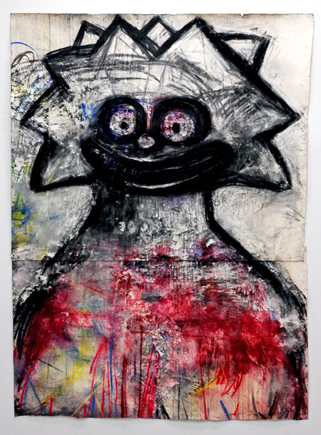
Joyce Pensato Lisa 2008 charcoal and pastel on paper 99″ x 72″ [installation view]
[detail]
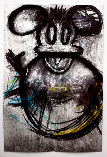
Joyce Pensato Duck-Mouse 2008 charcoal and pastel on paper 59.5″ x 40″ [installation view]

[detail]
Joyce Pensato Kyle 2008 charcoal and pastel on paper 59.5″ x 40″ [installation view]