David Byrne bike racks only temporary

David_Byrne_bicycle_rack_Chelsea.gif
hanging out with the man in Chelsea, but only for a bit

We still don’t have our Second Avenue subway or public toilets, despite promises going back decades, or almost a century in the case of the subway, but it didn’t take long to see the colorful and varied site-specific shapes of David Byrne’s bike racks pop up around the city. Hooray for David – and for all bikes and bikers! Now, if we hope to save the streets for people, we just have to figure out how to secure these wonderful machines from thieves.
I saw this particular grouping last Friday on West 25th Street, in the midst of the Chelsea gallery neighborhood. I like the friendly or family mix of cute bikes.
Wait, wait! I wrote those two paragraphs before I had looked for a link to use with this post and only just now did I see in the NYTimes story that the racks will only be installed for 364 days. That’s bunk!

The nine racks will be removed about 11 months from now; they were made of durable materials but are intended as temporary public art, not a permanent installation. (A temporary art project cannot remain on public land indefinitely without approval by the city’s Public Design Commission.) Mr. Byrne arranged to have the racks fabricated and hopes to have the chance to sell them, eventually, as works of art.

Once again it seems that in New York money “trumps” (choice of word is deliberate) both art and the public good.

Hrag Vartanian’s “Re:Public” bows on ArtCal Zine

Poster_Boy_Aakash_Nihalani_horse.jpg
Poster Boy & Aakash Nihalani collaboration (2008 collage on subway car floor)

Hrag Vartanian has written a terrific debut piece for his column, “Re:Public”, which will be appearing regularly in the Zine section of ArtCal.
The subject of his series will be street art, most of it found in New York, most of it of the moment. Today, in “Masters of the Ephemeral” Vartanian writes about and includes images of work by Poster Boy, Aakash Nihalani and the Poster Boy/Aakash Nihalani collaboration.
Vartanian’s own excellent site should already be on the feed of anyone interested in the art and ideas of our time.

[image from Poster Boy’s Flickr site]

Mary Heilmann at WACK!

Mary_Heilmann_First_Vent.jpg
Mary Heilmann The First Vent 1972 acrylic with bronze powder on canvas 20″ x 32″

I found a lot of treasures in the “WACK! Art and the Feminist Revolution” show when it made its stop at at PS1 last spring. Maybe I’m stuck on her aesthetic, but Mary Heilmann‘s work, not surprisingly, looked to me like some of the freshest and most beautiful things to be found on the two large floors of galleries.
Besides, it really lightened up my week as I going back over some of the images I had wanted to post much earlier, and after my last few entries it looked like I needed some light. This acrylic was done back in 1972, when all we had to worry about was Nam and the bomb.
After another look at Heilmann’s painting and its title, while finishing the two paragraphs above I realized that the idea of the representation of ventilator screens of any kind started to possess me, as it had more than once before. I remembered Doug Wada, who has used quite plain vents as the subject of a number of his trompe d’oeil paintings, in addition to this somewhat-less-generic A/C screen, but I know there are many others out there. Who can’t use more ventilation, even if only imagined? This thing probably started with the Romans, where the tradition continues.

NADA’s County Affair

NADA_County_Affair_crowd.jpg
artists and curators, barkers and rubes hanging out on 27th Street yesterday afternoon

Jacques_Louis_Vidal_Gamble.jpg
the purgatory section of Jacques Louis Ramon Vidal‘s sideshow/funhouse “The Gamble of Life”,

Color_Wheel_and_Museum_Miniature.jpg
Color Wheel performs in front of the Museum of Miniature Art‘s table

BOBO_Foxy.jpg
Bobo’s on 27th“, installed inside Foxy Production, linked seamlessly to the street outside the door [image includes artist/co-curator Nick Payne, center, via iChat from Bobo’s on 9th in Philadelphia]

Powhida_Townsend_lemonade.jpg
Jade Townsend and William Powhida sold their own “lemonade n’ shit” all afternoon

Little_Cakes_Turtle_Club.jpg
Little Cakes had an extremely focused bake sale benefit for the medical expenses of two abandoned and rescued turtles; these stand-in beauties were very, very tasty

I captured a few, too few, scenes yesterday at “NADA’s County Affair“. The good old hot time available on West 27th Street wasn’t just the work of the weather: If every art fair exhibited the kind of creativity, energy and fun at large (and small) on those ancient paving stones yesterday, the organizers would have to ration the public’s access with prepaid time slots.

Louise Fishman’s “Angry Paintings”

Louise_Fishman_Angry_Louise.jpg
Louise Fishman Angry Louise 1973 acrylic, charcoal and pencil on paper 26.5″ x 40.25″

Louise_Fishman_Angry_Bianca.jpg
Louise Fishman Angry Bianca 1973 acrylic on paper 26.5″ x 40.25″

Louise_Fishman_Angry_Bertha.jpg
Louise Fishman Angry Bertha 1973 acrylic on paper 26.5″ x 40.25″

I captured these installation images during a visit Barry and I made to PS1 in May, on one of the last days during which the museum hosted the historical show of feminist art focused on the 1970’s, “WACK!: Art and the Feminist Revolution”. We had eagerly acquired the book long before the show opened in New York; I have no idea why we waited so long to get to the show itself.
It was even more exciting than we had expected, and one of the biggest thrills for both of us was the opportunity of seeing Louise Fishman‘s 1973 seminal piece, “Angry Paintings”. We had heard about it/them almost from the time we met the artist eight years ago and came to know her work, but we had never seen even a representation of any of the 27 dramatic medium-sized works on paper. At PS1 they were shown as they should be, in one installation and on a dedicated wall.
While these remarkable sheets of paper look fresh enough to have been made last month, they could and should be in permanent exhibition in a major museum already. They’re gorgeous, but they’re also as “angry” as they ever were.
Fishman had begun her career as an abstract expressionist working with acrylics on canvas, but by the 70’s she was experimenting with forms only remotely related to traditional painting. Like many of her contemporaries in the flourishing women’s movement she had began to create forms related to traditional “women’s work”. No samplers or scarfs, but rather peculiarly-muscular abstractions “drawn” through sewing, weaving or stitching, sometimes twisting or cutting canvas and other materials, often thin, soft, unstretched cloth. Paper was next.
In a 2004 essay, “Vitruvian Woman”, David Deitcher wrote about the artist:

Unable to see how her paintings could speak to the social upheaval of the early 1970s, Fishman gave up painting and embarked on a period of experimentation . . . . [But] Fishman maintains that she felt “jealous of the writers’ camaraderie [of many within the radical feminist group Redstockings], of their ability to write doctrine and keep journals.” In 1973, she gave poetic shape to those longings, and to the anger and frustration that accompanied them, in a series of forceful paintings on paper that were dominated by the word “ANGRY,” which Fishman followed with the given name of one or more women she either knew directly or knew about.
. . . .
Responding to the boldness of these text paintings, [the academic and critic Catherine Lord] maintains that “the ‘Angry Paintings,’ with their confusion of letters and color, their overlays of slashes and loops, their fields of muddied pigment, their rough edges and archaeological slices, were Fishman’s route home. The choices she would follow in her later work are almost all prefigured here. It may fairly be said that the explosions recorded in the series enabled Louise Fishman to return to painting.” However, it would take Fishman another five years before she would again take up painting on stretched canvas; and almost three decades before she would finally claim as her own the daily practice of monumental gestural abstraction.

We feel very privileged to be here in time to see it.

Louise_Fishman_Angry_Paintings.jpg
[installation]

“Home Delivery” at MoMA seems to miss the point

Home_Delivery_yard.jpg
there goes the neighborhood (single-family houses visit midtown)

How many more suburban mini-estates do we really need? How many more can we bear?
It was a long time ago, and the details are a bit hazy, but I’m sure that my first love was the art of architecture and all its wonderful works. I remember the shapes and structural details of every room and every back yard in which I found myself as a very young child, even those I knew when I was barely able to walk, and Frank Lloyd Wright was my first artistic hero (well, I did grow up in the plains of the Midwest).
To this day architecture is second to none among my passions, and it’s a long list.
And so it was that on Tuesday I found myself getting up at the crack of dawn in order not to miss the press preview for the Museum of Modern Art’s new architecture show, “Home Delivery: Fabricating the Modern Dwelling”. In truth, Barry and I got there just after 11:30, but that’s an exceptionally early hour for either of us to be abroad, and we were just in time to hear the group addressed by Barry Bergdoll, the museum’s new Chief Curator of Architecture and Design. I had already noted his intriguing bio, and that was another incentive to make it up to 53rd Street that morning.
The show is fascinating, at least as much for a historical survey as for a review of the latest innovations. On Tuesday we were whisked out by one o’clock. There was hardly enough time to learn more than that I have to go back for more; this post isn’t a review, by any means. I was also excited enough about the show to buy the catalog on my way out, and I already know that it’s going to make me want to know more.
But I confess to one serious misgiving about the show.
In a world whose population is exploding, whose natural environment is threatened and whose resources are diminishing (including especially the resources which have supported cheap transportation of all forms), it would seem to me that if a modern museum’s show about architecture is focused almost entirely on free-standing private dwelling units, regardless of all the sexy bits about computer design, pre- or modularly-fabricated structures, and revolutionary ecological breakthroughs, it is at least half-dead in the water already and unlikely to be remembered as a landmark achievement by any future generation.
The American model of single-family homes, occupying plots of land preferably as large and as isolated as possible, is an exception elsewhere in the world, and it is about to become obsolete here as well. This ideal could only have been realized on a rich underpopulated continent. This bountiful wilderness was “tamed” by people who had learned everything they would need to know to satisfy their remarkable misanthropic compulsions from the genius generated by the far more amalgamated civilizations, mostly of Europe and Asia, from which they had fled.
To this day the average American disdains apartment living and in fact virtually any kind of shared space. We don’t really like each other very much. We don’t like living near other people and we don’t like traveling with them either. We must have our own houses and our own cars; except for those of us who already live with and thrive with them, we almost universally loathe the idea of apartment buildings and all forms of public transportation. Most of us don’t even want to share a free-standing house (regardless of how large it is and how big the home spread) with relatives not part of our own nuclear family, and even within these families we insist on having our own separate rooms; we also want our own cars, beginning at age 16, and until now these vehicles had to be big (trucks, really) even if we didn’t intend to take anyone else along for the ride. We basically want to be alone, and in both our hankering and the reality we’ve achieved, we really are alone.
We deserve to be by ourselves and we can afford it, or so most of us have been thinking until at least recently.
With its new architectural design show, “Home Delivery”, MoMA seems to have received the wrong delivery, since in spite of the fascination of both its subject and the attractions of its installations, its fundamental focus on the single-family dwelling is the same as that identified with the mid-century modern age which produced many of the historical projects to which it gives homage. For New York it was an age dominated in popular projects by the problematic vision of Robert Moses, and we know now that the salad days of the profligate suburban American “ranch” (in whatever style or pastiche) are finally over, everywhere.
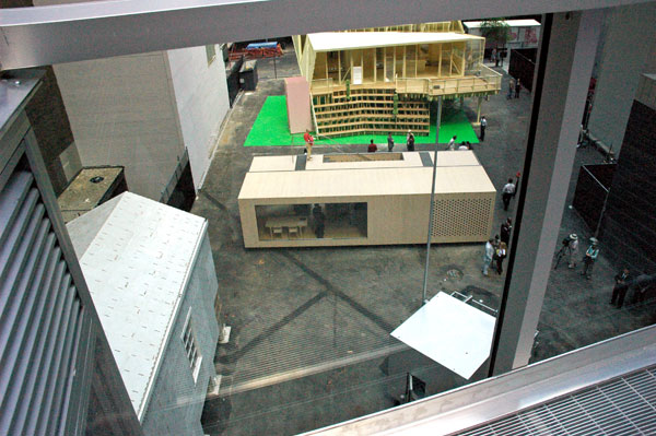
Five temporary, very different “model homes” have been erected on a vacant lot just west of the museum; while each of them is a delight to read about and explore, only a single structure (with the possibility of one other) has been designed so it could be a part of a multiple-dwelling structure.
Frank Lloyd Wright didn’t have any use for apartment living either, but in fairness I would say that when he was born in 1867 there was still a real American frontier and both Europeans and Americans were marveling, even then sometimes in very different ways, at what seemed to be the unlimited possibilities of an industrial age. Also, in the mid-nineteenth century the world’s population was only about one sixth that of today’s figure of 6.7 billion, and the projection for 2050 is for close to ten billion. If we haven’t learned to live in sophisticated multiple dwellings by then, those who have somehow managed to survive are likely to be sheltering inside mud huts.

ADDENDUM: I may be reading too much into its significance, but the architects involved in the design of the full-scale, free-standing houses are almost all Americans.
Except for the special case of the very cool “micro compact home” of Horden Cherry Lee Architects/ Haack + H�pfner Architects (U.K. and Germany), and the elegant and very flexible solution called System3 by Oskar Leo Kaufmann and Albert R�f (Austria), all of the projects in MoMA’s vacant lot were by architects who appear to be based in the U.S.
The office of Kaufman and R�f is located in the pretty Voralberg town of Dornbirn, in the center of an Alpine province not known for population density.
Construction geeks of all kinds will want to watch the stop-time video I just came across on Treehugger showing the assembly of System3 inside MoMA’s back yard. The “module” arrived on 54th Street in a single Hapag-LLoyd shipping container and was assembled in one long morning.

Bruce Connor (1933-2008)

ConnorBruce.jpg
Bruce Conner Untitled 1960 mixed media, pearls, nylon, mesh, wire, etc. 20″ x 24.5″ x 2.5″

I included this image in the first post I did about work I’d seen at the 2005 Armory Show. I remember how excited I was at the time, particularly as I had known nothing (or thought I knew nothing, since I had actually experienced his art for years) about Bruce Connor before I came across this piece, and he certainly wasn’t newly-arrived on the scene. My excitement continues, sadly mixed with the news that Connor died on Monday at his home in San Francisco.

Joseph Hart’s “Fragments”

Joseph_Hart_Fragments_constellations.jpg
Joseph Hart Vija No. 9 2007 acrylic on paper 22″ x 30″

Some time ago I wrote about a show of Forth Estate prints at Klaus von Nichtssagend, and I included an image of a work by Joseph Hart. Of course I did an on-line search at the time for more of the artist’s work and really liked what I found. This was no surprise, considering my respect for the Williamsburg gallery, and the company the print shared.
I missed the solo show of collage work which Hart had in the Freight + Volume project space last year, so I was doubly happy to come across an announcement of the publication of “Fragments”, a beautiful new limited edition book of his work, some of which appears to have been in that show. I decided to include one of the images here. I chose it for its breathtaking beauty, even if it seems to be in a style and form a bit different from most of the work I’ve seen.
Hart appears to be interested in systems and the way all the stuff we’re surrounded by is presented to us. This includes our historical and cultural values, science and art no less than all the rest. Investigating the simplest or most complex given or invented artifact, on virtually any scale, he ends up creating living, organic “museums” with his own diagrams and maps, every one of an astounding beauty.
The publisher is San Francisco’s Seems Books, and more pages can be seen on their site.
Wow, I just noticed they also have a book of Mike Par� work!

Christopher Brooks’s studio

Christopher_Brooks_black_snowman.jpg
Christopher_Brooks_black_and.jpg
Christopher_Brooks_black_bar.jpg
Christopher_Brooks_busy.jpg
Christopher_Brooks_white_exclamation.jpg
Christopher_Brooks_pretty_white.jpg

Barry and I were in Christopher Brooks’s studio last week. Unfortunately the images I’ve uploaded here can only begin to describe the work we saw. They start with a black enamel panel which is related to the two pieces we saw at Audiello one month ago and they finish with a very recent work, a shiny panel which is (almost) completely white – at least for now, since the artist is probably not finished with it yet.
You will get an indication from these pictures that we saw a large range of work, stretching even in these shots from extraordinarily minimal painted panels to some whose compositions were almost shockingly busy (for Brooks) with both applied and painted figures and shapes, as well as his characteristic broken or layered surfaces. I think everything we saw had that subtle element of collage that I’ve associated with Brooks’s paintings all along. Some of the pieces we saw had been completed years ago, but a seductive line running through all of the work showed it was all clearly the creation of an independent artist who knows what he wants to do and does it very well.
The images on Brooks’s own site represent a creative period of twelve years and they are very good. Because of that I first hesitated to put up any of the shots I came home with from our visit, but even a professional jpeg isn’t always enough to describe a painting or a sculpture. I think that sometimes an informal installation or studio shot can add a lot to reproducing the image of a painting or sculpture, although there’s no substitute for being able to stand in front of it. There’s also the additional dimension which any kind of editing can bring to the work, and if the photographer is excited about the art images captured more or less impulsively may sometimes do it better service than formal, abstracted shots which present it only straight on, an approach we don’t even use when we’re able to actually be there.
I’ve also noticed that the straight images on both Brooks’s site and my own can represent almost nothing of the excitement of the three-dimensional quality of the surfaces of these particular paintings, and because of the deliberate, rich reflective qualities many of them exhibit, they may just look wrong given conventional studio treatment. In the end I suppose I just wanted an excuse to show more of them, and my computer skills are too modest to work with the images on his Flash site. I was excited, and I hope some visitors to this blog will be as well.