the “war on terror” has reduced us to slaves

Batty_Roy_dove.jpg
Roy Batty‘s epiphany

Last night I spent far too much time worrying about how to express the depth of my broader frustration and despair before posting the latest version of my regular fulminations over Guantanamo. I should have waited until this morning, when I opened Newsday, and read John Anderson’s review of the “Blade Runner: The Final Cut”.
Anderson ends his report on what is billed as the director Ridley Scott’s definitive version of the dark 1982 classic with this:

One of the its more chilling moments foreshadows our current climate with a kind of clairvoyance.
“Quite an experience to live in fear,” says Rutger Hauer’s rampaging Replicant, for whom we have no small amount of sympathy. “That’s what it’s like to be a slave.” Here, “Blade Runner” not only foreshadows a post-industrial world, but seems to critique the post-9/11 world as well.

[image from cogeco]

second annual New York Art Book Fair

Lyon_Noah_paper_mural.jpg
Noah Lyon‘s print mural, wrapped around a wall above his colorful booth

Slavs_%26_Tartars_fric.jpg
Slavs & Tatars poster (“the money, it’s not so smart, says the Tajik guy”)

Soiled_Mattress_and_Springs.jpg
Soiled Mattress and the Springs, sounding here more hardcore than laid-back, accompanied by Matthew Thurber’s drawings

I know the images above may not seem to represent the primary focus of the New York Art Book Fair, but even under ideal circumstances I find it very difficult to get an interesting photograph of a book. Representing both a challenge and an obstacle, last weekend’s covered market, had thousands of them. Spread over two floors of the old Dia space in Chelsea, every book demanded a look or a reading and, in some cases, even a hearing. There was also the challenge an excited crowd can present to any attempt at photo documentation (or vice versa).
Incidentally the creators of work shown in all three images actually were hawking books of some kind. Lyon was showing his own beautiful printed and handmade volumes in addition to his work in other media; the Moscow collaborative, Slavs & Tatars, displayed books, posters and T-shirts, all of which were reminders of the rest of the world’s ignorance and long neglect of the richness of a multicultural Eurasia; and the the punk/lounge trio Soiled Mattress and the Springs were invited to help launch the new arts magazine, ANP Quarterly.
I’ve decided that art book fairs are even more exhausting than straight art fairs: I’m sure it has almost everything to do with what the crowded, small-scale displays can do to the eyes and the head.
But nothing will keep us away from another incarnation of this one. Barry and I saw some great stuff, met some wonderful people (books, art, a little music and the people who love those things – what’s not to like?), went home with a few goodies – and an even longer wish list – and had at least as much fun as we did last year, at the first appearance of the fair, which was created and run by Printed Matter.

Michael Cline at Daniel Reich

Cline_Michael_Picket.jpg
Michael Cline Picket 2007 oil on linen 62″ x 36″
Cline_Michael_Picket_detail.jpg
[detail]

In time, Michael Cline’s jaw-dropping show of oils at Daniel Reich, “Folks”, may be recorded as a cultural benchmark, both aesthetic and social, for offering us such a peculiar and powerful window onto the darker and neglected side of this urban moment. It certainly will not be forgotten by those who experience the paintings.
These sacred/profane altarpieces go where the photographer’s art cannot.

Mark Stillwell at Front Room

Stillwell_Mark_golden.jpg
Stillwell_Mark_white.jpg
Mark Stillwell Super Defense Force [two details of the installation]

The current show at Front Room, Mark Stillwell’s “Super Defense Force“, seems like a perfect fit for the post 9/11 U.S. mindset. The theme runs something like terror as escapism (incorporating “escape” in every sense), except that the diorama inside the Williamsburg gallery space is both comical and thought-provoking; there is no comedy and no thinking inside the continuing fantasy world of “the war on terror”.
The gallery describes the installation, which marks the artist’s first solo show in its Williamsburg space, in this excerpt from the press release:

Stillwell, known for his room-sized installations of urban landscapes under figurative and literal siege, converts the gallery into an overwhelming cityscape installation overrun by gargantuan monsters. Stillwell uses painted and reclaimed packaging, byproducts of the over-consuming society he portrays, in this scene of terror. Crowds of paper cut-out citizens run screaming from the devastation and hostile creatures that are overtaking the city.
. . . . The Coney Island-like setting in “The Super Defense Force” is used to contrast apocalyptic anxieties, militarism, and the proliferation of luxury condos against a backdrop of carnival escapism.

On the gallery site itself there are a number of more helpful and seductive still images, and a video with a moving, monster’s-eye view of the set.

Andrew MacDonald in Front Room Banner Project

MacDonald_Andrew_banner_white.jpg
MacDonald_Andrew_banner_color.jpg

It seems everybody loves a banner, these days probably more than ever, and the Williamsburg gallery Front Room has been inspired by their popularity to commission works by a number of artists over the years. The current installation is by Andrew MacDonald.
I saw only the more minimal side of the piece as I entered the gallery to see the Mark Stillwell show, but I loved it. It suggested the warmth and elegance of a thick white heirloom quilt, but at the same time it obviously wasn’t taking itself too seriously. Only on my way out did I see the other face, and in the late-afternoon light the colored curves of the grommeted squares seemed to be dancing inside the fringe of pom-poms they shared with the surface I had seen first.
It made me smile.

“Death & Love in Modern Times” at Dinter

Horner_George_Skull.jpg
George Horner Skull 2006 acrylic, gesso, silkscreen ink and whiskey on canvas 35″ x 29″ [installation view]

Van_Slick_Valaire_Stop_Making_Eyes_.jpg
Valaire Van Slick
Stop making eyes at me,
I’ll stop making eyes at you
And what it is that surprises me
is that I don’t really want you to

2006 acrylic, industrial enamel, clear-coat and glitter on canvas 30″ x 40″

TABOO%21_Tashjian_Stephen_Skull.jpg
TABOO! Stephen Tashjian Skull #2 and Skull #1 each 2007 acrylic and iridescent glitter on handmade paper from India 12″ x 9″ [installation view]

Lopez-Rocha_Tomas_La_Flaca.jpg
Tomas Lopez-Rocha La Flaca 2007 mixed media on canvas 14″ x 11″

Lopez-Rocha_Tomas_Dia_de_Muertos.jpg
Tomas Lopez-Rocha Dia de Muertos 2007 mixed media on canvas 14″ x 11″

Under normal circumstances things skull-like hold absolutely no fascination for me, but Dinter Fine Art’s current show, “Death & Love in Modern Times“, manages to totally transcend the dry calcium props which enliven its macabre theme. The press release suggests I may be in the minority when it comes to interest in the subject of skeletons, so I should thank a lot of people besides Ingrid Dinter, the curator, for the mounting of this exciting collection.
The intense, more-or-less salon-hung exhibition is assembled from work by an extraordinary company of artists:

Michael Byron, Billy Copley, David Dupuis, Dan Fischer, Rico Gatson, Tomoo Gokita, Leon Golub, George Horner, Peter Hujar, Daniel Johnston, Dan McCleary, Kelly McCormick, Ana Mendieta, Tomas Lopez Rocha James Romberger, Julie Ryan, Phil Sims, Aaron Sinift, TABBOO! Stephen Tashjian, Marguerite Van Cook, Valaire Van Slyck, Mike Walton, Andy Warhol and Rob Wynne

“Quote Unquote” at Nurture Art

Lujan_Jason_Selections.jpg
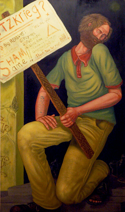
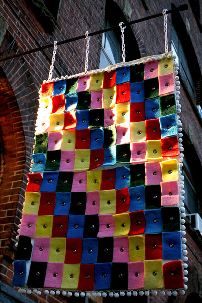
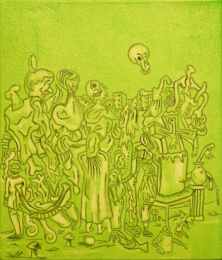
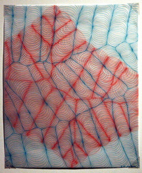
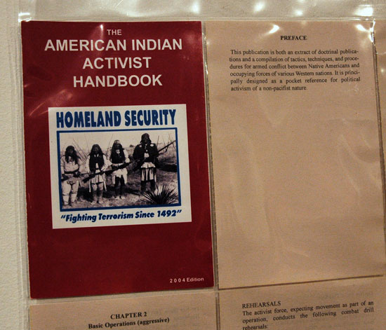
Jason Lujan Selections from the Native American Handbook 2005 paper, ink T-pins, variable dimensions [detail of installation]

Motta_Carlos_Black_and_White_Paintings.jpg
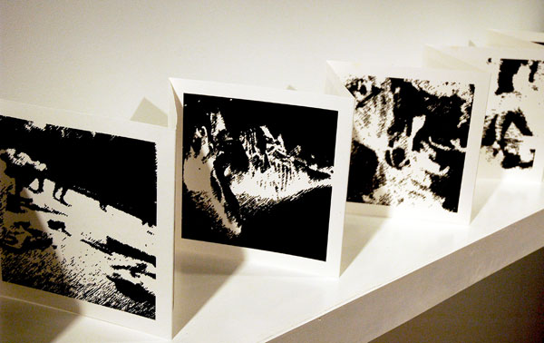
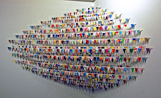
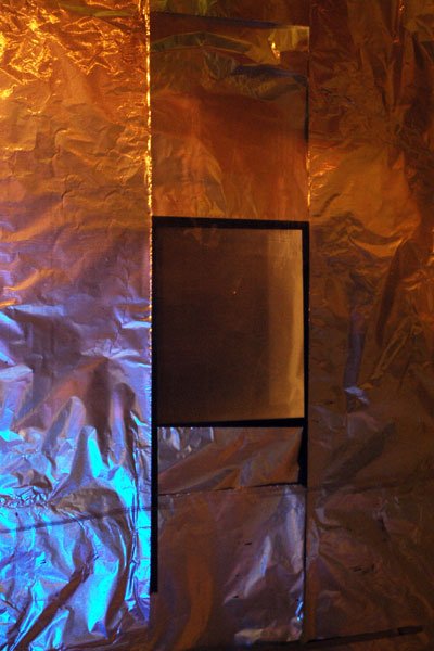
Carlos Motta SOA: Black and White Pain-tings I 2005-2006 book, 2 audio CDs, headphones, shelf 9″ x 77″ [detail of installation]

Bocchino_A_J_State_of_the_Union.jpg
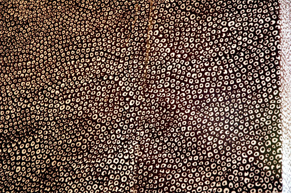
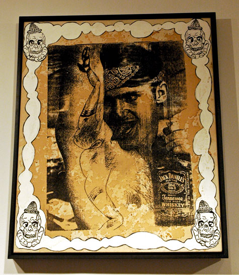
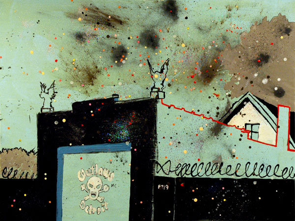
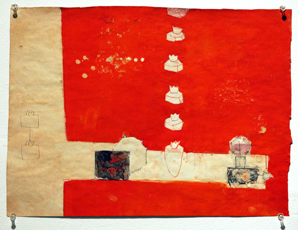
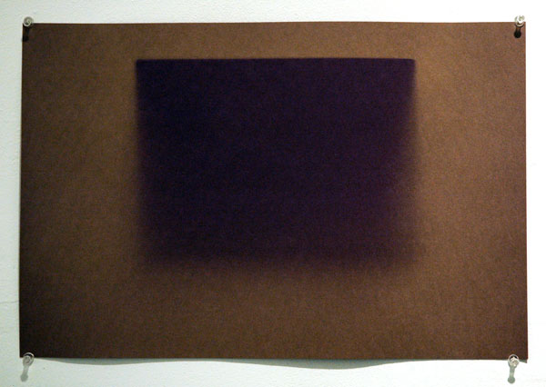
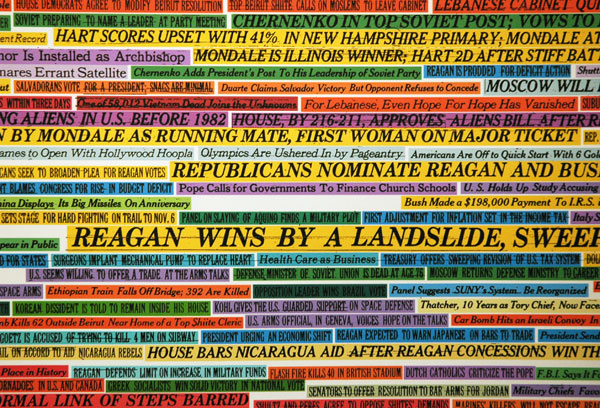
A. J. Bocchino State of the Union (1878-2006) 2007 marker on archival ink jet print 30″ x 40″ [detail of installation]

Page_Julia_Waiting.jpg
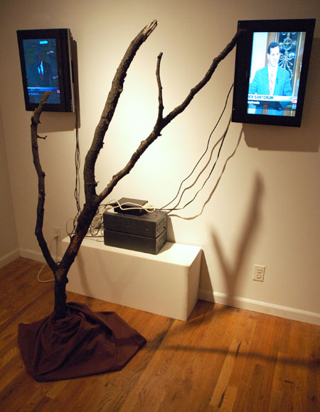
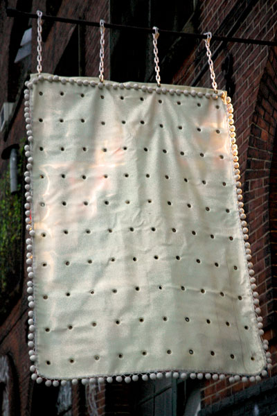
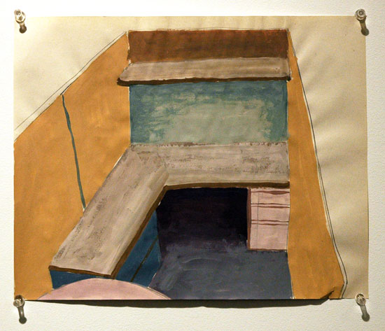
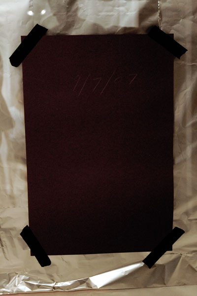
Julia Page Waiting for ( ) 2006 video installation, variable dimensions [installation view]

Estabrook_Mike_yllierO_lliB.jpg
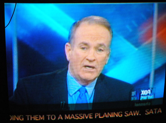
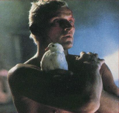
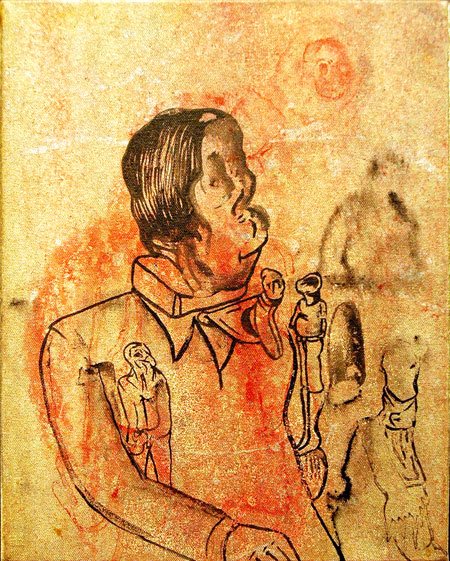
Mike Estabrook yllier’O lliB 2005 DVD [large detail of installation]

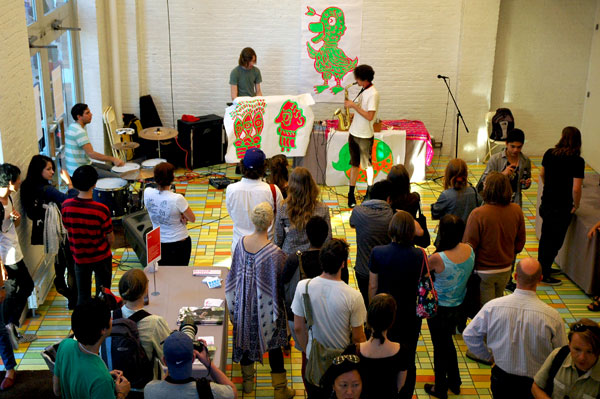
I only had to see the the announcement for this show to know that I had to get out to Bushwick this month. I would normally try to see any show mounted by the folks at Nurture Art*, but the description of “Quote Unquote“, which was curated by Yaelle Amir, made this one an absolute must. So last week Barry and I found ourselves at the opening itself, where it became almost immediately clear that I’d have to go back on a slow day – to listen to the audio that didn’t make it over the noisy energy of the crowd.
The shiny illustrated color brochure which accompanies the show and addresses each piece separately is a terrific innovation [I’m told that a generous gift insures this will be a regular thing] and its text represents one of the best arguments I’ve ever seen for the convention of the gallery handout.
I’ve copied the leaflet’s general lines on the installation, two introductory paragraphs and a concluding statement:

Language is an undoubtedly powerful medium that is utilized to both shape and manipulate our perception of reality. Stemming from this acknowledgment, “Quote Unquote” presents works by seven artists who deconstruct and re-contextualize text and speech originally employed to form a social-political statement. The foundation of these works is appropriated from various sources – newscast, popular literature, military records, newspaper- and molded into a new form with an intentional message.
As Language articulates our conception, opinion, and memory of our culture, a process of reevaluation necessarily unfolds as it is disassembled. Thus, by re-sampling text with social significance, and introducing their own interpretation into its rigid structure, the artists of Quote Unquote provide a window to new understandings of our social contract.
. . . .
Rather than rearranging the original language to the point of abstraction, these artists have strived [sic] to subvert its context while keeping its source evident. In so doing, they expose the manipulative tactics that are routinely employed via language by the media, politicians, military personnel, and cultural entrepreneurs. With a diligent methodical approach, humor, metaphor, and irony, they raise awareness to the underlying structure of the language that sculpts and embodies the essence of our very own collective identity.

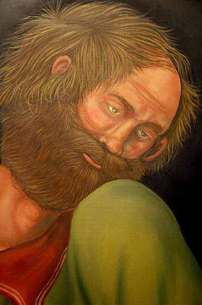
I won’t try to describe the meaning of any of the selection of images I’ve uploaded, and I don’t pretend that without a visit to the gallery they can tell you anything more than that each the artists have an aesthetic which survives the intelligence of the work.
All right, I’ll copy the gallery’s description of just one of my favorite pieces:

Julia Page’s Waiting for ( ) (2006) combines the script from the final act of Samuel Beckett’s play “Waiting for Godot,” in which two vagrants sit by a skeletal tree talking, eating, arguing, making up, sleeping, and contemplating suicide, as they await the elusive Godot. In the final act, they decide to leave, yet neither one takes action. In her video, Page constructs the final sentences of the play from C-Span coverage of senate debates on the war in Iraq. Through this juxtaposition, she alludes to the futility of these debates, and the politicians’ lack of initiative to resolve the Iraqi predicament.

*
At the opening someone from the gallery quipped about our making the show a recommended opening on ArtCal during the week before, “You give these two an award and you’re friends for life!” We all chuckled at the trope, but in fact the two of us have been big fans of Nurture Art’s program for years.

Matthew Northridge at Zach Feuer window

Northridge_Matthew_Feuer.jpg
Matthew Northridge Memorial to the Great Western Expo September 11 – October 20, 2007
[no other information available for this piece, shown here in an installation view]

I have to admit that among the changing installations in the Chelsea gallery area I look forward to most, with something like the same childish delight with which I once welcomed Tooth Fairy or Easter Bunny visits, are those to be found in Zach Feuer‘s window on 10th Avenue (the west side, between 25th and 26th Street). This modest space, which has been carved out of a former entryway, is currently occupied by a single wonderful piece by Matthew Northridge.

Capla Kesting throws blogger out of gallery

Capla_Kesting_blackout.jpg
Travis Lindquist [image protected here from viewers]

In Williamsburg last Friday evening Barry and I had just come from a reception and we had a little time to kill before the 7 o’clock hour when the galleries we had planned to visit would be opening their doors for this month’s “Williamsburg Every Second“.
We were in a festive mood.
We walked over to Capla Kesting to take a look at their Travis Lindquist show. I wasn’t very interested in most of the work, but the relatively arcane historical references in some of the drawings arranged in an interesting way on the center wall induced me to take a closer look. I decided to capture a few images for consideration later. I had already taken several photographs when I was told by a woman who was apparently connected to the gallery that they had their own shots of the work and most of them were available on their own site. I started to explain that I liked to capture my own images for my artblog and I would have gone on to try to explain exactly why, but I was interrupted by some words to the effect that they have to “protect the copyright”, and I was told that I would not be allowed to photograph the art.
I tried to at least explain what I had been doing and I reached for a card to introduce myself and my site, but neither she nor David Kesting, the Proprietor, would have any of it. Neither wanted to know who I was, but they definitely wanted me out. I told Barry, who had not been a part of any of this exchange, that I wanted to leave. As we turned to go Kesting yelled after us, “Don’t come back, you hear?!”
I wouldn’t think of it.
Also, to avoid some questions in the future, I should add here that since ArtCal is “The Opinionated New York Art Guide” and as it is the opinion of its editors that Capla Kesting Fine Art has chosen to restrict the public’s visual access to visual art, the gallery will not be included in its listings from this date.

“The Pierogi Show” at Pocket Utopia

Fuchs_Manfred_red.jpg
Manfred Fuchs Untitled 2002 12″ x 16″ mixed media on paper [installation view]

Marozik_Michelle_Office_Cubicle.jpg
Michelle Marozik Office Cubicle 2004 8.5″ x11″ [installation view]

Bristow_Bethany_Blue_and_Orange_2.jpg
Bethany Bristow Blue and Orange Drawing 2002 ink on vellum [installation view]

Gerhard_Bill_Four_Day_Exposure.jpg
Bill Gerhard Four Day Exposure 2006 black paper 12″ x 18″ [installation view]

My last post was about a show at Pierogi; this one is about a show called “The Pierogi Show” and it’s a very different thing.
The pioneering artist-run Williamsburg gallery currently devoted to a solo show of work by Jim Turok is known around the world as much for what is not hanging on its walls (meaning its extraordinary flat files) as for its ability to turn up, show and support great work while continuously serving as the vital heart of a community of artists. While most of Pierogi’s files are still stowed on North 7 Street, Austin Thomas’s “Pocket Utopia” has mounted a tribute to what Joe Amrhein, its founder, has accomplished and continues to accomplish. For the first official show in her space on Flushing Avenue, just five stops east of the Bedford stop on the L line, she has borrowed and hung pieces by 20 artists whose works on paper normally hang out in Amrhein’s drawers.
On her lively gallery blog Thomas describes a selection process which had to somehow eliminate 98% of the material available:

The file has 900 artists in it, maybe more. I had to come up with some sort of structure to review it. Mike (husband) entered all 900 names into a spreadsheet, then we determined that 88 artists was a representative sample, so he had a computer program select 88 artists randomly. With a list containing the 88 artists in hand, I went looking through the files and guess what? I was still overwhelmed. I sat immobilized for weeks as the opening date of Pocket Utopia approached. Finally, I selected 20 artists from the 88 randomly selected artists because that’s the number of artists that Pierogi showed in their first show at Four Walls.
My process might seem random, but I think that’s how the art world works. Funny, the computer didn’t select my name. I’ve had work in the Flatfile for about 10 years. I always try to put new and my best work in, and maybe that’s why the 20 artists I chose are consistently good.

I’m amused that the presence of both random and curatorial elements in the story of how these particular works were drawn to Bushwick doesn’t seem to me to be so different from that which artists also experience in the larger world, where some capricious combination of chance and merit determines whether work gets to be shown.
Thomas is right when she writes that the work is good, and some of it is very good indeed.
The complete list of artists in the exhibition:

Hildur Ásgeirsdóttir Jónsson
Clement Bagot
Claudia Barthoi
Lee Boroson
Bethany Bristow
David Brody
Tamar Cohen
Guy Corriero
Peggy Cyphers
Kate Drendel
Miriam Dym
Bruce Edelstein
clyde forth
Manfred Fuchs
Bill Gerhard
Fred Gutzeit
Michelle Ha
Theresa Hackett
Michelle Marozik
Mike Miga
Team Lump
Mika Yokobori

I’d like to add a couple more images, and a few words, on Bill Gerhard’s work, on the excuse that one of the two pieces of his in the show presents the drama of an evolving site-specific installation. “Four Day Exposure” from 2006, and shown above, hangs on the left wall of the gallery, but “Window Aperture”, is both a 2007 installation and a work in progress.
Gerhard uses the sun as a drawing tool, exposing black construction paper to form minimal shapes, in these cases simple rectangles The two thumbnail images below show the second work, first the face of the paper as it appeared at night from the sidewalk in front of the south-facing building and then the reverse side as visible from inside the gallery.

Gerhard_Bill_outside.jpg
Gerhard_Bill_inside.jpg