SVA Open Studios, including Gabriel Shuldiner

Shuldiner_Gabriel_Unavoidable_Destiny.jpg
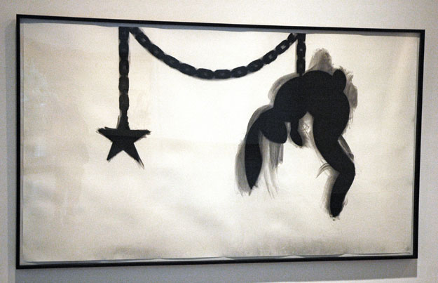
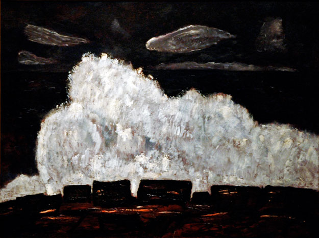
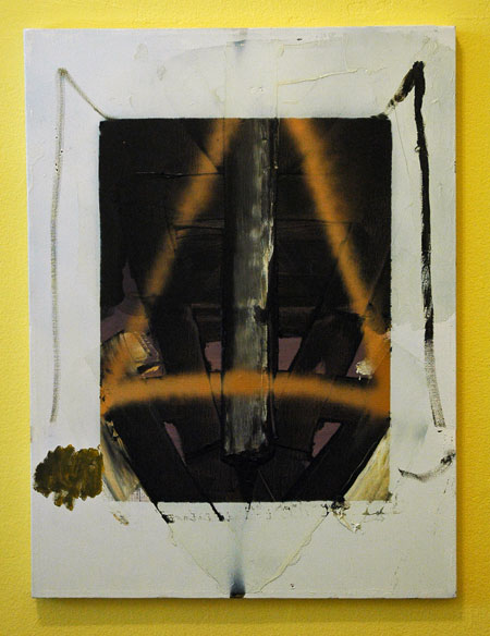
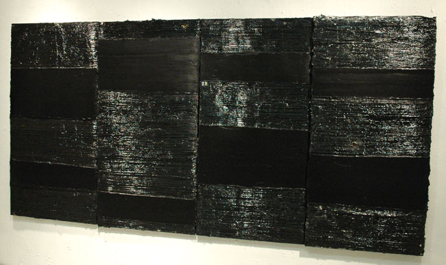
Gabriel Shuldiner An Unavoidable Destiny 2007 modified acrylic polymer, pigment, latex house paint, alkyd resin, gesso and casein resin, overall dimensions variable, approx. 48″ x 96″ x 1″ [installation view]

Shuldiner_Gabriel_Site_And_Context.jpg
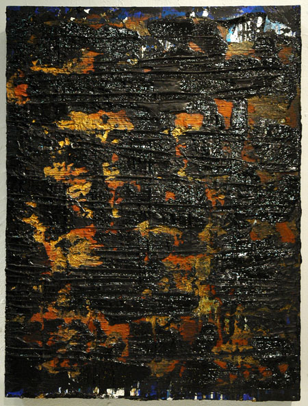
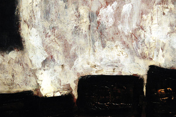
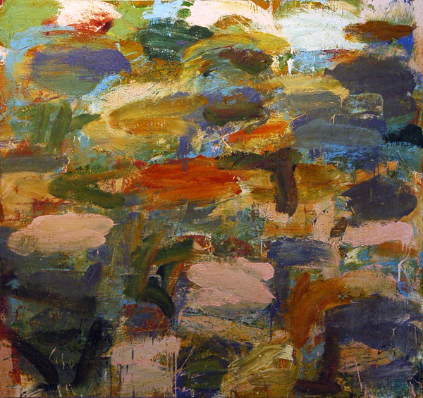
Gabriel Shuldiner Site And Context (Part I) 2007 modified acrylic polymer, pigment, enamel house paint, gesso, Enamelac, rust, dirt and alkyd resin on canvas on mounted wood panels, overall dimensions variable, approx. 40″ x 30″ x 6″ [installation view]
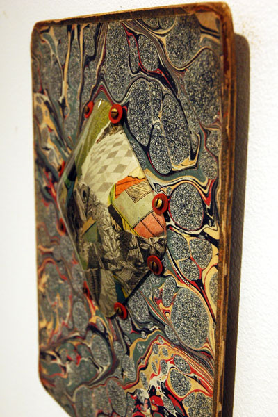
Shuldiner_Gabriel_Site_And_Context_detail.jpg
[detail]

Schuldiner_Gabriel_Until_Repetition.jpg
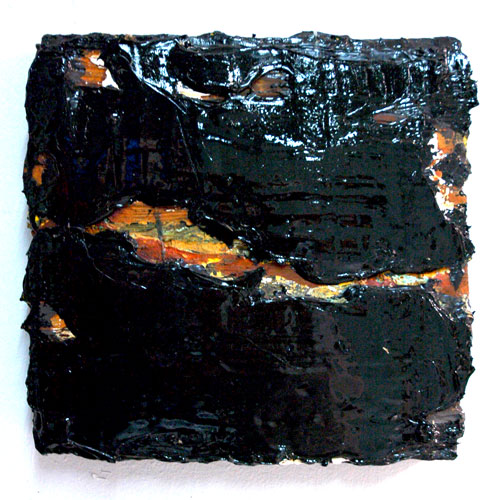
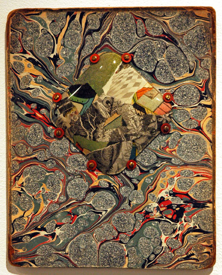
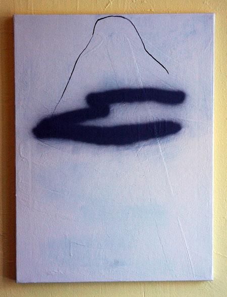
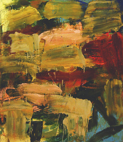
Gabriel Shuldiner Until Repetition Becomes Endurance 2007 modified acrylic polymer, pigment, gesso, reus and alkyd resin on canvas on mounted wood, overall dimensions variable, approximately 19.5″ x 19.5″ x 3″ [installation view]

Barry and I stopped by the open studios and exhibition of the Summer Art Residency of the School of Visual Arts on Thursday evening. This particular edition was an especially exciting one, judging at least partly from the fact that although it was a warm and humid evening (even warmer and more humid inside the building on 21st Street) we ended staying much longer than we expected.
As we had met Gabriel Shuldiner before and had seen some of his earlier work, we were not coming upon it totally blind. Shuldiner is very attracted to what he describes as the “power, authority and brillance” in the color black, even if he usually manages to introduce glimpses of some of its components in his lusty paint-sculptures. He writes about his art:

My work is about process: both highly intuitive and mathematically considered. . . . .
I experiment with many different materials, and am fascinated by the contrast and dialogue between them. Unconventional implements, homemade tools and modified paints help to make each mark, gash, scratch and chip as intentional and vital as my brushstroke.
My paintings evolve over time and eventually function as compositional objects; their relationship to the wall, to their environment and to the viewer’s position becomes an important and vital compositional element, as does the light it absorbs, reflects and scatters off the varied black pigments, creating further shades of grays and whites.

For more images and words, see Barry.
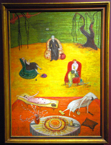
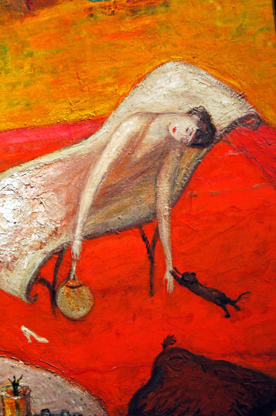
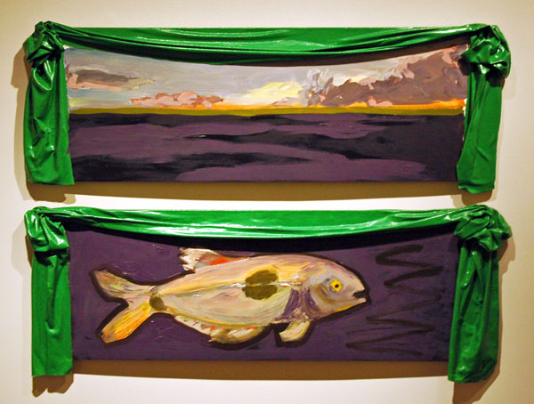
Most of the other artists were new to us and about them I have virtually no information other than names and images captured that night. I will be uploading mostly-undocumented photos of work by several of them later today or tomorrow.

Duke Riley: news from the [water] front

Duke_under_arrest.jpg
under arrest

Riley_Duke_Acorn_arrest.jpg
securing the acorn

This story had legs from the start, sea legs. Barry and I were watching it on line as it grew all day yesterday, and apparently it’s still going.
I would say that this late and abbreviated post were redundant except that I want to broadcast the respect for Duke Riley that we both share, and also to refer to our early immersion in the larger story of his remarkable art, including a wide-eyed visit to the first solo show at Magnan Projects in January last year. Then there was also the excitement of being able to share my own personal connection to and love for Rhode Island, the School of Design, Newport, and the little bicycle shop down my block on the corner of Brook Street, all sites associated with the still-unfolding story of the “Acorn” submersible project.
Don’t miss the slide show or the video on the NYTimes site.
My favorite take on the reaction of our guardians of public safety to the artist’s marine intervention? Libby and Roberta:

The Coast Guard and police didn’t think Riley’s floating bobber was so amusing and the boat was confiscated and he and his accomplices were charged with “marine mischief.” Talk about hammering a fly! Nobody seems to have a sense of humor or whimsy anymore, especially when it comes to imaginative art outside the normal channels. Now that’s a crime.

[images by Damon Winter from NYTimes slide show]

“collage + abstraction” at Pavel Zoubok

Mullin_Martin_Hydra.jpg
Martin Mullin Hydra 2006-2007 mixed media collage 11.75″ x 9″ [installation view]

Berlant_Tony_24_Hours.jpg
Tony Berlant 24 Hours 2000 11.5″ x20″

Warner_Robert_endpaper.jpg
Robert Warner Untitled 2007 flint glass and collage on book board 10.25″ x 8.25″ [installation view]
Warner_Robert_untitled_detail
[detail]

Bultman_Fritz_Wave.jpg
Fritz Bultman Waves and Others 1978 painted paper collage 16″ x 20″ [installation view]

Pavel Zoubok’s current group show, “collage + abstraction“, can described pretty much by its title alone. The works shown were created by 55 artists over most of the last 100 years. The oldest piece is Kurt Schwitters’s tiny, 1921 “Lady in Red”.
It’s a rich collection, and in a visit to the gallery earlier this week I found the small and large beauties of these dozens of works arranged as they are in a handsome, rhythmic, salon-ish installation almost overwhelming. And it’s all very elegant.
That last adjective however provokes me to ask mischievously whether something might be missing. There’s nothing obviously outrageous going on here. Maybe that’s only an over-stimulated today talking, looking for novelty, and in the interest of disclosure I should say right now that I like outrageous (note: Pavel Zoubok has often fed my appetite generously).
I definitely won’t fault the gallerist/curator’s aesthetic choices for this show, but in spite of my love for both abstraction and collage I think I regret the almost total absence of representational imagery in these works. Also, even if I can accept the restriction defined by the exhibition’s title definition, and although some of the works employ stuff outside the collagist’s conventional range of paper materials, maybe the components and, yes, the shapes of the collages selected could have been a bit less predictable. Stefan Saffer‘s “Fortress” and Robert Motherwell’s “Celtic Air” are two of the very few pieces which do not subscribe to a presentation involving four right-angle corners, and Saffer’s folded paper structure actually breathes totally free, managing to resist confinement in a frame of any kind, only barely able to rein in its third dimension.
But all this is small change when looking at the work itself. I went back to the gallery today, along with Barry and an artist friend. All three of us had a really hard time leaving.

Jeremy Blake 1971-2007

Blake_Jeremy_reading_Ossie_Clark.jpg
Jeremy Blake Reading Ossie Clark 2003 video [still taken from November, 2003 installation]

Jeremy Blake is no longer no longer missing, but he is still very much missed. The picture above looks very different to me after the news of the last two weeks; it now suggests a brilliant, burning star.
I posted this short piece three and a half years ago, with another capture from “Ossie Clark”.
[there are sensitive photos of Jeremy, and Jeremy with Theresa Duncan, on the Wikipedia entry]

Ingmar Bergman 1918-2007

Bergman_Wilderdbeeren.jpg
Victor Sj�str�m and Bibi Andersson in a still from Ingmar Bergman’s 1957 film, “Smultronst�llet” [Wild Strawberries]

Well, of course it is. Everything is like a scene from a Bergman film.

Wow. Maybe this is not a balanced judgment, since I’ve been greedily devouring Ingmar Bergman’s work for 50 years, but I think this piece by The Reeler‘s Stu VanAirsdale may be the most extraordinarily beautiful memorial to an artist that I’ve ever read.

[image from luebeck]

a visit to Brooklyn Museum

Chicago_Judy_Dinner_Party.jpg
Judy Chicago The Dinner Party 1974–1979 ceramic, porcelain and textiles [installation view]


Blake_Nayland_untitled_bunny_hung.jpg
Nayland Blake Untitled 2002 charcoal on paper [installation view]

Stettheimer_Florine_Heat.jpg
Florine Stettheimer Heat 1919 [installation view]
Stettheimer_Florine_Heat_detail.jpg
[detail]

Morton_Ree_Regional_Work_%232.jpg
Ree Morton Regional Work #2 1976 oil on wood with Celastic [installation view]

Bartlett_Jane_E_Sarah_Cowell.jpg
Jane E. Bartlett Sarah Cowell (later Sarah Cowell Lemoyne) 1877 oil on canvas

Edison_Thomas_A_Buffalo_Dance.jpg
Thomas A. Edison Inc., William Kennedy-Laurie Dickson, producer Buffalo Dance 1894 video from original 35mm silent B&W film [still from installation]

Peale_Raphaelle_Still_Life_with_Cake.jpg
Raphaelle Peale Still Life with Cake 1822 oil on panel [installation view]


Barry and I really did have a terrific time at Brooklyn Museum yesterday, and we’ve decided to visit its permanent and temporary exhibits much more frequently than we have in the past. It’s an easy subway run from Chelsea (or most anywhere else in Manhattan at least) and the installations are really smart. I was very impressed by the conception and execution of “American Identities” a long-term exhibition in the Luce Center of American Art which occupies much of the fifth floor. We didn’t have time to get into the so-called “visible storage” galleries of the Center, but I’m going to be heading back very soon.
This cultural treasure sits on the edge of the Brooklyn Botanical Gardens and Prospect Park. It’s both a great museum in Brooklyn and a great museum for Brooklyn. There’s much of Brooklyn in it, although the rare broadcast of that fact is pretty subtle and a very soft sell: Because I was looking for it, because I love my fabulous neighbor borough (and erstwhile great independent city), and because and I know much about its history and its culture, I think I may have been more aware of Brooklyn references than most visitors would be, including natives of burg themselves.
The crowds are smaller than those in the large Manhattan museums, but they just might be a little more enthusiastic, and it’s a delight for me to see their delight. The collection isn’t the least bit provincial, but somehow it seems like a museum you can warm up to. I have.
I’ve uploaded images of just a few things that excited me yesterday. Some of them made it partly because of information provided by documentation on the museum walls I can’t include here, but it’s clearly a very odd company, spontaneously assembled on the spot. Except for the first work, they were all part of “American Identities”, a collection of hundreds of objects from the Museum’s collection of art from all the Americas, including the decorative arts, from the colonial era to the present. Judy Chicago’s heroic and very elegant piece, “The Dinner Party“, is in its [almost?] permanent home on the 4th floor (a separate triangular gallery inside the Elizabeth Sackler Center for Feminist Art), but all of the other works I show are part of the “American Identities” exhibition one flight up.
It was still being installed when we were there, but I’m really looking forward to visiting the Museum’s upcoming special exhibition, “Global Feminisms Remix“, which opens on Friday right on the other side of the wall from “The Dinner Party”.

Marsden Hartley subs for Asher Durand at Brooklyn Museum

Hartley_Marsden_wave_unframed.jpg
Marsden Hartley Evening Storm, Schoodic, Maine No. 2 1942 oil on board 30″ x 40.5″
Hartley_Marsden_wave_detail.jpg
[detail]

We crossed Brooklyn ferry this afternoon (by subway, of course), on the last day of the Asher Durand show at Brooklyn Museum. I wasn’t permitted to photograph the Durand paintings, because they were not part of the museum’s own collection, but my camera wasn’t idle when we walked through the other galleries on the 5th floor.
This evening, still on the subject of the natural beauty of the Northeast, I can’t think of a better image to stand in for the pioneering Durand landscapes than this magnificent painting by Marsden Hartley. It may be my favorite thing of the day.

Daniel Reich in the Chelsea Hotel

Tranchell_Jeffrey_Gold_Bar.jpg
Jeffrey Tranchell Gold Bar 2007 enamel on wood 3.25″ x 32″ [installation view]

Smith_Mike_canvas_white.jpg
Mike Smith untitled 2007 latex, ink and enamel on canvas 24″ x 18″ [installation view]

Smith_Mike_canvas_gold.jpg
Mike Smith untitled 2007 latex, ink and enamel on canvas 20″ x 16″ [installation view]

I wanted to do this post over a month ago, as soon as I left “Darjeeling“, the enigmatic title of only the latest informal show installed by the Daniel Reich Gallery in one of the rooms of the Chelsea Hotel. At first I guess a lot of other things got in the way, and when the exhibition with the enigmatic title, shared by the artists Mike Smith and Jeffrey Tranchell, eventually closed writing about it seemed less, what, useful? Well, I haven’t been able to forget it. I continually see that room and its quirky installation in my head, regretting not sharing it here and half promising myself to do a belated entry.
So this is it, but for my tardiness I now feel I can’t leave without going into a bit of history:
Barry and I have been fans of the wonderfully unconventional Daniel Reich and his aesthetic choices from the beginning of his own gallery visibility, when (well before his first foray west of 10th Avenue) he was running a space in his micro-apartment on the ground floor of a building on West 21st Street. Before that we knew him as an assistant in Pat Hearn’s gallery and later the director. Earlier still we had met him when he was one of a number of young earnests attracted to the eccentric court sheltered by Bill Bartman‘s Art Resources Transfer [A.R.T.] gallery, publishing and bookstore space on West 22nd Street.
I’d like to imagine that it’s partly because of Daniel’s own career narrative that these two artists were given the opportunity of mounting this interesting small show.
We like his own shows and we like the Chelsea Hotel, our neighbor. I’ve always regretted that this magnificent building with a legendary, even mythical past, wasn’t the full-time venue for more galleries, but then it is fundamentally a residential pile, and I was always pretty fond of the commercial occupancies which did manage to get leases there, like a tackle shop, a guitar store, a tattoo parlor, a tiny tailor shop, an acupuncture salon. The hotel is under new management today, and even these interesting tenants are now going or already gone from the scene, probably to be replaced with one or more national chains to which none of its present residents or neighbors will ever be able to warm up.
I hope this isn’t one of the Chelsea Hotel’s last adventurous visual arts events, but it and Daniel Reich are certain to remain part of the legend.

Wall Street Journal touts ArtCal

artcal_logo.png

I guess none of our fans read the Wall Street Journal (I suppose that’s quite possible), because no one told us until today about this item by Lauren A. E. Schuker from last Saturday’s edition. It’s all about telling readers where they might find the next art bargains, and among a number of other ideas are the writer’s suggestions for checking out the web.

Art blogs can also be a good source of information about emerging artists. Popular sites include artcal.net, artnet.com, edwardwinkleman.blogspot.com, galleryhopper.org and artsjournal.com/man.

I can’t help noticing that ArtCal was placed before artnet, and this isn’t an alphabetical list.
Maybe WSJ fans will now be tuning in regularly. In any event, the Schuker’s piece seems like a good thing for everybody. It doesn’t seem it would hurt if our money moguls got more culture and it would definitely help underknown artists and galleries if people with money stopped tripping over each other chasing down the safest art-world stars.
Meanwhile, an inside tip from bloggy and jameswagner: ArtCal will be launching a totally new design in the next week or two. The trim and stylish new logo appears at the top of this post.

Joel Longenecker at Sideshow

Longenecker_Joel_Then_You_Die.jpg
Joel Longenecker And Then You Die 2007 oil on canvas 90″ x 96″
Longenecker_Joel_Then_You_Die_detail.jpg
[detail]

Longenecker_Float_Theory_4.jpg
Joel Longenecker Float Theory 2007 oil on linen 62″ x 54″

Longenecker_Get_Drift_3.jpg
Joel Longenecker Get Drift 2007 oil on canvas 78″ x 74″

When I first saw these paintings I didn’t know how to fit them into my accustomed ideas about how art should ideally provoke and re-draw my world in some way when I initially encounter it. Joel Longenecker‘s paintings in his solo show, “Ignorance and Bliss“, at Sideshow are both powerful and beautiful, but they do not capture new territory. In fact while they were all finished this year, they would not look anomalous (although they’d probably have been stars) in a Manhattan gallery show years ago.
But to say this is not to dismiss what Longenecker has accomplished. I still like to visit the work of the iconic abstract expressionists, even when it’s become very familiar, and when an artist speaks in the same language today, but to tell new stories, why should I refuse to listen?
I knew I would end up appreciating this work more if I hung around a bit yesterday, and I did. I didn’t however expect to become as attached to it as I am now, the result of an increased familiarity from having spent an absurd amount of time today trying to adjust the colors on the images I shot during my visit. I had to revise my adjustments over and over to see that the colors were neither too bright and transparent nor too dark and smudgy. I hope I’ve come close to the originals but, especially with painting, there’s no substitute for being able to stand in front of the canvas itself.