two more “Dangling” reviews

CorriePetereyeglasses.jpg
Peter Corrie Untitled (from suite of drawings, “No Time Swan” 2005-2006) mixed media, approx. 16″ x 10″ [installation view]

We have two more exciting blog reviews for “Dangling Between The Real Thing And The Sign In The Window“. Short excerpts appear below.
Heart As Arena uploaded a review on November 6:

Susan’s C. Dessel’s “Our Backyard: A Cautionary Tale” gave me nightmares while I was looking at it. I didn’t even have to wait for sleep. The piece had Abu Ghraib and Hurrica Katrina sharing the same set of synapses in my head, filling the gap with shame and anger and nothing good. When they start hiding the dead it falls to artists to dig up the bodies and throw them back on the road, and Dessel has a very strong arm. You can try to duck, but it won’t help.

Two days earlier, on November 4, Tom Moody wrote:

Inside the gallery, the mood swings back and forth between the dire and the ebullient. . . . . Lots to like (and worry about) in this show.

Barry and I will be at the gallery for an hour or so around 7 this Friday (it’s open 3-8 on Fridays) and from 3 to 6 on Sunday. This is the final weekend for the show, which includes the work shown above.

Violet Hopkins at Foxy Production

HopkinsVioletHeavensdetail.jpg
Violet Hopkins Heavens Above 2006 colored pencil and acrylic ink on archival paper 80″ x 100″ [installation detail]

There’s no way a photograph can begin to describe Violet Hopkins enormous dark drawings installed at Foxy Production in a show titled “Entoptically Yours“. The image above is a detail of a subtle [really!] pencil drawing which is more than eight feet wide. The area shown is approximately one third of the framed piece. The image which continues on the paper above and to each side is a solid not-quite-blank slate drawn with black pencil alone. The plexiglas covering enclosed by the frame only adds to the mystery and complexity of the work, displayed here in perfectly-focused and subdued lighting.
HopkinsVIoletHeavensFoxy.jpeg
[view of entire drawing]

Incidentally, the largest drawing, more than twelve feet wide, takes up much of one wall of the gallery. If you miss the current Foxy show, you might soon have a chance to see it in Miami, where it will become part of a huge and extremely important private collection regularly open to the public.

[lower, thumbnail image from Foxy Production]

Sterling Ruby waiting in the wings at Foxy Production

RubySterlingnailpolish.jpg
Sterling Ruby drawing

Yeah, maybe Chris Martin, Xylor Jane and now Sterling Ruby. I don’t know that they would show so well together in a curated physical space, but they definitely can and do share a brilliantly-appointed chamber inside my own head and heart. Ruby’s images, and his choice of medium, are both just perverse enough to make his inclusion as a part of this imaginary trio seem less like a natural, but like that of the other two, his work strikes me as effortlessly grownup in a way even Peter Pan would be comfortable with.
Anyway.
No, Ruby does not currently have a show at Foxy Production; I just happened to spot this exciting piece (brilliant gold paper slashed with crimson nail polish, mounted behind plexiglas for bonus shadow) the other day when I ventured behind the magic “curtain” which separates four wonderful Violet Hopkins drawings from the gallery desk area.

Joyce Pensato at Parker’s Box

PensatoHomer.jpg
Joyce Pensato Homer 2006, charcoal and pastel on paper 120″ x 130″ [installation view]

Pensatoclown.jpg
Joyce Pensato Hello Stranger 2006 enamel on linen 90″ x 72″ [installation view]
Pensatoclowndetail.jpg
[detail]

Pensatogremlin.jpg
Joyce Pensato This Must Be The Place 2006 charcoal and pastel on paper 60″ x 40″ [installation view]

Joyce Pensato opened a stunning solo show, “This Must Be The Place”, at Parker’s Box on October 20. I’ve often said it before, but I still can’t even begin to undestand why Pensato is not more widely known and more higly prized than she is. I’d stand in line for this installation, but instead Barry and I were given a surprise private tour by the artist herself when we stopped by the gallery on the afternoon after the opening.
Unfortunately I was so distracted that I neglected to pick up a checklist while I was there. I found information on the gallery site, but one of these images will therefore have to remain pretty much unidentified for now, but like his strange friends this off-Donald seems to be able to speak very well for himself.

“Dangling Between” reviewed by TINSQUO

Mark Roth and Janna Olson of TINSQUO (there is no status quo) have published a review of “Dangling Between The Real Thing And The Sign In The Window“. It’s so laudatory it’s embarassing, but not so embarassing that I won’t point to it here.
As Barry just wrote on Bloggy, we will both be at the gallery this Sunday afternoon from 3 until 6, to welcome and talk to anyone who wants to stop by.

Xylor Jane at CANADA

JaneXylorRuin.jpg
Xylor Janes Ruin [installation view]

XylorJaneSoLong.jpg
Xylor Jane So Long [installation view]

Xylor Jane‘s second solo show at CANADA is a knockout, and the more I learn (well, “learn” may be too presumptious; “read” or “hear” would be more appropriate) about the artist and her art the more I’m pulled into its beauty and its mystery. I feel a similar connection to Chris Martin‘s work, but it would take someone with far better creds than I to explain what that’s all about, or in fact what’s going on inside the work of either artist.
Even my camera seemed possessed when it had to deal with Jane’s paintings yesterday: The smaller images on the camera back and on the computer screen clearly revealed colors and shapes which were barely apparent to my naked eye when I stood in front of these two seemingly monochromatic paintings, and they are barely visible even in these uploaded shots. Incidentally, two of the three other paintings in the exhibition are more obviously colorful than the pair I’ve chosen to include here.
The works are each approximately three or four feet square.
Check the paragraphs from the press release included on the ArtCal event page. I’ve also included below the artist’s notes [punctuation and capitalization as found] for the two paintings represented by the images above, and after that, some of Jane’s general notes for all of the paintings.

Ruin
The strokes face either in or out, changing with each year along with the hue
584 weeks
11.22 years
Art Career in Black and Velvet
Failure misery demise
Time prison, blocks of years

So Long
structured on a 16-sided polygon that squares itself at the edge
8x16x32 it has a stutter that allows the seven hues to be in order (on the vertical and horizontal-) in both directions
it has 4096 strokes facing out
Strokes radiate from skewed center, growing larger.
Black rainbow waves an Infinite good bye

General info for all paintings
Brush is reloaded for each stroke
Each stroke represents one day
All begin at a center – clockwise moving
Each painting should be turned a quarter turn clockwise at each solstice or equinox marked on the side of the canvas so that the right side will indicate the season for that hanging direction
Monday = yellow
Tuesday = Green
Wednesday = blue
Thursday = indigo
Friday = violet
Saturday = red
Sunday = orange

Cliff Evans at Location One

evanseagle.jpg
evanscheerleader.jpg
evansprefabs.jpg
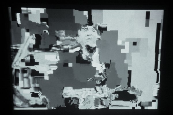
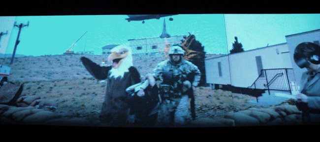
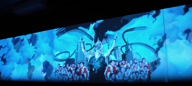
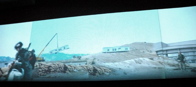
Cliff Evans The Road to Mount Weather 2006 three-channel video [three stills from the installation]

Cliff Evans’s extraordinary three-channel video installation, “The Road to Mount Weather“, is at Location One until November 4. This ambitious and very impressive work, curated by Pieranna Cavalchini, Curator of Contemporary Art at the Isabella Stewart Gardner Museum, was painstakingly collaged from images downloaded from the internet. For me it was like watching a vintage 3-strip Cinerama spectacle documenting the continuing dream-become-nightmare which is likely to be remembered as the culmination of the American imperium.
The sound design is, not incidentally, terrific.
This SoHo space devoted to exciting New Media work is always worth a visit, but because of the distractions of our current curating adventure Barry and I might have missed the very impressive current installation had it not been for a strong recommendation, and at least one subsequent reminder, from Jacques Vidal, one of the artists included in our Williamsburg show. I now appreciate both the reason for his enthusiasm and the connection between Evans’s work and his own.
From the gallery’s press release:

The Road to Mount Weather is an open animation, susceptible to hugely varied critical perspectives and interpretations. It shakes us out of our complacency. In a mock epic journey through capitalist Hell, Evans creates a baffling cascade of imagery coded in complex syntax. The large swath of information is presented in a loop shown at a slow and melodious pace. With each repeated viewing, the viewer becomes more intrigued, less complacent, finding new associations and symbols, and questioning the final meaning of the narrative.
Evans is one of a number of artists who have mined the form and content of appropriation and photomontage in their work. Among his notable predecessors are Georges Braque and the Dadaists. Images are treated almost like found objects, obtained from the vast reference library that is today’s Internet. They are cut up and scrambled, scene after scene, with deliberate order and disquieting disorder ultimately finding a perfect fit in the puzzle.
Evans reflects on America’s complex geopolitical situation and its impact on mainstream news where fear is a constant. [His] ever-expansive investigation is matched by an eye for detail as well as an ability to find humorous prank subtexts.

Cory Arcangel at Team

ArcangelLucier.jpg
Cory Arcangel Untitled (After Lucier) 2006 Mini-Mac [still from installation]

Cory Arcangel left Oberlin six years ago with a degree in Technology in Music and the Related Arts and his visual art has almost always incorporated disparate musical elements. His current show at Team however would look and sound absolutely right installed inside any one of the city’s more serious schools of music. That is, if any one of these institutions was adventurous enough to encourage and present the kind of vibrant New Media work which could attract new and larger audiences to an endangered art form.
Actually, the piece represented in the image at the top of this post is totally silent, something of an exception in the exhibition which currently fills the gallery on Grand Street. Its subject however is very much the concept of musical performance and its structure relates to the work of one of our most revolutionary composers of “serious” music. Fellow blogger Joshua Johnson explains:

Untitled (After Lucier), 2006, confronts that specific issue [the dilletante’s ignorance of the technical devices of much of today’s art] head-on; Arcangel appropriates the strategy of avant-garde composer Alvin Lucier’s 1970 piece I am Sitting in a Room, in which Lucier continued to re-record a recording of himself reading “I am sitting in a room…” until the recording became an abstract sonic portrait of the space he was recording in. Untitled (After Lucier) examines the implications of compression, by continuously digitally re-compressing a video of the Beatles famous Ed Sullivan appearance. As the video compresses it becomes more and more abstract– a visual representation of the process of compression. Essentially, Arcangel asks us to question how the experience of culture is transformed by the container it is presented in. When a video is uploaded to Youtube it is modified by the technology, and thus takes on the characteristics of the “room” in which the viewer experiences it.

Ah, music to our eyes.

RELATED POST: “Cory Arcangel opens Team’s new SoHo digs

“Dangling Between” now has its own website

CorriePeterMoralitymotto.jpg
Peter Corrie Untitled 2006 one of a suite of drawings, some with artist’s frame, from “No Time Swan”, mixed media, various sizes [installation view]

Dangling Between The Real Thing And The Sign In The Window“, the group exhibition which Barry and I curated this month, continues at Dam, Stuhltrager through November 13. The latest news is that the show now has a dedicated website with images (via flickr) of all the works included and information on all of the artists.
Older news, which should be welcome to adventurous and impecunious art fans but still only familiar to those who have already visited the gallery and looked at the checklist, includes the fact that there are unique pieces available for as little as sixty dollars – “UNKNOWN ARTISTS AT UNHEARD PRICES

Note: We’ve just added to the site some additional, detailed images of some of the works.

“When Fathers Fail” at Daniel Reich

SepuyaPaulDifference.jpg
Paul Mpagi Sepuya The Difference Between a Memory, a Portrait, a Resolution parts 1, 2 and 3, three separate digital prints, each 30″ x 40″ [installation view]

KjaerLiseBreathe.jpg
Lise Kjaer Untitled, Breathe cutout paper letters, dimensions variable [installation view]

Hey, although I can’t make much of the press release (I think it’s something about giving us leave to complete the artist’s work by making of it what we wish), most of the pieces in this show are pretty striking. “When Fathers Fail” at Daniel Reich is worth a visit even if you’re academically defenseless.
The show has been extended until November 1.