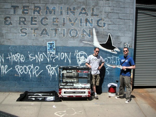
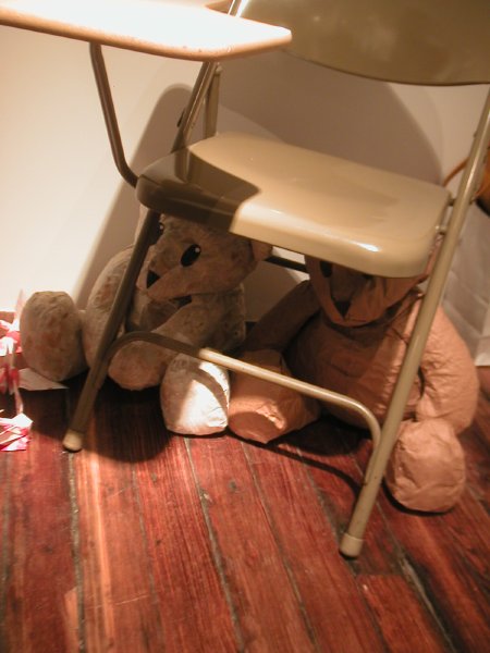
Ryan on the left, Barry with the sawed-off shotgun on the right
We hadn’t yet left the seductive sidewalk gallery of Eric Doeringer early this afternoon when Barry and I spotted the Humphrey Industries/ open-air kiosk in front of one of the last auto repair garage/receiving stations left on 24th Street (fortunately, like the site Eric had chosen, it too was closed on Saturdays).
Absolutely anyone who knows us would not dispute my claim that neither of us is fond of guns or gun imagery, but I have to admit that Barry and I both found the particular charms of Ryan Humphrey’s extensive, if very wooden, selection almost irresistable. In the end however we decided a painted canvas frisbee target (clay pigeon?) was more our style, even if we’re almost certain to be back.
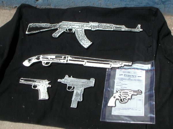
some of the merchandise available
Category: Culture
Ara Peterson and Justin Samson at John Connelly
Ara Peterson/Forcefield Third Annual Roggabogga Motion Picture 2002 video 6 min. 7 sec.
Ara Peterson 12 Ball 1997 video 2 min. 51 sec.
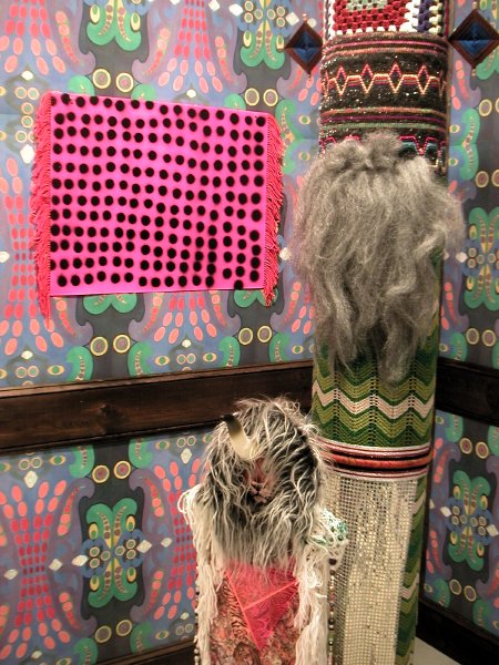
view of Justin Samson installation showing Nandor the First and Treebeard (2004 mixed media) in the foreground, Bactroban (2005 record cover collage with yarn) mounted on the wall behind
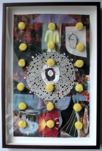
Justin Samson Visitors 2004 collage on paper 16″ x 10″ (19.75″ x 13″ framed)
John Connelly Presents continues to balance shows in two separate gallery spaces on the tenth floor of 526 West 26th Street, and they’re always eye-openers, even for the most jaded art boulevardier. This month is no exception, with eleven abstract videos by Ara Peterson in one room, and Justin Samson’s extravagant installation in his reconstruction of the main space.
Michael Ashkin at Andrea Rosen
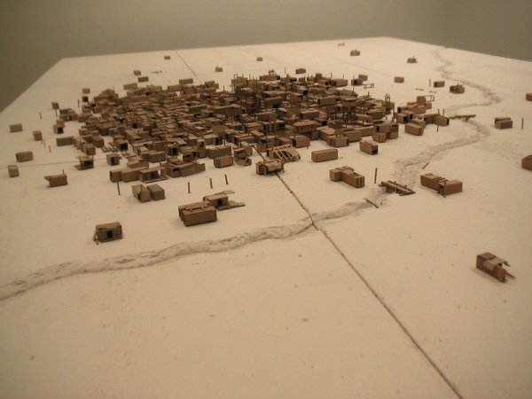
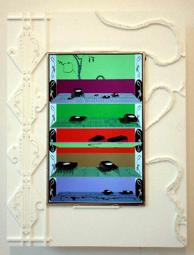
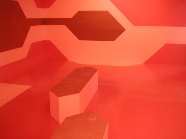
Michael Ashkin Adjnabistan 2005 recycled cardboard and gypsum 46″ x 132″ x 252″ [large detail of installation]
Michael Ashkin’s new large-scale piece, Adjnabistan, represents a significant departure from his handsome earlier work, which at least appeared to be about realism, even if it enclosed an angry conceptual core. The latest work, which almost entirely fills Andrea Rosen‘s project room, is both fundamentally and apparently conceptual, even if it retains enough of an element of realism to seduce the child in all of us.
From the press release:
Adjnabistan is the name of the anti-nationality I invented with a friend while traveling through the Middle East in the late 1970s. Derived from the Arabic adjnabi (meaning foreigner, stranger, or other), this land of impossible origin proved useful, especially in Iran, where, as an American, one needed to avoid treacherous political discussions. If said with the proper lightness of tone, Adjnabistan could provoke a smile or even be accepted without question. In any event, we could not be accused of lying or insincerity; in fact, the more I used this word over the months, the more I came to develop mental images of this shadow homeland. These images varied widely and, like a dream, spanned numerous geographies, but empathetically included aspects of the political and economic neglect evident in the landscapes through which we passed.
To illustrate the most extreme version of the schism between ideas and means, Ashkin imagined Adjnabistan as a community at the far end of exclusion, i.e., as a squatter/refugee/concentration camp built from used or abandoned shipping containers, situated in a fringe wasteland. The physical piece developed accordingly, with three forces asserting themselves: the inhabitants hopes and aspirations, the social, political and economic constraints they encountered; and finally, the artists own interests in developing a work of art. As the piece developed, fences were built, torn down and rebuilt. Watch towers became guard towers. Family compounds became prisons then perforated by fresh doorways. Structures too grandiose were dismantled and scavenged. The town underwent cycles of overflow and attrition. Populations thrived, perished or set themselves adrift in the surrounding desert.
Omigosh, I don’t think there’s ordinarily a connection between the two rooms, but I just realized the brilliance of a decision which brings together Ashkin and Andrea Zittel, who is showing work in the gallery’s main space, part of the latter’s continuing real and conceptual explorations of “the limitations of living space.”
John F. Simon, Jr. at Sandra Gering
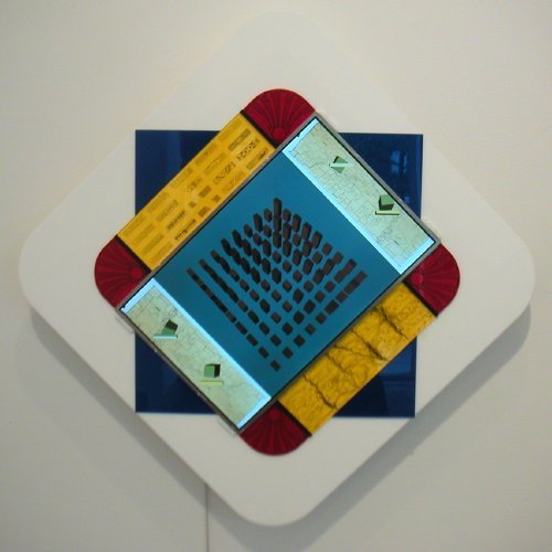
John F. Simon, Jr. Endless Victory 2005 software, Apple Powerbook G4, acrylic plastic 28″ x 28″ x 3.25″ [detail/screen still]
Sandra Gering showed only two modest-sized works by John F. Simon, Jr. in the show which closed on Saturday. Either one however could stand in for an entire art collection, since each of the two computer screens mounted in exquisite cut and engraved Plexiglas frames presents an infinitely-changing image. The one shown above is Simon’s take, in the words of the press release, “on the endless merging, dividing, overtaking, turning, starting and stopping motions” of the city which inspired Piet Mondrian’s unfinished 1943/44 Victory Boogie-Woogie.
No image in either work will ever be repeated on the screen, so the pieces will be renewing themselves forever. You may not be able to afford one of these jewels, but if you could, you’d never have to buy another work of art for novelty alone.
The gallery installation showed four pieces from each of the two editions, only beginning to suggest the endless variations produced by the software.
There’s really a lot going on here. The screen images are never entirely abstract, they regularly mimic three dimensions, and their inspirational sources are a balance of humanistic ideals and conceptual purity.
The second edition, Endless Bounty, emerges from the tension between Simon’s urban lifestyle and his longing for nature. The software flips between the two ideals displaying maps, drawings, photographs and three-dimensional models in a continual effort to capture our gaze.
I’m really attracted to the intelligence and creativity of Simon’s art, but he adds something most artists who work with computer code do not have: He knows how to draw, and it’s always a part of his “machinery.”
John F. Simon, Jr. Endless Bounty 2005 software, Apple Powerbook G4, acrylic plastic 23″ x 17.5″ x 3.25″ [detail/screen still]
[lower image from Sandra Gering Gallery]
Jesse Bercowetz, Matt Bua, Carrie Dashow at Jessica Murray
They’ve made landfall and explored Roosevelt Island but in the end it’s apparently not quite what they or any of us thought it would be.
Jesse Bercowetz, Matt Bua and Carrie Dashow continue their investigation of the weird mythologies of a half-forgotten, long narrow island lodged in the middle of New York’s East River with an installation at Jessica Murray. This is a project begun last year whose first forms “in which the artists assumed the role of underworld crypto-zoologists” were exhibited under the title Under Gone at PS1 in the fall.
In order to explore the island and its treacherous surrounding waters once known as The Hell Gate they [subsequently] launched a makeshift raft into the East River. In their new installation Pent-Up and Under Gone, Bercowetz, Bua, and Dashow explore their findings, as well as the Islands oral and written histories, and are led to a new interpretation of the land as a growing monster of unpredictable powers, with a life of its own, undetermined by humans.
There’s no way any image can prepare you for what they’ve installed, and as usual the work leaves me speechless (in a good way). Don’t miss their huge “book.”
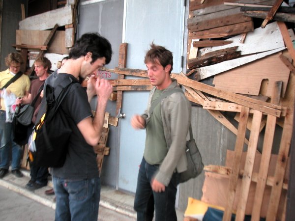
You’re going to want to see it all, but you’re going to have to find the gallery first: The huge 11th Avenue building was already partially veiled by a construction canopy, but the three artists have gone a step further. They’ve almost entirely covered the entrance to Jessica’s neat minimalist rooms with boards and pallets which look much like the scrap wood you’d expect to find on parts of Roosevelt Island’s muddy shore. Still, you should be able to just about make out the red lettering if you’re on foot.
dust thrown up by gusty (West) river winds outside the gallery
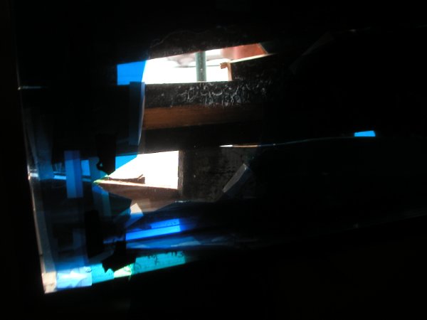
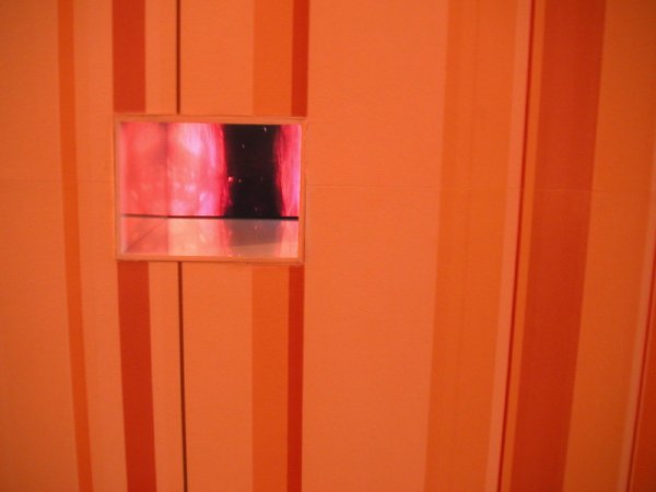
one of the two “enhanced” gallery windows as seen from the inside
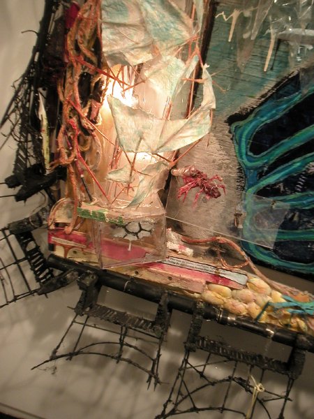
Jesse Bercowetz/Matt Bua Pent-Up and Undergone (panel) 2005 mixed media 64″ x 88″ x 18″ [detail]
bringing terror home, “Peace by Piece”
Damien Davis Bear and Cover 2004 paper bears, desk [installation view]
How do we address the horror of Hiroshima and Nagasaki today, sixty years after the fact? The artist Hiroshi Sunairi, a native of Hiroshima, asked his students at New York University this question when he taught a course one year ago entitled “Peace by Piece.” Some of their answers are currently assembled downtown in Tribeca’s Debrosses Gallery.
My own most profound memory of atomic war is not the initial report of my country’s annihilation of these two great cities but rather the routine, regulary-scheduled school rehearsals for an imagined defense against the oh-so-likely employment of these same bombs by a former ally suddenly turned satanic enemy. Unlike the people of Hiroshima and Nagasaki, we were always able to come out from under our desks. To this day the people of the United States remain the only ones who have ever used these insane weapons against another.
Although he is far too young to have ever experienced the terror of The Bomb, or even the fear of its terror, Damien Davis manages to describe it in this simple, powerful installation. The small folded pieces of paper which appear at the bottom left in the picture are stray origami cranes folded by the students as part of the political mobilization of the project.
The exhibition will be accompanied by the artists and their professor on a flight to Hiroshima this summer, where it will be installed from August 13 through August 20 at the old Bank of Japan building, Hiroshima Branch, one of the few buildings which survived the 1945 bombing.
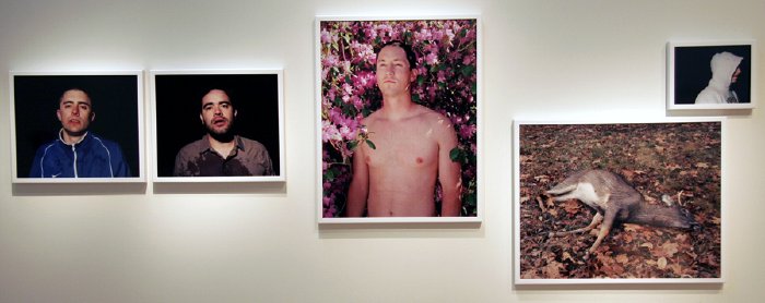
Jesse Burke at the Rhode Island School of Design
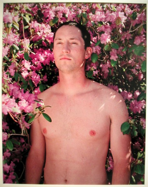
Jesse Burke Pink & Black 2005 C-prints detail view of installation
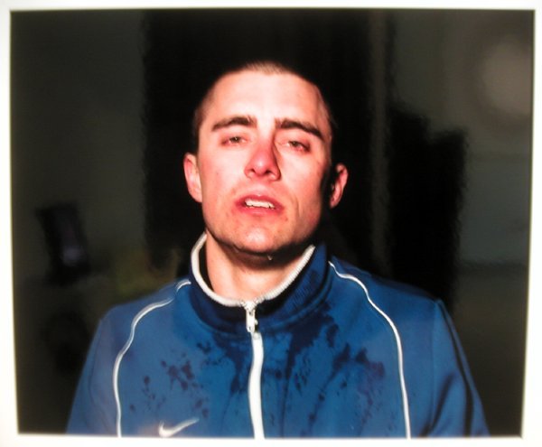
Jesse Burke Pink & Black 2005 C-prints detail view of installation
The two images above are elements of a larger work by Jesse Burke which we encountered while in Rhode Island last week.
While we were having dinner in Providence we met several young artists who were dining together at the next table. They all had some connection to the Rhode Island School of Design, and before we left the city we visited that school’s installation of work by artists who had just completed its graduate program. There we encountered this piece by Jesse Burke, one of the people we had spoken to at the restaurant. We thought his Pink and Black was the strongest work in the entire show. I will be very surprised if he isn’t adopted by a good New York gallery very soon.
The complete work we saw at the RISD Museum is shown below.
Jesse Burke Pink & Black 2005 C-prints
The artist’s statement:
The idea of masculinity is so incredibly fragile, so sought after, because of what it stands for, because of the history of men. A delicate balance exists between the heroic ideal of masculinity strength, endurance, toughness and the true, fragile reality of men as seen through my eyes. My work is an autobiographically driven investigation into the notions of masculine identity and the presence of vulnerability and sensitivity that acts as forces against the mythology of male dominance and power.
My notions of what it means to be a man are romantic. I believe an innate part of our psyche needs us to be the Iron John of Robert Bly, yet we are responding to that primal urge in a new way. We have grown into a new fragility. We identify and illuminate within ourselves what it means to be men through the examples we see in our families, in the media, and in our peers. We are bombarded by images defining what it means to be male, and we are helpless but to give in part way to these campaigns. We are fragile.
I photograph my life and the lives of the men in my social and family circles in an attempt to understand from where our ideas of masculinity originate. As the author I act as an interpreter of a specific culture and mythology. I am most drawn to the moments when we are vulnerable or emasculated; where there is a presence of a rupture or wound inflicted in some way, whether it be physical, emotional, or metaphorical. I employ concepts such as male bonding and peer influence, masculine rites and rituals, homosocial desire, physical exertion, and our connections to one another as well as the landscape that we interact within to expose these instances.
[image at the bottom from Jesse Burke]
Jürgen Mayer H. and Alex Schweder at Henry Urbach
Jürgen Mayer H. In Heat detail of room-size installation/painting
Alex Schweder Lovesick Room detail of room-size installation
I’d want to do a post on this show even if the images weren’t so spectacular, and I now have an additional reason to do so: Only tonight, as I read the press release while typing these lines, did I learn that this is the last exhibition for Henry Urbach Architecture in the current space (no further information, and the gallery site is “under construction”). Henry is a very special gallerist; I hope we will soon be pleasently surprised with the announcement of his next chapter.
Both artists in the current show are architects who have worked both here and in Europe. On 26th Street this month Mayer H. has built a three-dimensional painting which incorporates all six planes of the gallery and which includes seating as well. Some of the surfaces lose color with body contact, however fleeting. Schweder has covered the walls of the adjacent gallery space with “striped wallpaper that emits a delicious, cake-like odor.” In a recess on one wall a small monitor projects a moving endoscopic image, suggesting that the visitor is located both inside and outside of this fragrant architectural body.
David Ratcliff at Team Gallery
David Ratcliff Embroidery 2005 acrylic on canvas 72″ x 66″
David Ratcliff Floatation 2005 acrylic on canvas 72″ x 96″
The show was over even before we got home on Saturday after visiting it for the first time, so I can’t blame my current indisposition for this belated encomium.
I thought David Ratcliff’s recent show at team was absolutely beautiful, and I didn’t even think of Warhol until someone else brought up the name.
I also had not yet had the advantage of information the gallery supplied about Ratcliff’s inspirations and his process. From the press release:
David Ratcliff’s first solo exhibition takes as its title a line from Bret Easton Ellis’ novel American Psycho. Ratcliff’s compendium paintings share with Ellis something of the elegant formal violence that seemed the only way to give voice to the decade that most relished acquisition for acquisition’s sake. As a matter of fact, Walead Beshty, the artist and writer, has called Ratcliff’s new works “1980’s history paintings.”
. . .
Ratcliff, like Ellis, is fond of lists, allowing the gathering together of signs to do the work of cultural critique. In a sense, the collecting together of material is as crucial as the manner in which it is deployed.
For his imagery Ratcliff builds his own stencil cartoons on his computer and then prints them onto paper which he cuts out and attaches to the surface of a black-painted canvas. He chooses a single vibrant color for each piece and sprays the surface. The wet paint destroys the stencil and leaves the edges of the images somewhat less than precise.
[images from team gallery]
Tim Thyzel and Lot-ek at the new Cynthia Broan
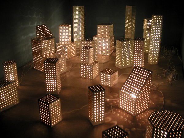
Tim Thyzel Dot Lights 2004-2005 26 pegboard and electrical light constructions, variable dimensions, installation view
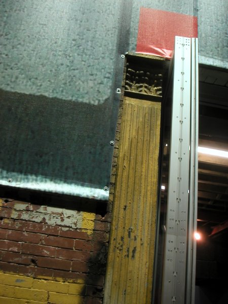
LOT-EK Cynthia Broan Gallery 2005 billboard-style facade with retained elements, detail
Cynthia Broan returned to Chelsea tonight, with a bang, after a two years’ absence. Her beautiful new gallery on West 29th Street is a former garage which has transformed by the architectural firm LOT-EK into what appears to be the perfect gallery instrument, an exhibition space with moving walls and a billboard-style facade. Tonight we saw a clean blue box. Yes, the walls were painted a medium blue to set off more than a dozen of Tim Thyzel’s minimal, mostly-white sculptural forms, assembled from ordinary commercial display materials.
From the press release:
Slots & Dots, sculptor Tim Thyzel’s third solo show with the gallery, utilizes the slotwall and pegboard commonly seen in low-end retail stores to create a series of sculptures which reflect on formal aspects of art and architecture as well as issues of merchandising and consumer appeal. Also known as MDF (medium density fiberboard), slotwall accommodates hardware such as hooks and shelving for interchangeable retail display. Several of the works shown include these hooks to add both texture and context to the work. The crisp white laminate, punctuated with lines and holes, transcends its usual application to construct a series of towers and stacks, which are both elegant and humorous.