A few days ago, unable to entirely escape the sometimes forced jollity of the season while walking about the City, I found myself casually thinking about the number of color schemes that could be drawn on to celebrate these December holidays (or decorate things which already had perfectly respectable aesthetics) – and also the hues that couldn’t.
The decor I had in mind at the time was mostly that which attaches to the traditional, Christmas-inspired parts of these celebrations, and the colors which even in the mixed societies of today still seem to dominate the December palette, even in warmer climates, where balloons are sometimes pretty Christmas-y.
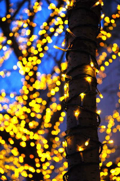
I decided in my head that, at least when it comes to monochromatic lighting arrangements, orange was certainly out, if only because orange was so important to some major October and November holidays. I think I had also eliminated bright yellow, and hadn’t even thought of chartreuse, so I was pretty surprised, coming out of Chelsea Market two days ago, to come across thousands of these tiny chartreuse lights fixed to every surface of the trees planted just west of the raised terrace of the Maritime Hotel on 9th Avenue.
I decided they were probably actually yellow, or gold, that it was the bright blue light remaining in the sky that was tinting them a bit chartreuse. By the time I got closer and captured this image the sky had darkened a bit and they no longer looked anything but gold. I now determined that one way or another, gold goes with almost everything, including (let’s hope for all of our sakes) this brand new year.
Category: Image
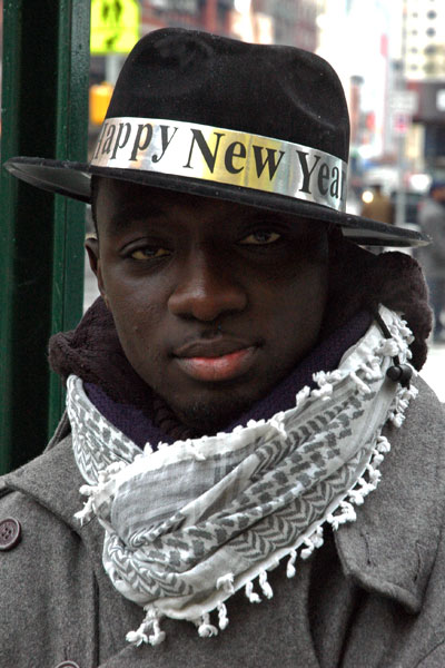
Chelsea hats, crazy wigs, and Serigne, New Year’s 2009
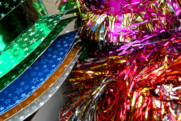
I passed the stand set up on the corner of 7th Avenue and 23rd Street. It was late last evening, windy and bitterly cold. The two vendors were selling New Year’s Eve party hats, light wands, and noise makers. I had already passed them by when I stopped to think about checking out the merchandise. My arms however were already juggling several heavy bags of food, so I decided I’d go back today to pick up something for a occasion to whose observance I’ve never been indifferent.
I’ve saved stuff from past years when I thought something was a little more special than most of the ephemera manufactured for this ancient holiday; I could recycle the old tin horns and such, but I probably needed some fresh party streamers. Then I asked myself, should I also get two pairs of 2010 spectacles? I’d never worn the silly things before, but this just might be the very last year for that classic template.
Aside from satisfying my needs, or encouraging last-minute buying impulses, I was looking forward to seeing what I expected would be a colorful array of merchandise (bring the camera!). It hadn’t occurred to me that the market experience, the bargaining between customer and seller would itself have been a powerful draw.
I didn’t see any streamers, and I didn’t spring for the glasses, but Serigne gave me a good price on two outrageous tinsel “wigs” (I might have some work in persuading Barry to wear his). I had already asked Serigne if I might take a few pictures of his table display, and he was kind enough to ascent – even without the condition that I make a purchase, although he encouraged me to do so. I heard him talking to the woman he was with, who later told me he was her son, and I was mesmerized by the cadences of their speech. I asked what language they were speaking, and they told me it was Wolof, that they were Wolof, from Senegal.
Serigne suggested I take a picture of his hat. It was one of the many models arrayed accross the table, but I doubt it could ever look as good as it does on his own handsome head.
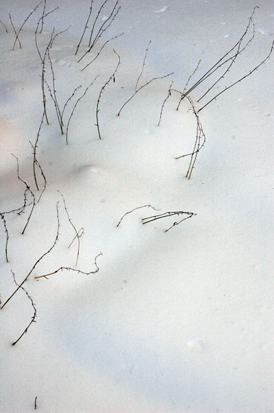
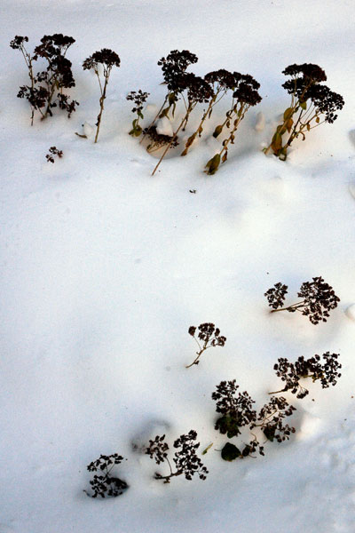
Chelsea winter garden
The beauty created by a heavy snowfall is even more exceptional for its certain evanescence – although a camera can still try to keep it from vanishing.
This afternoon, 24 hours or so after the snow had ended here, I took all three of these images in the central garden of our building, but the pair which appear below really want to be together.
 |
 |
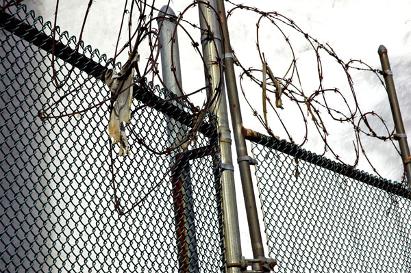
Henry Street lot gate
untitled (torn t-shirt) 2009
High Line grasses in the rain
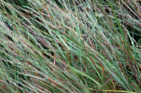
I don’t know whether I was more struck by the fact that the High Line was almost deserted yesterday (on a Saturday!) or that it was suddenly looking very autumn-ish as we introduced it to some visitors yesterday. Of course it had been raining all day, and it is mid-September.
very blue wall
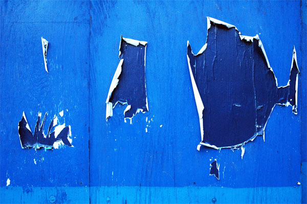
I ran across this torn and shredded wheat-pasted blue wall collage two weeks ago in West Chelsea.
scrap of Bart on Chrystie Street
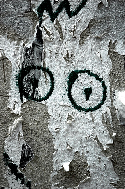
untitled (Bart) 2009
I’ve seen the way a baby, and even the smallest of animals, will always notice when it’s being looked at. We’re all attracted to eyes, and that’s true even when we know they’re attached to inanimate objects. I saw this paper remnant on a wall on the Lower East Side yesterday. It looks a bit like Bart Simpson to me, although I can’t say I really know the kid.
Brooklyn East River shoreline at low tide
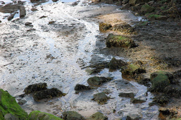
untitled (sea moss) 2009
No, it’s not Ireland, Cornwall, Nova Scotia or Iceland. It’s the Brooklyn shore of the East River just below the Manhattan Bridge. I took this picture late Saturday afternoon while Barry and I had stopped for lunch just inside the northern entrance to Brooklyn Bridge Park before we went on to visit the Marie Walsh Sharpe Art Foundation open studios.
The mud, the rocks, and the sea moss were photographed as the water was still receding with the power of the tide. While we were munching on our sandwiches, sitting on some rocks only a few feet away from the water, I realized we were at almost exactly the same spot where I stood in the mid-80’s to capture an image of a burned-out car heavily-camouflaged by tons of other dumped metal. There appeared to have been a protracted battle with some pretty aggressive weed types, but by the time I got to the site, the trash had clearly gained the field.
The Brooklyn shore environment is very different now, infinitely less romantic of course, as I suppose is all of New York. The Minox 35 print was black & white (as was everything I was doing then) and today even in my memory the entire under-the-bridges landscape is pretty noir. In my mind’s eye it all looks like something inside a Jarmusch film, maybe “Permanent Vacation“.
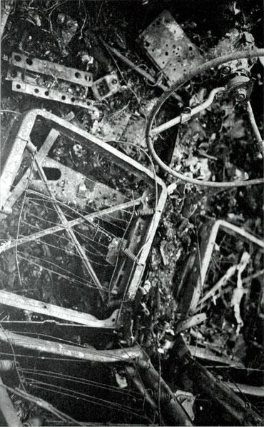
untitled (springs) ca.1985 silver print 13.25″ x 8.5″ [digital photograph of installation (minus mat and frame) of 35mm print behind plexi, showing flash hot spot]
staring down at the rails
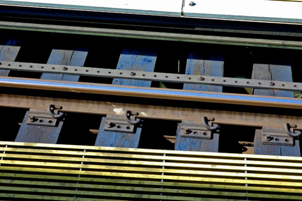
untitled (blue ties) 2009
Waiting for the #7 train at the 74 Street – Broadway station in Queens this afternoon, scorning the more obvious idea of going for a shot of the complex Manhattan skyline visible off to the west, I looked around for some simple patterns and found these lines.
“3 Columbus Circle”: it ain’t vinyl, but it’s still siding
Untitled (Pan Am) 2009
ghosts in the night: the Pan Am Building kisses the Commodore Hotel
I had originally intended to post this virtually abstract shot as an image alone, with no commentary, like I do with many of my photographs, but then I got to thinking about some of the follies that these two barely-seen structures (the Met Life Building* reflected in the windows of the Grand Hyatt Hotel) represent, and what they continue to tell us about New York’s past. Finally, during a long-anticipated visit to the new Hearst Tower last Wednesday I looked out a window in the northeast corner of one of the higher floors and I realized that some of us haven’t learned a thing. I now knew how I was going to finish this post.
Almost 30 years ago the Hyatt Hotel group demonstrated that there really are second acts in New York, but they may not always be worth staying for, or even bearable. The early twentieth-century “skyscraper” which stood on the Hyatt site, adjacent to Grand Central, was until 1980 known as the Commodore Hotel. Not surprisingly, it had been named for “Commodore” Cornelius Vanderbilt, the railroad entrepreneur who built the first Grand Central Terminal in 1871.
The Hyatt corporation’s architects retained the shape of its mass, and left most of the exterior bricks of the old hotel in place, merely covering everything with a highly-reflective glass skin.
Anyone who thinks this kind of philistine rape is a thing of the past might be advised to take a walk across town. An equal or even greater abomination is being committed between Eighth Avenue and Broadway in the upper fifties. I’m referring to what owner/developer Joseph Moinian calls “3 Columbus Circle”. Originally known as “Columbus Tower”**, when it was finished in 1928 (Shreve & Lamb, architects), the building occupies the entire block, between 57th and 58th Streets. Some will remember It once sheltered the much-missed Coliseum Books inside its southeast corner.
Last week I saw huge sections of masonry gouged out of finely-laid brick walls every few feet of the building’s surface, all destined to hold brackets for a totally-redundant glass curtain wall. I couldn’t keep looking, and, inexplicably, didn’t take any pictures. Maybe I couldn’t imagine looking at them once I got home. For those with the stomach, here’s the website devoted to the building’s transformation and marketing.
The site of this commercial-developmental obscenity is cater-corner from the bold, newly-topped-out Norman Foster Hearst Tower, which shoots out of the cast-stone facade of the six completed floors of the landmark 1928 Joseph Urban-designed New York Hearst headquarters. But it will bear a dramatically closer affinity to the new facade tacked onto 2 Columbus Circle, one block north of it, a monstrous work of destruction commissioned by the institution which I mischievously continue to refer to by its original name, the “American Craft Museum” (and not just on account of its notorious architectural crime).
The Pan Am Building may not be anyone’s favorite New York skyscraper, but at least it’s still permitted to represent something other than a shiny siding job.
*
(1963) architects: Emery Roth & Sons, with Walter Gropius and Pietro Belluschi
**
New York Times architecture critic David Dunlap has dug back even further. In a board post [with interesting pictures] on Wired New York, he writes: “For now, a palisade of three-story Ionic columns, supporting a neo-Classical entablature, surrounds the base of the structure. This is a visible vestige of the Colonnade Building, designed by William Welles Bosworth . . . .
Shreve & Lamb�s brown-brick facade was far simpler than the monumental colonnade. That incongruous combination of ornate base and spartan tower still speaks subtly � to anyone patient enough to listen � about the rise of Automobile Row in the early 20th century. But in a few months, it will be gone; another quirky corner of Manhattan that has been scrubbed, smoothed, polished, branded and lost.”
NOTE: The image is of the west wall of the Grand Hyatt, showing a few white-ish rectangular windows; the smaller, more numerous blue-ish shapes are the lighted windows in [what I normally call] the Pan Am Building, reflected on the Hyatt glass. The photo was taken from the sidewalk on the south side of 42nd Street.